Quantcast
Channel: SPSS – Andrew Wheeler
Viewing all 78 articles
Browse latest View live

Using sequential case processing for data management in SPSS

$
0
0

SPSS when making calculations essentially loops through every variable sequentially. So although calculations in syntax are always vectorized (the exception being explicit loops in MATRIX commands), that is compute y = x - 5. works over the entire x vector without specifying it, it really is just doing a loop through all of the records in the data set and calculating the value of y in one row at a time.

We can use this to our advantage though in a variety of data management tasks in conjunction with using lagged values in the data matrix. Let’s consider making a counter variable within a set of ID’s. Consider the example dataset below;

data list free /id value.
begin data
1 10
1 11
1 14
1 13
2 12
2 90
2 16
2 14
3 12
3 8
3 17
3 22
end data.
dataset name seq.

To make a counter for the entire dataset, it would be as simple as using the system variable $casenum, but what about a counter variable within each unique id value? Well we can use SPSS’s sequential case processing and LAG to do that for us. For example (note that this assumes the variables are already sorted so the id’s are in sequential order in the dataset);

DO IF id <> LAG(id) or MISSING(LAG(id)) = 1.
    COMPUTE counter_id = 1.
ELSE IF id = LAG(id).
    COMPUTE counter_id = lag(counter_id) + 1.
END IF.

The first if statement evalutes if the previous id value is the same, and if it is different (or missing, which is for the first row in the dataset) starts the counter at 1. If the lagged id value is the same, it increases the counter by 1. It should be clear how this can be used to identify duplicate values as well. Although the MATCH FILES command can frequently be more economical, it is pretty easy using sort. For instance, lets say in the previous example I wanted to only have one id per row in the dataset (e.g. eliminate duplicate id’s), but I wanted to only keep the highest value within id. This can be done just by sorting the dataset in a particular way (so the id with the highest value is always at the top of the list of sequential id’s).

SORT CASES BY id (A) value (D).
COMPUTE dup = 0.
IF id = lag(id) dup = 1.
SELECT IF dup = 0.

The equivalent expression using match files would be (note the reversal of dup in the two expressions, in match files I want to select the 1 value).

SORT CASES BY id (A) value (D).
MATCH FILES file = *
/first = dup
/by id.
SELECT IF dup = 1.

The match files approach scales better to more variables. If I had two variables I would need to write IF id1 = lag(id1) and id2 = lag(id2) dup = 1. with the lag approach, but only need to write /by id1 id2. for the match files approach. Again this particular example can be trivially done with another command (AGGREGATE in this instance), but the main difference is the two approaches above keep all of the variables in the current data set, and this needs to be explicitly written on the AGGREGATE command.

DATASET ACTIVATE seq.
DATASET DECLARE agg_seq.
AGGREGATE
  /OUTFILE='agg_seq'
  /BREAK=id
  /value=MAX(value).
dataset close seq.
dataset activate agg_seq.

One may think that the sequential case processing is not that helpful, as I’ve shown some alternative ways to do the same thing. But consider a case where you want to propogate down values, this can’t be done directly via match files or aggregate. For instance, I’ve done some text munging of tables exported from PDF files that look approximately like this when reading into an SPSS data file (where I use periods to symbolize missing data);

data list free /table_ID (F1.0) row_name col1 col2 (3A5).
begin data
1 . Col1 Col2 
. Row1 4 6
. Row2 8 20
2 . Col1 Col2
. Row1 5 10
. Row2 15 20
end data.
dataset name tables.

Any more useful representation of the data would need to associate particular rows with which table it came from. Here is sequential case processing to the rescue;

if MISSING(table_ID) = 1 table_ID = lag(table_ID).

Very simple fix, but perhaps not intuitive without munging around in SPSS for awhile. For another simple application of this see this NABBLE discussion where I give an example of propogating down and concatenating multiple string values). Another (more elaborate) example of this can be seen when merging and sorting a database of ranges to a number within the range.

This is what I would consider an advanced data management tool, and one that I use on a regular basis.


Interval graph for viz. temporal overlap in crime events

$
0
0

I’ve currently made a vizualization intended to be an exploratory tool to identify overlapping criminal events over a short period. Code to reproduce the macro is here, and that includes an example with made up data. As opposed to aoristic analysis, which lets you see globally the aggregated summaries of when crime events occurred potentially correcting for the unspecified time period, this graphical procedure allows you to identify whether local events overlap. It also allows one to perceive global information as well, in particular whether the uncertainty of events occur in morning, afternoon, or night.

A call to the macro ends up looking like this (other vars is optional and can include multiple variables – I assume token names are self-explanatory);

!interval_data date_begin = datet_begin time_begin = XTIMEBEGIN date_end = datet_end time_end = XTIMEEND 
label_id = myid other_vars = crime rand.

This just produces a new dataset name interval_data, which can then be plotted. And here is the example graph that comes with the macro and its fake data (after I edited the chart slightly).

GGRAPH
  /GRAPHDATASET NAME="graphdataset" dataset = "interval_data" VARIABLES= LABELID DAY TIMEBEGIN TIMEEND MID WITHINCAT DAYWEEK
  /GRAPHSPEC SOURCE=INLINE.
BEGIN GPL
 SOURCE: s=userSource(id("graphdataset"))
 DATA: LABELID=col(source(s), name("LABELID"), unit.category())
 DATA: DAY=col(source(s), name("DAY"), unit.category())
 DATA: TIMEBEGIN=col(source(s), name("TIMEBEGIN"))
 DATA: TIMEEND=col(source(s), name("TIMEEND"))
 DATA: MID=col(source(s),name("MID"))
 DATA: WITHINCAT=col(source(s),name("WITHINCAT"), unit.category())
 DATA: DAYWEEK=col(source(s),name("DAYWEEK"), unit.category())
 COORD: rect(dim(1,2), cluster(3,0))
 SCALE: cat(dim(3), values("1","2","3","4","5","6","7","8","9","10","11","12","13","14","15","16","17","18","19","20","21","22","23",
                                         "24","25","26","27","28","29","30","31"))
 ELEMENT: interval(position(region.spread.range(WITHINCAT*(TIMEBEGIN + TIMEEND)*DAY)), color.interior(DAYWEEK),
                             transparency.interior(transparency."0.1"), transparency.exterior(transparency."1")))
 ELEMENT: point(position(WITHINCAT*MID*DAY), color.interior(DAYWEEK), label(LABELID))
END GPL.

The chart can be interpreted as the days of the week are colored, and each interval represents on crime event, except when a crime events occurs over night, then the bar is split over two days (and each day the event is labeled). I wanted labels in the chart to easily reference specific events, and I assigned a point to the midpoint of the intervals to plot labels (also to give some visual girth to events that occurred over a short interval – otherwise they would be invisible in the chart). To displace the bars horizontally within the same day the chart essentially uses the same type of procedure that occurs in clustered bar charts.

GPL code can be inserted directly within macros, but it is quite a pain. It is better to use python to paramaterize GGRAPH, but I’m too lazy and don’t have python installed on my machine at work (ancient version of SPSS, V15, is to blame).

Here is another example with more of my data in the wild. This is for thefts from motor vehicles in Troy from the beginning of the year until 2/22. We had a bit of a rash over that time period, but they have since died down after the arrest of one particular prolific offender. This is evident in the chart,

We can also break down by other categories. This is what the token other_vars is for, it carries forward these other variables for use in facetting. For an example Troy has 4 police zones, and here is the graph broken down by each of them. Obviously crime sprees within short time frames are more likley perpetrated in close proximity. Also events committed by the same person are likely to re-occur within the same geographic proximity. The individual noted before was linked to events in Zone 4. I turn the labels off (it is pretty easy to toggle them in SPSS), and then one can either focus on individual events close in time or overlapping intervals pretty easily.

*Panelling by BEAT_DIST.
GGRAPH
  /GRAPHDATASET NAME="graphdataset" dataset = "interval_data" VARIABLES= LABELID DAY TIMEBEGIN TIMEEND MID WITHINCAT DAYWEEK BEAT_DIST
  /GRAPHSPEC SOURCE=INLINE.
BEGIN GPL
 SOURCE: s=userSource(id("graphdataset"))
 DATA: LABELID=col(source(s), name("LABELID"), unit.category())
 DATA: DAY=col(source(s), name("DAY"), unit.category())
 DATA: TIMEBEGIN=col(source(s), name("TIMEBEGIN"))
 DATA: TIMEEND=col(source(s), name("TIMEEND"))
 DATA: MID=col(source(s),name("MID"))
 DATA: WITHINCAT=col(source(s),name("WITHINCAT"), unit.category())
 DATA: DAYWEEK=col(source(s),name("DAYWEEK"), unit.category())
 DATA: BEAT_DIST=col(source(s),name("BEAT_DIST"), unit.category())
 COORD: rect(dim(1,2), cluster(3,0))
 SCALE: cat(dim(3), values("1","2","3","4","5","6","7","8","9","10","11","12","13","14","15","16","17","18","19","20","21","22","23",
                           "24","25","26","27","28","29","30","31","32","33","34","35","36","37","38","39","40","41","42","43","44","45",
                           "46"))
 ELEMENT: interval(position(region.spread.range(WITHINCAT*(TIMEBEGIN + TIMEEND)*DAY*1*BEAT_DIST)), color.interior(DAYWEEK),
                             transparency.interior(transparency."0.1"), transparency.exterior(transparency."1")))
 ELEMENT: point(position(WITHINCAT*MID*DAY*1*BEAT_DIST), color.interior(DAYWEEK), label(LABELID))
END GPL.

Note that to make the X axis insert all of the days I needed to include all of the numerical categories (between 1 and 46) in the value statement in the SCALE statement.

The chart in its current form can potentially be improved in a few ways, but I’ve had trouble accomplishing them so far. One is instead of utilizing clustering to displace the intervals, one could use dodging directly. I have yet to figure out how to specify the appropriate GPL code though when using dodging instead of clustering. Another is to utilize the dates directly, instead of any aribitrary categorical counter since the beginning of the series. To use dodging or clustering the axis needs to be categorical, so you could just make the axis the date, but bin the dates and specify the width of the bin categories to be 1 day (this would also avoid the annoying values statement to specify all the days). Again though, I was not able to figure out the correct GPL code to accomplish this.

I’d like to investigate ways to make this interactive and link with maps as well. I suspect it is possible in D3.js, and if I get around to figuring out how to make such a map/graphic duo I will for sure post it on the blog. In the meantime any thoughts or comments are always appreciated.


Some random SPSS graph tips: shading areas under curves and using dodging in binned dot plots

$
0
0

This is just a quick post on some random graphing examples you can do with SPSS through inline GPL statements, but are not possible through the GUI dialog. These also take knowing alittle bit about the grammer of graphics, and the nuts and bolts of SPSS’s implementation. First up, shading under a curve.

Shading under a curve

I assume the motivation for doing this is obvious, but it is alittle advanced GPL to figure out how to accomplish. I swore someone asked how to do this the other day on NABBLE, but I could not find any such questions. Below is an example.

*****************************************.
input program.
loop #i = 1 to 2000.
compute X = (#i - 1000)/250.
compute PDF = PDF.NORMAL(X,0,1).
compute CDF = CDF.NORMAL(X,0,1).
end case.
end loop.
end file.
end input program.
dataset name sim.
exe.

formats PDF X (F2.1).

*area under entire curve.
GGRAPH
  /GRAPHDATASET NAME="graphdataset" VARIABLES=X PDF MISSING=LISTWISE
  REPORTMISSING=NO
  /GRAPHSPEC SOURCE=INLINE.
BEGIN GPL
 SOURCE: s=userSource(id("graphdataset"))
 DATA: X=col(source(s), name("X"))
 DATA: PDF=col(source(s), name("PDF"))
 GUIDE: axis(dim(1), label("X"))
 GUIDE: axis(dim(2), label("Prob. Dens."))
 ELEMENT: area(position(X*PDF), missing.wings())
END GPL.


*Mark off different areas.
compute tails = 0.
if CDF <= .025 tails = 1.
if CDF >= .975 tails = 2.
exe.

*Area with particular locations highlighted.
GGRAPH
  /GRAPHDATASET NAME="graphdataset" VARIABLES=X PDF tails 
  /GRAPHSPEC SOURCE=INLINE.
BEGIN GPL
 SOURCE: s=userSource(id("graphdataset"))
 DATA: X=col(source(s), name("X"))
 DATA: PDF=col(source(s), name("PDF"))
 DATA: tails=col(source(s), name("tails"), unit.category())
 SCALE: cat(aesthetic(aesthetic.color.interior), map(("0",color.white),("1",color.grey),("2",color.grey)))
 SCALE: cat(aesthetic(aesthetic.transparency.interior), map(("0",transparency."1"),("1",transparency."0"),("2",transparency."0")))
 GUIDE: axis(dim(1), label("X"))
 GUIDE: axis(dim(2), label("Prob. Dens."))
 GUIDE: legend(aesthetic(aesthetic.color.interior), null())
 GUIDE: legend(aesthetic(aesthetic.transparency.interior), null())
 ELEMENT: area(position(X*PDF), color.interior(tails), transparency.interior(tails))
END GPL.
*****************************************.

The area under the entire curve is pretty simple code, and can be accomplished through the GUI. The shading under different sections though requires a bit more thought. If you want both the upper and lower tails colored of the PDF, you need to specify seperate categories for them, otherwise they will connect at the bottom of the graph. Then you need to map the categories to specific colors, and if you want to be able to see the gridlines behind the central area you need to make the center area transparent. Note I also omit the legend, as I assume it will be obvious what the graph represents given other context or textual summaries.

Binning scale axis to produce dodging

The second example is based on the fact that for SPSS to utilize the dodge collision modifier, one needs a categorical axis. What if you want the axis to really be scale though? You can make the data categorical but the axis on a continuous scale by specifying a binned scale, but just make the binning small enough to suit your actual data values. This is easy to show with a categorical dot plot. If you can, IMO it is better to use dodging than jittering, and below is a perfect example. If you run the first GGRAPH statement, you will see the points aren’t dodged, although the graph is generated just fine and dandy with no error messages. The second graph bins the X variable (which is on the second dimension) with intervals of width 1. This ends up being exactly the same as the continuous axis, because the values are all positive integers anyway.

*****************************************.
set seed = 10.
input program.
loop #i = 1 to 1001.
compute X = TRUNC(RV.UNIFORM(0,101)).
compute cat = TRUNC(RV.UNIFORM(1,4)).
end case.
end loop.
end file.
end input program.
dataset name sim.

GGRAPH
  /GRAPHDATASET NAME="graphdataset" VARIABLES=X cat
  /GRAPHSPEC SOURCE=INLINE.
BEGIN GPL
 SOURCE: s=userSource(id("graphdataset"))
 DATA: X=col(source(s), name("X"))
 DATA: cat=col(source(s), name("cat"), unit.category())
 COORD: rect(dim(1,2))
 GUIDE: axis(dim(1), label("cat"))
 ELEMENT: point.dodge.symmetric(position(cat*X))
END GPL.

*Now lets try to bin X so the points actually dodge!.
GGRAPH
  /GRAPHDATASET NAME="graphdataset" VARIABLES=X cat
  /GRAPHSPEC SOURCE=INLINE.
BEGIN GPL
 SOURCE: s=userSource(id("graphdataset"))
 DATA: X=col(source(s), name("X"))
 DATA: cat=col(source(s), name("cat"), unit.category())
 COORD: rect(dim(1,2))
 GUIDE: axis(dim(1), label("cat"))
 ELEMENT: point.dodge.symmetric(position(bin.rect(cat*X, dim(2), binWidth(1))))
END GPL.
****************************************.

Both examples shown here only take slight alterations to code generatable through the GUI, but take a bit more understanding of the grammer to know how to accomplish (or even know they are possible). You unfortunately can’t implement Wilkinson’s (1999) true dot plot technique like this (he doesn’t suggest binning, but by choosing where the dots are placed by KDE estimation). But this should be sufficient for most circumstances.


Update for Aoristic Macro in SPSS

$
0
0

I’ve substantially updated the aoristic macro for SPSS from what I previously posted. The updated code can be found here. The improvements are;

  • Code is much more modularized, it is only 1 function and takes an Interval parameter to determine what interval summaries you want.
  • It includes Agresti-Coull binomial error intervals (95% Confidence Intervals). It also returns a percentage estimate and the total number of cases the estimate is based off of, besides the usual info for time period, split file, and the absolute aoristic estimate.
  • allows an optional command to save the reshaped long dataset

Functionality dropped are default plots, and saving of begin, end and middle times for the same estimates. I just didn’t find these useful (besides academic purposes).

The main motivation was to add in error bars, as I found when I was making many of these charts it was obvious that some of the estimates were highly variable. While the Agresti-Coull binomial proportions are not entirely justified in this novel circumstance, they are better than nothing to at least illustrate the error in the estimates (it seems to me that they will likely be too small if anything, but I’m not sure).

I think a good paper I might work on in the future when I get a chance to is 1) show how variable the estimates are in small samples, and 2) evaluate the asympotic coverages of various estimators (traditional binomial proportions vs. bootstrap I suppose). Below is an example output of the updated macro, again with the same data I used previously. I make the small multiple chart by different crime types to show the variability in the estimates for given sample sizes.


Why I feel SPSS (or any statistical package) is better than Excel for this particular job

$
0
0

I debated on pulling an Andrew Gelman and adding a ps to my prior Junk Charts Challenge post, but it ended up being too verbose, so I just made an entirely new follow-up. To start, the discussion has currently evolved from this series of posts;

  • The original post on remaking a great line chart by Kaiser Fung, with the suggestion that the task (data manipulation and graphing) is easier in Excel.
  • My response on how to make the chart in SPSS.
  • Kaiser’s response to my post, in which I doubt I swayed his opinion on using Excel for this task! It appears to me based on the discussion so far the only real quarrel is whether the data manipulation is sufficiently complicated enough compared to the ease of pointing and clicking in Excel to justify using Excel. In SPSS to recreate Kaiser’s chart is does take some advanced knowledge of sorting and using lags to identify the pit and recoveries (the same logic could be extended to the data manipulations Kaiser says I skim over, as long as you can numerically or externally define what is a start of a recession).

All things considered for the internet, discussion has been pretty cordial so far. Although it is certainly sprinkled in my post, I didn’t mean for my post on SPSS to say that the task of grabbing data from online, manipulating it, and creating the graph was in any objective way easier in SPSS than in Excel. I realize pointing-and-clicking in Excel is easier for most, and only a few really adept at SPSS (like myself) would consider it easier in SPSS. I write quite a few tutorials on how to do things in SPSS, and that was one of the motivations for the tutorial. I want people using SPSS (or really any graphing software) to make nice graphs – and so if I think I can add value this way to the blogosphere I will! I hope my most value added is through SPSS tutorials, but I try to discuss general graphing concepts in the posts as well, so even for those not using SPSS it hopefully has some other useful content.

My original post wasn’t meant to discuss why I feel SPSS is a better job for this particular task, although it is certainly a reasonable question to ask (I tried to avoid it to prevent flame wars to be frank – but now I’ve stepped in it at this point it appears). As one of the comments on Kaiser’s follow up notes (and I agree), some tools are better for some jobs and we shouldn’t prefer one tool because of some sort of dogmatic allegiance. To make it clear though, and it was part of my motivation to write my initial response to the challenge post, I highly disagree that this particular task, which entails grabbing data from the internet, manipulating it, and creating a graph, and updating said graph on a monthly basis is better done in Excel. For a direct example of my non-allegiance to doing everything in SPSS for this job, I wouldn’t do the grabbing the data from the internet part in SPSS (indeed – it isn’t even directly possible unless you use Python code). Assuming it could be fully automated, I would write a custom SPSS job that manipulates the data after a wget command grabs the data, and have it all wrapped up in one bat file that runs on a monthly timer.

To go off on a slight tangent, why do I think I’m qualified to make such a distinction? Well, I use both SPSS and Excel on a regular basis. I wouldn’t consider myself a wiz at Excel nor VBA for Excel, but I have made custom Excel MACROS in the past to perform various jobs (make and format charts/tables etc.), and I have one task (a custom daily report of the crime incidents reported the previous day) I do on a daily basis at my job in Excel. So, FWIW, I feel reasonably qualified to make decisions on what tasks I should perform in which tools. So I’m giving my opinion, the same way Kaiser gave his initial opinion. I doubt my experience is as illustruous as Kaiser’s, but you can go to my CV page to see my current and prior work roles as an analyst. If I thought Excel, or Access, or R, or Python, or whatever was a better tool I would certainly personally use and suggest that. If you don’t have alittle trust in my opinion on such matters, well, you shouldn’t read what I write!

So, again to be clear, I feel this is a job better for SPSS (both the data manipulation and creating the graphics), although I admit it is initially harder to write the code to accomplish the task than pointing, clicking and going through chart wizards in Excel. So here I will try to articulate those reasons.

  • Any task I do on a regular basis, I want to be as automated as possible. Having to point-click, copy-paste on a regular basis invites both human error and is a waste of time. I don’t doubt you could fully (or very near) automate the task in Excel (as the comment on my blog post mentions). But this will ultimately involve scripting in VBA, which diminishes in any way that the Excel solution is easier than the SPSS solution.
  • The breadth of both data management capabilities, statistical analysis, and graphics are much larger in SPSS than in Excel. Consider the VBA code necessary to replicate my initial VARSTOCASES command in Excel, that is reshaping wide data to stacked long form. Consider the necessary VBA code to execute summary statistics over different groups without knowing what the different groups are beforehand. These are just a sampling of data management tools that are routine in statistics packages. In terms of charting, the most obvious function lacking in Excel is that it currently does not have facilities to make small-multiple charts (you can see some exceptional hacks from Jon Peltier, but those are certainly more limited in functionality that SPSS). Not mentioned (but most obvious) is the statistical capabilities of a statistical software!

So certainly, this particular job, could be done in Excel, as it does not require any functionality unique to a stats package. But why hamstring myself with these limitations from the onset? Frequently after I build custom, routine analysis like this I continually go back and provide more charts, so even if I have a good conceptualization of what I want to do at the onset there is no guarantee I won’t want to add this functionality in later. In terms of charting not having flexible small multiple charts is really a big deal, they can be used all the time.

Admittedly, this job is small enough in scope, if say the prior analyst was doing a regular updated chart via copy-paste like Kaiser is suggesting, I would consider just keeping that same format (it certainly is a lost opportunity cost to re-write the code in SPSS, and the fact that it is only on a monthly basis means to get time recovered if the task were fully automated would take quite some time). I just have personally enough experience in SPSS I know I could script a solution in SPSS quicker from the on-set than in Excel (I certainly can’t extrapolate that to anyone else though).

Part of both my preference and experience in SPSS comes from the jobs I personally have to do. For an example, I routinely pull a database of 500,000 incidents, do some data cleaning, and then merge this to a table of 300,000 charges and offenses and then merge to a second table of geocoded incident locations. Then using this data I routinely subset it, create aggregate summaries, tables, estimate various statistics and models, make some rudimentary maps, or even export the necessary data to import into a GIS software.

For arguments sake (with the exception of some of the more complicated data cleaning) this could be mostly done in SQL – but certainly no reasonable person should consider doing these multiple table merges and data cleaning in Excel (the nice interactive facilities with working with the spreadsheet in Excel are greatly dimished with any tables that take more a few scrolls to see). Statistical packages are really much more than tools to fit models, they are tools for working and manipulating data. I would highly recommend if you have to conduct routine tasks in which you manipulate data (something I assume most analysts have to do) you should consider learning statistical sofware, the same way I would recommend you should get to know SQL.

To be more balanced, here are things (knowing SPSS really well and Excel not as thoroughly) I think Excel excels at compared to SPSS;

  • Ease of making nicely formatted tables
  • Ease of directly interacting and editing components of charts and tables (this includes adding in supplementary vector graphics and labels).
  • Sparklines
  • Interactive Dashboards/Pivot Tables

Routine data management is not one of them, and only really sparklines and interactive dashboards are functionality in which I would prefer to make an end product in Excel over SPSS (and that doesn’t mean the whole workflow needs to be one software). I clean up ad-hoc tables for distribution in Excel all the time, because (as I said above) editing them in Excel is easier than editing them in SPSS. Again, my opinion, FWIW.


Some notes on single line charts in SPSS

$
0
0

One thing you can’t do in legacy graph commands in SPSS is superimpose multiple elements on a single graph. One common instance in which I like doing this is to superimpose point observations on a low-frequency line chart. The data example I will use is the reported violent crime rate by the NYPD between 1985 and 2010, taken from the FBI UCR data tool. So below is an example line chart in SPSS.


data list free / year VCR.
begin data
1985    1881.3
1986    1995.2
1987    2036.1
1988    2217.6
1989    2299.9
1990    2383.6
1991    2318.2
1992    2163.7
1993    2089.8
1994    1860.9
1995    1557.8
1996    1344.2
1997    1268.4
1998    1167.4
1999    1062.6
2000    945.2
2001    927.5
2002    789.6
2003    734.1
2004    687.4
2005    673.1
2006    637.9
2007    613.8
2008    580.3
2009    551.8
2010    593.1
end data.
formats year VCR (F4.0)

GGRAPH
  /GRAPHDATASET NAME="graphdataset" VARIABLES=year VCR
  /GRAPHSPEC SOURCE=INLINE.
BEGIN GPL
 SOURCE: s=userSource(id("graphdataset"))
 DATA: year=col(source(s), name("year"))
 DATA: VCR=col(source(s), name("VCR"))
 GUIDE: axis(dim(1), label("Year"))
 GUIDE: axis(dim(2), label("Violent Crime Rate per 100,000"))
 ELEMENT: line(position(year*VCR), color.interior(color.black))
 ELEMENT: point(position(year*VCR), color.interior(color.black), color.exterior(color.white), size(size."8px"))
END GPL.

This ends up being a pretty simple GPL call (at least relative to other inline GPL statements!). Besides nicely labelling the axis the only special things to note are

  • I drew the line element first.
  • I superimposed a point element on top of the line, filled black, with a white outline.

When you make multiple element calls in the GPL specification it acts just like drawing on a piece of paper, the elements that are listed first are drawn first, and elements listed later are drawn on top of those prior elements. I like doing the white outline for the superimposed points here because it creates further seperation from the line, but is not obtrusive enough to hinder general assessment of trends in the line.

To back up a bit, one of the reasons I like superimposing the observation points on a line like this is to show explicitly where the observations are on the chart. In these examples it isn’t as big a deal, as I don’t have missing data and the sampling is regular – but in cases in which those aren’t the case the line chart can be misleading. Both Kaiser Fung and Naomi Robbins have recent examples that illustrate this point. Although their examples are obviously better not connecting the lines at all, if I just had one or two years data missing it might be an ok assumption to just interpolate a line through that missing in this circumstance. Also in many instances lines are easier to assess general trends than bars and super-imposing multiple lines is frequently much better than making dodged bar graphs.

Another reason I like superimposing the points is because in areas of rapid change, the lines appear longer, but the sampling is the same. Superimposing the points reinforces the perception that the line is based on regularly sampled places on the X-axis.

Here I extend this code to further superimpose error intervals on the chart. This is a bit of a travesty for an example of time-series analysis (I just make prediction intervals from a regression on time, time squared and time cubed), but just go with it for the graphical presentation!


*Make a cubic function of time.
compute year_center = year - (1985 + 12.5).
compute year2 = year_center**2.
compute year3 = year_center**3.
*90% prediction interval.
REGRESSION
  /MISSING LISTWISE
  /STATISTICS COEFF OUTS R ANOVA
  /CRITERIA=PIN(.05) POUT(.10) CIN(90)
  /NOORIGIN
  /DEPENDENT VCR
  /METHOD=ENTER year_center year2 year3
  /SAVE ICIN .
formats LICI_1 UICI_1 (F4.0).
*Area difference chart.
GGRAPH
  /GRAPHDATASET NAME="graphdataset" VARIABLES=year VCR LICI_1 UICI_1
  /GRAPHSPEC SOURCE=INLINE.
BEGIN GPL
 SOURCE: s=userSource(id("graphdataset"))
 DATA: year=col(source(s), name("year"))
 DATA: VCR=col(source(s), name("VCR"))
 DATA: LICI_1=col(source(s), name("LICI_1"))
 DATA: UICI_1=col(source(s), name("UICI_1"))
 GUIDE: axis(dim(1), label("Year"))
 GUIDE: axis(dim(2), label("Violent Crime Rate per 100,000"))
 ELEMENT: area.difference(position(region.spread.range(year*(LICI_1 + UICI_1))), color.interior(color.grey), 
                  transparency.interior(transparency."0.5"))
 ELEMENT: line(position(year*VCR), color.interior(color.black))
 ELEMENT: point(position(year*VCR), color.interior(color.black), color.exterior(color.white), size(size."8px"))
END GPL.

This should be another good example where lines are an improvement over bars, I suspect it would be quite visually confusing to make such an error interval across a spectrum of bar charts. You could always do dynamite graphs, with error bars protruding from each bar, but that does not allow one to assess the general trend of the error intervals (and such dynamite charts shouldn’t be encouraged anyway).

My final example is using a polygon element to highlight an area of the chart. If you just want a single line, SPSS has the ability to either post-hoc edit a guideline into the graph, or you can specify the location of a guideline via GUIDE: form.line. What if you to highlight multiple years though – or just a range of values in general? You can superimpose a polygon element spanning the area of interest to do that. I saw a really nice example of this recently on the Rural Blog detailing Per-Capita sales before and after a Wal-Mart entered a community.

So here in this similar example I will highlight an area of a few years.


GGRAPH
  /GRAPHDATASET NAME="graphdataset" VARIABLES=year VCR
  /GRAPHSPEC SOURCE=INLINE.
BEGIN GPL
 SOURCE: s=userSource(id("graphdataset"))
 DATA: year=col(source(s), name("year"))
 DATA: VCR=col(source(s), name("VCR"))
 TRANS: begin=eval(1993)
 TRANS: end=eval(1996)
 TRANS: top= eval(3000)
 TRANS: bottom=eval(0)
 GUIDE: axis(dim(1), label("Year"))
 GUIDE: axis(dim(2), label("Violent Crime Rate per 100,000"))
 SCALE: linear(dim(2), min(500), max(2500))
 ELEMENT: polygon(position(link.hull((begin + end)*(bottom + top))), color.interior(color.blue), 
                  transparency.interior(transparency."0.5"))
 ELEMENT: line(position(year*VCR), color.interior(color.black))
 ELEMENT: point(position(year*VCR), color.interior(color.black), color.exterior(color.white), size(size."8px"))
END GPL.

For the polygon element, you first specify the outer coordinates through 4 TRANS commands, and then when making the GPL call you specify that the positions signify the convex hull of the polygon. The inner GPL statement of (begin + end)*(bottom + top) evaluates as the same to (begin*bottom + begin*top + end*bottom + end*top) because the graph alegebra is communative. The bottom and top you just need to pick to encapsulate some area outside of the visible max and min or the plot (and then further restrict the axis on the SCALE statment). Because the X axis is continuous, you could even make the encompassed area fractional units, to make it so the points of interest fall within the area. It should also be easy to see how to extend this to any arbitrary square within the plot.

In both examples with areas highlighted in the charts, I drew the areas first and semi-transparent. This allows one to see the gridlines underneath, and the areas don’t impede seeing the actual data contained in the line and points because it is beneath those other vector elements. The transparency is just a stylistic element I personally prefer in many circumstances, even if it isn’t needed to prevent multiple elements from being obsfucated by one another. In these examples I like that the gridlines aren’t hidden by the areas, but it is only a minor point.


Spineplots in SPSS

$
0
0

So the other day someone on cross-validated asked about visualizing categorical data, and spineplots was one of the responses. The OP asked if a solution in SPSS was available, and there is none currently available, with the exception of calling R code for Mosaic plots, which there is a handy function for that on developerworks. I had some code I started to attempt to make them, and it is good enough to show-case. Some notes on notation, these go by various other names (including Marimekko and Mosaic), also see this developerworkds thread which says spineplot but is something a bit different. Cox (2008) has a good discussion about the naming issues as well as examples, and Wickham & Hofmann (2011) have some more general discussion about different types of categorical plots and there relationships.

So instead of utilizing a regular stacked bar charts, spineplots make the width of the bar proportional to the size of the category. This makes categories with a larger share of the sample appear larger. Below is an example image from a recent thread on CV discussing various ways to plot categorical data.

This should be fairly intuitive what it represents. It is just a stacked bar chart, where the width of the bars on the X axis represent the marginal proportion of that category, and the height of the boxes on the Y axis represent the conditional proportion within each category (hence, all bars sum to a height of one).

Located here I have some of my example code to produce a similar plot all natively within SPSS. Directly below is an image of the result, and below that is an example of the syntax needed to generate the chart. In a nutshell, I provide a macro to generate the coordinates of the boxes and the labels. Then I just provide an example of how to generate the chart in GPL. The code currently sorts the boxes by the marginal totals on each axis, with the largest categories in the lower stack and to the left-most area of the chart. There is an optional parameter to turn this off though, in which case the sorting will be just by ascending order of however the categories are coded (the code has an example of this). I also provide an example at the end calling the R code to produce similar plots (but not shown here).

Caveats should be mentioned here as well, the code currently only works for two categorical variables, and the labels for the categories on the X-axis are labelled via data points within the chart. This will produce bad results with labels that are very close to one another (but at least you can edit/move them post-hoc in the chart editor in SPSS).

I asked Nick Cox on this question if his spineplot package for Stata had any sorting, and he replied in the negative. He has likely thought about it more than me, but I presume they should be sorted somehow by default, and sorting by the marginal totals in the categories was pretty easy to accomplish. I would like to dig into this (and other categorical data visualizations) a bit more, but unfortunately time is limited (and these don’t have much direct connection to my current scholarly work). There is a nice hodge-podge collection at the current question on CV I mentioned earlier (I think I need to add in a response about ParSets at the moment as well).


********************************************************************.
*Plots to make Mosaic Macro, tested on V20.
*I know for a fact V15 does not work, as it does not handle 
*coloring the boxes correctly when using the link.hull function.

*Change this to whereever you save the MosaicPlot macro.
FILE HANDLE data /name = "E:\Temp\MosaicPlot".
INSERT FILE = "data\MacroMosaic.sps".

*Making random categorical data.
dataset close ALL.
output close ALL.

set seed 14.
input program.
loop #i = 1 to 1000.
    compute DimStack = RV.BINOM(2,.6).
    compute DimCol = RV.BINOM(2,.7).
    end case.
end loop.
end file.
end input program.
dataset name cats.
exe.

value labels DimStack
0 'DimStack Cat0'
1 'DimStack Cat1'
2 'DimStack Cat2'.
value labels DimCol
0 'DimCol Cat0'
1 'DimCol Cat1'
2 'DimCol Cat2'.

*set mprint on.
!makespine Cat1 = DimStack Cat2 = DimCol.
*Example Graph - need to just replace Cat1 and Cat2 where appropriate.
dataset activate spinedata.
rename variables (DimStack = Cat1)(DimCol = Cat2).
GGRAPH
  /GRAPHDATASET NAME="graphdataset" VARIABLES=X2 X1 Y1 Y2 myID Cat1 Cat2 Xmiddle
  MISSING = VARIABLEWISE
  /GRAPHSPEC SOURCE=INLINE.
BEGIN GPL
 SOURCE: s=userSource(id("graphdataset"))
 DATA: Y2=col(source(s), name("Y2"))
 DATA: Y1=col(source(s), name("Y1"))
 DATA: X2=col(source(s), name("X2"))
 DATA: X1=col(source(s), name("X1"))
 DATA: Xmiddle=col(source(s), name("Xmiddle"))
 DATA: myID=col(source(s), name("myID"), unit.category())
 DATA: Cat1=col(source(s), name("Cat1"), unit.category())
 DATA: Cat2=col(source(s), name("Cat2"), unit.category())
 TRANS: y_temp = eval(1)
 SCALE: linear(dim(2), min(0), max(1.05))
 GUIDE: axis(dim(1), label("Prop. Cat 2"))
 GUIDE: axis(dim(2), label("Prop. Cat 1 within Cat 2"))
 ELEMENT: polygon(position(link.hull((X1 + X2)*(Y1 + Y2))), color.interior(Cat1), split(Cat2))
 ELEMENT: point(position(Xmiddle*y_temp), label(Cat2), transparency.exterior(transparency."1"))
END GPL.

*This makes the same chart without sorting.
dataset activate cats.
dataset close spinedata.
!makespine Cat1 = DimStack Cat2 = DimCol sort = N.
dataset activate spinedata.
rename variables (DimStack = Cat1)(DimCol = Cat2).
GGRAPH
  /GRAPHDATASET NAME="graphdataset" VARIABLES=X2 X1 Y1 Y2 myID Cat1 Cat2 Xmiddle
  MISSING = VARIABLEWISE
  /GRAPHSPEC SOURCE=INLINE.
BEGIN GPL
 SOURCE: s=userSource(id("graphdataset"))
 DATA: Y2=col(source(s), name("Y2"))
 DATA: Y1=col(source(s), name("Y1"))
 DATA: X2=col(source(s), name("X2"))
 DATA: X1=col(source(s), name("X1"))
 DATA: Xmiddle=col(source(s), name("Xmiddle"))
 DATA: myID=col(source(s), name("myID"), unit.category())
 DATA: Cat1=col(source(s), name("Cat1"), unit.category())
 DATA: Cat2=col(source(s), name("Cat2"), unit.category())
 TRANS: y_temp = eval(1)
 SCALE: linear(dim(2), min(0), max(1.05))
 GUIDE: axis(dim(1), label("Prop. Cat 2"))
 GUIDE: axis(dim(2), label("Prop. Cat 1 within Cat 2"))
 ELEMENT: polygon(position(link.hull((X1 + X2)*(Y1 + Y2))), color.interior(Cat1), split(Cat2))
 ELEMENT: point(position(Xmiddle*y_temp), label(Cat2), transparency.exterior(transparency."1"))
END GPL.
*In code online I have example using Mosaic plot plug in for R.
********************************************************************.

Citations of Interest


Fluctuation diagrams in SPSS

$
0
0

The other day on my spineplot post Jon Peck made a comment about how he liked the structure charts in this CV thread. Here I will show how to make them in SPSS (FYI the linked thread has an example of how to make them in R using ggplot2 if you are interested).

Unfortunately I accidently called them a structure plot in the original CV thread, when they are actually called fluctuation diagrams (see Pilhofer et al. (2012) and Wickham & Hofmann (2011) for citations). They are basically just binned scatterplots for categorical data, and the size of a point is mapped to the number of observations that fall within that bin. Below is the example (in ggplot2) taken from the CV thread.

So, to make these in SPSS you first need some categorical data, you can follow along with any two categorical variables (or at the end of the post I have the complete syntax with some fake categorical data). First, it is easier to start with some boilerplate code generated through the GUI. If you have any data set open that has categorical data in it (unaggregated) you can simply open up the chart builder dialog, choose a barplot, place the category you want on the x axis, then place the category you want on the Y axis as a column panel for a paneled bar chart.

The reason you make this chart is that the GUI interprets the default behavior of this bar chart is to aggregate the frequencies. You make the colum panel just so the GUI will write out the data definitions for you. If you pasted the chart builder syntax then the GPL code will look like below.


*Fluctuation plots - first make column paneled bar chart.
GGRAPH
  /GRAPHDATASET NAME="graphdataset" VARIABLES=Dim1[LEVEL=NOMINAL] COUNT()
  [name="COUNT"] Dim2[LEVEL=NOMINAL] MISSING=LISTWISE REPORTMISSING=NO
  /GRAPHSPEC SOURCE=INLINE.
BEGIN GPL
 SOURCE: s=userSource(id("graphdataset"))
 DATA: Dim1=col(source(s), name("Dim1"), unit.category())
 DATA: COUNT=col(source(s), name("COUNT"))
 DATA: Dim2=col(source(s), name("Dim2"), unit.category())
 GUIDE: axis(dim(1), label("Dim1"))
 GUIDE: axis(dim(2), label("Count"))
 GUIDE: axis(dim(3), label("Dim2"), opposite())
 SCALE: cat(dim(1))
 SCALE: linear(dim(2), include(0))
 SCALE: cat(dim(3))
 ELEMENT: interval(position(Dim1*COUNT*Dim2), shape.interior(shape.square))
END GPL.

With this boilerplate code though we can edit to make the chart we want. Here I outline some of those steps. Only editing the ELEMENT portion, the steps below are;

  • Edit the ELEMENT statement to be a point instead of interval.
  • Delete COUNT within the position statement (within the ELEMENT).
  • Change shape.interior to shape.
  • Add in ,size(COUNT) after shape(shape.square).
  • Add in ,color.interior(COUNT) after size(COUNT).

Those are all of the necessary statements to produce the fluctuation chart. The next two are to make the chart look nicer though.

  • Add in aesthetic mappings for scale statements (both the color and the size).
  • Change the guide statements to have the correct labels (and delete the dim(3) GUIDE).

The GPL code call then looks like this (with example aesthetic mappings) and below that is the chart it produces.


*In the end fluctuation plot.
GGRAPH
  /GRAPHDATASET NAME="graphdataset" VARIABLES=Dim1 Dim2 COUNT()[name="COUNT"]
  /GRAPHSPEC SOURCE=INLINE.
BEGIN GPL
 SOURCE: s=userSource(id("graphdataset"))
 DATA: Dim1=col(source(s), name("Dim1"), unit.category())
 DATA: Dim2=col(source(s), name("Dim2"), unit.category())
 DATA: COUNT=col(source(s), name("COUNT"))
 GUIDE: axis(dim(1), label("Dim1"))
 GUIDE: axis(dim(2), label("Dim2"))
 SCALE: pow(aesthetic(aesthetic.size), aestheticMinimum(size."8px"), aestheticMaximum(size."45px"))
 SCALE: linear(aesthetic(aesthetic.color.interior), aestheticMinimum(color.lightgrey), aestheticMaximum(color.darkred))
 ELEMENT: point(position(Dim1*Dim2), shape(shape.square), color.interior(COUNT), size(COUNT))
END GPL.

Aesthetically, besides the usual niceties the only thing to note is that the size of the squares typically needs to be changed to fill up the space (you would have to be lucky to have an exact mapping between area and the categorical count to work out). I presume squares are preferred because area assessments with squares tend to be more accurate than circles, but that is just my guess (you could use any shape you wanted). I use a power scale for size aesthetic, as the area for a square increases by the size of the side squared (and people interpret the areas in the plot, not the size of the side of the square). SPSS’s default exponent for a power scale is 0.5, which is the square root so exactly what we want. You just need to supply a reasonable start and end size for the squares to let them fill up the space depending on your counts. Unfortunately, SPSS does not make a correctly scaled legend in size, but the color aesthetic is correct (I leave it in only to show that it is incorrect, if for publication I would like suppress the different sizes and only show the color gradient). (Actually, my V20 continues to not respect shape aesthetics that aren’t mapped – and this is produced via post-hoc editing of the shape – owell).

Here I show two redundant continuous aesthetic scales (size and color). SPSS’s behavior is to make the legend discrete instead of continuous. In Wilkinson’s Grammer of Graphics he states that he prefers discrete scales (even for continous aesthetics) to aid lookup.


***********************************************************.
*Making random categorical data.
set seed 14.
input program.
loop #i = 1 to 1000.
    compute Prop = RV.UNIFORM(.5,1).
    end case.
end loop.
end file.
end input program.
dataset name cats.
exe.

compute Dim1 = RV.BINOMIAL(3,PROP).
compute Dim2 = RV.BINOMIAL(5,PROP).

*Fluctuation plots - first make column paneled bar chart.
GGRAPH
  /GRAPHDATASET NAME="graphdataset" VARIABLES=Dim1[LEVEL=NOMINAL] COUNT()
  [name="COUNT"] Dim2[LEVEL=NOMINAL] MISSING=LISTWISE REPORTMISSING=NO
  /GRAPHSPEC SOURCE=INLINE.
BEGIN GPL
 SOURCE: s=userSource(id("graphdataset"))
 DATA: Dim1=col(source(s), name("Dim1"), unit.category())
 DATA: COUNT=col(source(s), name("COUNT"))
 DATA: Dim2=col(source(s), name("Dim2"), unit.category())
 GUIDE: axis(dim(1), label("Dim1"))
 GUIDE: axis(dim(2), label("Count"))
 GUIDE: axis(dim(3), label("Dim2"), opposite())
 SCALE: cat(dim(1))
 SCALE: linear(dim(2), include(0))
 SCALE: cat(dim(3))
 ELEMENT: interval(position(Dim1*COUNT*Dim2), shape.interior(shape.square))
END GPL.

*Then edit 1) element to point.
*2) delete COUNT within position statement
*3) shape.interior -> shape
*4) add in "size(COUNT)"
*5) add in "color.interior(COUNT)"
*6) add in aesthetic mappings for scale statements
*7) change guide statements - then you are done.

*In the end fluctuation plot.
GGRAPH
  /GRAPHDATASET NAME="graphdataset" VARIABLES=Dim1 Dim2 COUNT()[name="COUNT"]
  /GRAPHSPEC SOURCE=INLINE.
BEGIN GPL
 SOURCE: s=userSource(id("graphdataset"))
 DATA: Dim1=col(source(s), name("Dim1"), unit.category())
 DATA: Dim2=col(source(s), name("Dim2"), unit.category())
 DATA: COUNT=col(source(s), name("COUNT"))
 GUIDE: axis(dim(1), label("Dim1"))
 GUIDE: axis(dim(2), label("Dim2"))
 SCALE: pow(aesthetic(aesthetic.size), aestheticMinimum(size."8px"), aestheticMaximum(size."45px"))
 SCALE: linear(aesthetic(aesthetic.color.interior), aestheticMinimum(color.lightgrey), aestheticMaximum(color.darkred))
 ELEMENT: point(position(Dim1*Dim2), shape(shape.square), color.interior(COUNT), size(COUNT))
END GPL.

*Alternative ways to map sizes in the plot.
*SCALE: linear(aesthetic(aesthetic.size), aestheticMinimum(size."5%"), aestheticMaximum(size."30%")).
*SCALE: linear(aesthetic(aesthetic.size), aestheticMinimum(size."6px"), aestheticMaximum(size."18px")).

*Alternative jittered scatterplot - need to remove the agg variable COUNT.
*Replace point with point.jitter.
GGRAPH
  /GRAPHDATASET NAME="graphdataset" VARIABLES=Dim1 Dim2
  /GRAPHSPEC SOURCE=INLINE.
BEGIN GPL
 SOURCE: s=userSource(id("graphdataset"))
 DATA: Dim1=col(source(s), name("Dim1"), unit.category())
 DATA: Dim2=col(source(s), name("Dim2"), unit.category())
 GUIDE: axis(dim(1), label("Dim1"))
 GUIDE: axis(dim(2), label("Dim2"))
 ELEMENT: point.jitter(position(Dim1*Dim2))
END GPL.
***********************************************************.

Citations of Interest


A brief intro on building Custom Dialogs in SPSS

$
0
0

So the other day after my fluctuation chart post Jon Peck gently nudged me to make a chart custom dialog (with teasers such as it only takes a few minutes.) Well, he is right, they are quite easy to make. Here I will briefly walk through the process just to highlight how easy it really is.

At first, I was confusing the custom builder dialog with the old VB like scripts. The newer builder dialog (not sure what version it was introduced, but all I note here was produced in V20) is a purely GUI application that one can build dialogs to insert arbitrary code sections based on user input. It is easier to show than say, but in the end the dialog I build here will produce the necessary syntax to make the fluctuation charts I showed in the noted prior post.

So first, to get to the Chart Builder dialog one needs to access the menu via Utilities -> Custom Dialogs -> Custom Dialog Builder.

Then, when the dialog builder is opened, one is presented with an empty dialog canvas.

To start building the dialog, you drag the elements in the tool box onto the canvas. It seems you will pretty much always want to start with a source variable list.

Now, before we finish all of the controls, lets talk about how the dialog builder interacts with the produced syntax. So, for my fluctuation chart, a typical syntax call might look like below, if we want to plot V1 against V2.

GGRAPH
  /GRAPHDATASET NAME="graphdataset" VARIABLES=V1 V2 COUNT()[name="COUNT"]
  /GRAPHSPEC SOURCE=INLINE.
BEGIN GPL
 SOURCE: s=userSource(id("graphdataset"))
 DATA: V1=col(source(s), name("V1"), unit.category())
 DATA: V2=col(source(s), name("V2"), unit.category())
 DATA: COUNT=col(source(s), name("COUNT"))
 GUIDE: axis(dim(1), label("V1"))
 GUIDE: axis(dim(2), label("V2"))
 SCALE: pow(aesthetic(aesthetic.size), aestheticMinimum(size."8px"), aestheticMaximum(size."45px"))
 SCALE: linear(aesthetic(aesthetic.color.interior), aestheticMinimum(color.lightgrey), aestheticMaximum(color.darkred))
 ELEMENT: point(position(V1*V2), shape(shape.square), color.interior(COUNT), size(COUNT))
END GPL.

So how exactly will the dialog builder insert arbitrary variables? In our syntax, we want to replace sections of code with %%Identifier%%, where Identifier refers to a particular name we assign to any particular control in the builder. So, if I wanted to have some arbitrary code to change V1 to whatever the user inputs, I would replace V1 in the original syntax with %%myvar%% (and name the control myvar). In the end, the syntax template for this particular dialog looks like below.

GGRAPH
  /GRAPHDATASET NAME="graphdataset" VARIABLES=%%x%% %%y%% COUNT()[name="COUNT"]
  /GRAPHSPEC SOURCE=INLINE.
BEGIN GPL
 SOURCE: s=userSource(id("graphdataset"))
 DATA: %%x%%=col(source(s), name("%%x%%"), unit.category())
 DATA: %%y%%=col(source(s), name("%%y%%"), unit.category())
 DATA: COUNT=col(source(s), name("COUNT"))
 GUIDE: axis(dim(1), label("%%x%%"))
 GUIDE: axis(dim(2), label("%%y%%"))
%%title%%
 SCALE: pow(aesthetic(aesthetic.size) %%minpixel%% %%maxpixel%%)
 SCALE: linear(aesthetic(aesthetic.color.interior), aestheticMinimum(color.lightgrey), aestheticMaximum(color.darkred))
 ELEMENT: point(position(%%x%%*%%y%%), shape(shape.square), color.interior(COUNT), size(COUNT))
END GPL.

To insert the syntax, there is a button in the dialog builder to open it (the tool tip will say syntax template). You can just copy and paste the code in. Here there are user inputs for both the variables for the fluctuation chart, and the minimum and maximum size of the pixels, and the chart title. Only the variables are required for execution, and if the user inputs for the other arbitrary statements are not filled in they dissapear completely from the syntax generation.

Now, we are set up with all of the arbitrary elements we want to insert into the code. Here I want to have controls for two target lists (the x and y axis variables), two number controls (for the min and max size of the pixels), and one text control (for the chart title). To associate the control with the syntax, after you place a control on the canvas you can select and edit its attributes. The Identifier attribute is what associates it with the %%mypar%% in the syntax template.

So here for the Y axis variable, I named the Identifier y.

Also take note of the syntax field, %%ThisValue%%. Here, you can change the syntax field to either just enter the field name (or user input), or enter in more syntax around that user input. As an example, the Syntax field for the Chart Title control looks like this;

GUIDE: text.title(label("%%ThisValue%%"))

If the title control is omitted, the entire %%title%% line in the syntax template is not generated. If some text is entered into the title control, the surrounding GUIDE syntax is inserted with the text replacing %%ThisValue%% in the above code example. You can see how I used this behavior to make the min and max pixel size for the points arbitrary.

To learn more about all of the different controls and more of the aesthetics and extra niceties you can do with the dialog builder, you should just take a stroll through the help for custom dialogs. Here is the location where I uploaded the FluctuationChart dialog builder to (you can open it up and edit it yourself to see the internals). I hope to see more contributions by other SPSS users in the future, they are really handy for Python and R scripts in addition to GGRAPH code.


Calendar Heatmap in SPSS

$
0
0

Here is just a quick example of making calendar heatmaps in SPSS. My motivation can be seen from similar examples of calendar heatmaps in R and SAS (I’m sure others exist as well). Below is an example taken from this Revo R blog post.

The code involves a macro that can take a date variable, and then calculate the row position the date needs to go in the calendar heatmap (rowM), and also returns a variable for the month and year, which are used in the subsequent plot. It is brief enough I can post it here in its entirety.


*************************************************************************************.
*Example heatmap.

DEFINE !heatmap (!POSITIONAL !TOKENS(1)).
compute month = XDATE.MONTH(!1).
value labels month
1 'Jan.'
2 'Feb.'
3 'Mar.'
4 'Apr.'
5 'May'
6 'Jun.'
7 'Jul.'
8 'Aug.'
9 'Sep.'
10 'Oct.'
11 'Nov.'
12 'Dec.'.
compute weekday = XDATE.WKDAY(!1).
value labels weekday
1 'Sunday'
2 'Monday'
3 'Tuesday'
4 'Wednesday'
5 'Thursday'
6 'Friday'
7 'Saturday'.
*Figure out beginning day of month.
compute #year = XDATE.YEAR(!1).
compute #rowC = XDATE.WKDAY(DATE.MDY(month,1,#year)).
compute #mDay = XDATE.MDAY(!1).
*Now ID which row for the calendar heatmap it belongs to.
compute rowM = TRUNC((#mDay + #rowC - 2)/7) + 1.
value labels rowM
1 'Row 1'
2 'Row 2'
3 'Row 3'
4 'Row 4'
5 'Row 5'
6 'Row 6'.
formats rowM weekday (F1.0).
formats month (F2.0).
*now you just need to make the GPL call!.
!ENDDEFINE.

set seed 15.
input program.
loop #i = 1 to 365.
    compute day = DATE.YRDAY(2013,#i).
    compute flag = RV.BERNOULLI(0.1).
    end case.
end loop.
end file.
end input program.
dataset name days.
format day (ADATE10).
exe.

!heatmap day.
exe.
temporary.
select if flag = 1.
GGRAPH
  /GRAPHDATASET NAME="graphdataset" VARIABLES=weekday rowM month
  /GRAPHSPEC SOURCE=INLINE.
BEGIN GPL
 SOURCE: s=userSource(id("graphdataset"))
 DATA: weekday=col(source(s), name("weekday"), unit.category())
 DATA: rowM=col(source(s), name("rowM"), unit.category())
 DATA: month=col(source(s), name("month"), unit.category())
 COORD: rect(dim(1,2),wrap())
 GUIDE: axis(dim(1))
 GUIDE: axis(dim(2), null())
 GUIDE: axis(dim(4), opposite())
 SCALE: cat(dim(1), include("1.00", "2.00", "3.00", "4.00", "5.00","6.00", "7.00"))
 SCALE: cat(dim(2), reverse(), include("1.00", "2.00", "3.00", "4.00", "5.00","6.00"))
 SCALE: cat(dim(4), include("1.00", "2.00", "3.00", "4.00", "5.00",
  "6.00", "7.00", "8.00", "9.00", "10.00", "11.00", "12.00"))
 ELEMENT: polygon(position(weekday*rowM*1*month), color.interior(color.red))
END GPL.
*************************************************************************************.

Which produces this image below. You can not run the temporary command to see what the plot looks like with the entire year filled in.

This is nice to illustrate potential day of week patterns for specific events that only rarely occur, but you can map any aesthetic you please to the color of the polygon (or you can change the size of the polygons if you like). Below is an example I used this recently to demonstrate what days a spree of crimes appeared on, and I categorically colored certain dates to indicate multiple crimes occurred on those dates. It is easy to see from the plot that there isn’t a real strong tendency for any particular day of week, but there is some evidence of spurts of higher activity.

In terms of GPL logic I won’t go into too much detail, but the plot works even with months or rows missing in the data because of the finite number of potential months and rows in the plot (see the SCALE statements with the explicit categories included). If you need to plot multiple years, you either need seperate plots or another facet. Most of the examples show numerical information over every day, which is difficult to really see patterns like that, but it shouldn’t be entirely disgarded just because of that (I would have to simultaneously disregard every choropleth map ever made if I did that!)


Viz. weighted regression in SPSS and some discussion

$
0
0

Here I wish to display some examples of visually weighted regression diagnostics in SPSS, along with some discussion about the goals and relationship to the greater visualization literature I feel is currently missing from the disscussion. To start, the current label of “visually weighted regression” can be attributed to Solomon Hsiang. Below are some of the related discussions (on both Solomon’s and Andrew Gelman’s blog), and a paper Solomon has currently posted on SSRN.

Also note that Felix Schonbrodt has provided example implementations in R. Also the last link is an example from the is.R() blog.

Hopefully that is near everyone (and I have not left out any discussion!)

A rundown of their motivation (although I encourage everyone to either read Solomon’s paper or the blog posts), is that regression estimates have a certain level of uncertainty. Particularly at the ends of the sample space of the independent variable observations, and especially for non-linear regression estimates, the uncertainty tends to be much greater than where we have more sample observations. The point of visually weighted regression is to deemphasize area of the plot where our uncertainty about the predicted values is greatest. This conversely draws ones eye to the area of the plot where the estimate is most certain.

I’ll discuss the grammer of these graphs a little bit, and from there it should be clear how to implement them in whatever software (as long as it supports transparency and fitting the necessary regression equations!). So even though I’m unaware of any current SAS (or whatever) examples, I’m sure they can be done.

SPSS Implementation

First lets just generate some fake data in SPSS, fit a predicted regression line, and plot the intervals using lines.


*******************************.
set seed = 10. /* sets random seed generator to make exact data reproducible */.
input program.
loop #j = 1 to 100. /*I typically use scratch variables (i.e. #var) when making loops.
    compute X = RV.NORM(0,1). /*you can use the random number generators to make different types of data.
    end case.
end loop.
end file.
end input program.
dataset name sim.
execute. /*note spacing is arbitrary and is intended to make code easier to read.
*******************************.

compute Y = 0.5*X + RV.NORM(0,SQRT(0.5)).
exe.

REGRESSION
  /MISSING LISTWISE
  /STATISTICS COEFF OUTS R ANOVA
  /CRITERIA=PIN(.05) POUT(.10) CIN(95)
  /NOORIGIN
  /DEPENDENT Y
  /METHOD=ENTER X
  /SAVE PRED MCIN.

*Can map seperate variable based on size of interval to color and transparency.

compute size = UMCI_1 - LMCI_1.
exe.
formats UMCI_1 LMCI_1 Y X size PRE_1 (F1.0).

*Simple chart with lines.
GGRAPH
  /GRAPHDATASET NAME="graphdataset" VARIABLES=X Y PRE_1 LMCI_1 UMCI_1 MISSING=LISTWISE
  REPORTMISSING=NO
  /GRAPHSPEC SOURCE=INLINE DEFAULTTEMPLATE=yes.
BEGIN GPL
 SOURCE: s=userSource(id("graphdataset"))
 DATA: X=col(source(s), name("X"))
 DATA: Y=col(source(s), name("Y"))
 DATA: PRE_1=col(source(s), name("PRE_1"))
 DATA: LMCI_1=col(source(s), name("LMCI_1"))
 DATA: UMCI_1=col(source(s), name("UMCI_1"))
 GUIDE: axis(dim(1), label("X"))
 GUIDE: axis(dim(2), label("Y"))
 SCALE: linear(dim(1), min(-3.8), max(3.8))
 SCALE: linear(dim(2), min(-3), max(3))
 ELEMENT: point(position(X*Y), size(size."2"))
 ELEMENT: line(position(X*PRE_1), color.interior(color.red))
 ELEMENT: line(position(X*LMCI_1), color.interior(color.grey))
 ELEMENT: line(position(X*UMCI_1), color.interior(color.grey))
END GPL.

In SPSS’s grammer, it is simple to plot the predicted regression line with areas of the higher confidence interval as more transparent. Here I use saved values from the regression equation, but you can also use functions within GPL (see smooth.linear and region.confi.smooth).


*Using path with transparency between segments.
GGRAPH
  /GRAPHDATASET NAME="graphdataset" VARIABLES=X Y PRE_1 size 
  /GRAPHSPEC SOURCE=INLINE.
BEGIN GPL
 SOURCE: s=userSource(id("graphdataset"))
 DATA: X=col(source(s), name("X"))
 DATA: Y=col(source(s), name("Y"))
 DATA: PRE_1=col(source(s), name("PRE_1"))
 DATA: size=col(source(s), name("size"))
 GUIDE: axis(dim(1), label("X"))
 GUIDE: axis(dim(2), label("Y"))
 GUIDE: legend(aesthetic(aesthetic.transparency.interior), null())
 SCALE: linear(dim(1), min(-3.8), max(3.8))
 SCALE: linear(dim(2), min(-3), max(3))
 ELEMENT: point(position(X*Y), size(size."2"))
 ELEMENT: line(position(X*PRE_1), color.interior(color.red), transparency.interior(size), size(size."4"))
END GPL.

It is a bit harder to make the areas semi-transparent throughout the plot. If you use an area.difference ELEMENT, it makes the entire area a certain amount of transparency. If you use intervals with the current data, the area will be too sparse. So what I do is make new data, sampling more densley along the x axis and make the predictions. From this we can use interval element to plot the predictions, mapping the size of the interval to transparency and color saturation.


*make new cases to have a consistent sampling of x values to make the intervals.

input program.
loop #j = 1 to 500.
    compute #min = -5.
    compute #max = 5.
    compute X = #min + (#j - 1)*(#max - #min)/500.
    compute new = 1.
    end case.
    end loop.
end file.
end input program.
dataset name newcases.
execute.

dataset activate sim.
add files file = *
/file = 'newcases'.
exe.
dataset close newcases.

match files file = *
/drop UMCI_1 LMCI_1 PRE_1.

REGRESSION
  /MISSING LISTWISE
  /STATISTICS COEFF OUTS R ANOVA
  /CRITERIA=PIN(.05) POUT(.10) CIN(95)
  /NOORIGIN
  /DEPENDENT Y
  /METHOD=ENTER X
  /SAVE PRED MCIN.

compute size = UMCI_1 - LMCI_1.
formats ALL (F1.0).

temporary.
select if new = 1.
GGRAPH
  /GRAPHDATASET NAME="graphdataset" VARIABLES=X PRE_1 LMCI_1 UMCI_1 size MISSING=LISTWISE
  REPORTMISSING=NO
  /GRAPHSPEC SOURCE=INLINE.
BEGIN GPL
 SOURCE: s=userSource(id("graphdataset"))
 DATA: X=col(source(s), name("X"))
 DATA: PRE_1=col(source(s), name("PRE_1"))
 DATA: LMCI_1=col(source(s), name("LMCI_1"))
 DATA: UMCI_1=col(source(s), name("UMCI_1"))
 DATA: size=col(source(s), name("size"))
 TRANS: sizen = eval(size*-1)
 TRANS: sizer = eval(size*.01)
 GUIDE: axis(dim(1), label("X"))
 GUIDE: axis(dim(2), label("Y"))
 GUIDE: legend(aesthetic(aesthetic.transparency.interior), null())
 GUIDE: legend(aesthetic(aesthetic.transparency.exterior), null())
 GUIDE: legend(aesthetic(aesthetic.color.saturation.exterior), null())
 SCALE: linear(aesthetic(aesthetic.transparency), aestheticMinimum(transparency."0.90"), aestheticMaximum(transparency."1"))
 SCALE: linear(aesthetic(aesthetic.color.saturation), aestheticMinimum(color.saturation."0"), 
              aestheticMaximum(color.saturation."0.01"))
 SCALE: linear(dim(1), min(-5.5), max(5))
 SCALE: linear(dim(2), min(-3), max(3))
 ELEMENT: interval(position(region.spread.range(X*(LMCI_1 + UMCI_1))), transparency.exterior(size), color.exterior(color.red), size(size."0.005"), 
                  color.saturation.exterior(sizen))
 ELEMENT: line(position(X*PRE_1), color.interior(color.darkred), transparency.interior(sizer), size(size."5"))
END GPL.
exe.

Unfortunately, this creates some banding effects. Sampling fewer points makes the banding effects worse, and sampling more reduces the ability to make the plot transparent (and it is still produces banding effects). So, to produce one that looks this nice took some experimentation with how densely the new points were sampled, how aesthetics were mapped, and how wide the interval lines would be.

I tried to map a size aesthetic to the line and it works ok, you can still see some banding effects. Also note, to get the size of the line to be vertical (as oppossed to oriented in whatever direction the line is orientated) one needs to use a step line function. The jump() specification makes it so the vertical lines in the step chart aren’t visible. It took some trial and error to map the size to the exact interval (not sure if one can use the percent specifications to fix that trial and error). The syntax for lines though generalizes to multiple groups in SPSS easier than does the interval elements (although Solomon comments on one of Felix’s blog post that he prefers the non-interval plots with multiple groups, due to drawing difficulties and getting too busy I believe). Also FWIW it took less fussing with the density of the sample points and drawing of transparency to make the line mapped to size look nice.


temporary.
select if new = 1.
GGRAPH
  /GRAPHDATASET NAME="graphdataset" VARIABLES=X PRE_1 LMCI_1 UMCI_1 size MISSING=LISTWISE
  REPORTMISSING=NO
  /GRAPHSPEC SOURCE=INLINE.
BEGIN GPL
 SOURCE: s=userSource(id("graphdataset"))
 DATA: X=col(source(s), name("X"))
 DATA: PRE_1=col(source(s), name("PRE_1"))
 DATA: LMCI_1=col(source(s), name("LMCI_1"))
 DATA: UMCI_1=col(source(s), name("UMCI_1"))
 DATA: size=col(source(s), name("size"))
 GUIDE: axis(dim(1), label("X"))
 GUIDE: axis(dim(2), label("Y"))
 GUIDE: legend(aesthetic(aesthetic.transparency.interior), null())
 GUIDE: legend(aesthetic(aesthetic.transparency.exterior), null())
 GUIDE: legend(aesthetic(aesthetic.size), null())
 SCALE: linear(aesthetic(aesthetic.size), aestheticMinimum(size."0.16in"), aestheticMaximum(size."1.05in"))
 SCALE: linear(aesthetic(aesthetic.transparency.interior), aestheticMinimum(transparency."0.5"), aestheticMaximum(transparency."1"))
 SCALE: linear(dim(1), min(-5.5), max(5))
 SCALE: linear(dim(2), min(-3), max(3))
 ELEMENT: line(position(smooth.step.left(X*PRE_1)), jump(), color.interior(color.black), transparency.interior(size), size(size))
 ELEMENT: line(position(X*PRE_1), color.interior(color.black), transparency.interior(size), size(size."3"))
END GPL.
exe.
*Add these two lines to see the actual intervals line up (without ending period).
*ELEMENT: line(position(X*LMCI_1), color.interior(color.black)).
*ELEMENT: line(position(X*UMCI_1), color.interior(color.black)).

Also note Solomon suggests that the saturation of the plot should be higher towards the mean of the predicted value. I don’t do that here (but have a superimposed predicted line you can see). A way to do that in SPSS would be to make multiple intervals and continually superimpose them (see Maltz and Zawitz (1998) for an applied example of something very similar). Another way may involve using color gradients for the intervals (which isn’t possible through syntax, but is through a chart template). There are other examples that I could do in SPSS (spaghetti plots of bootstrapped estimates, discrete bins for certain intervals) but I don’t provide examples of them for reasons noted below.

I will try to provide some examples of more interesting non-linear graphs in the near future (I recently made a macro to estimate restricted cubic spline bases). But this should be enough for now to show how to implement such plots in SPSS for everyone, and the necessary grammer to make the charts.

Some notes on current discussion and implementations

My main critiques of the current implementations (and really more so the discussion) are more curmudgeonly than substantive, but hopefully it is clear enough to provide some more perspective on the work. I’ll start by saying that, it is unclear if either Solomon or Felix have read the greater visualization literature on visualizing uncertainty. While I can’t fault Felix for that so much (it is a bit much to expect a blog post to have a detailed bibliography) Solomon has at least posted a paper on SSRN. I don’t mean this as too much of a critique to Solomon, he has a good idea, and a good perspective on visualization (if you read his blog he has plenty of nice examples). But, it is more aimed at a particular set of potential alternative plots that Solomon and Felix have presented that I don’t feel are very good ideas.

Like all scientific work, we stand on the shoulders of those who come before us. While I haven’t explicitly seen visually weighted regression plots in any prior work, there are certainly many very similar examples. The most obvious would probably be the discussion of Jackson (2008), and for applied examples of this technique to very similar regression contexts are Maltz and Zawitz (1998) and Esarey and Pierce (2012) (besides Jackson (2008), there is a variety of potential other related literature cited in the discussion to Gelman’s blog posts – but this article is blatently related). There are undoubtedly many more, likely even older than the Maltz paper, and there is a treasure trove of papers about displaying error bars on this Andrew Gelman post. Besides proper attribution, this isn’t just pedantic, we should take the lessons learned from the prior literature and apply them to our current situation. There are large literatures on visualizaing uncertainty, and it is a popular enough topic that it has its own sections in cartography and visualization textbooks (MacEachren 2004; Slocum et al. 2005; Wilkinson 2005).

In particular, there is one lesson I feel should strongly reflect on the current discussion, and that is visualizing crisp lines in graphics implies the exact opposite of uncertainty to the viewers. Spiegelhalter, Pearson, and Short (2011) have an example of this, where a graphic about a tornado warning was taken a bit more to heart than it should have, and instead of people interpreting the areas of highest uncertainty in the predicted path as just that, they interpreted it as more a deterministic. There appears to be good agreement about using alpha blending (Roth, Woodruff, and Johnson 2010), and having fuzzy lines are effective ways of displaying uncertainty (MacEachren 2004; Wood et al. 2012). Thus, we have good evidence that, if the goal of the plot is to deemphasize portions of the regression that have large amounts of uncertainty in the estimates, we should not plot those estimates using discrete cut-offs. This is why I find Felix’s poll results unfortunate, in that the plot with the discrete cut-offs is voted the highest by viewers of the blog post!

So here is an example graph by Felix of the discrete bins (note this is the highest voted image in Felix’s poll!). Again to be clear, discrete bins suggests the exact opposite of uncertainty, and certainly does not deemphasize areas of the plot that have the greatest amount of uncertainty.

Here is the example of the plot from Solomon that also has a similar problem with discrete bins. The colors portray uncertainty, but it is plain to see the lattice on the plot, and I don’t understand why this meets any of Solomon’s original goals. It takes ink to plot the lattice!

More minor, but still enough to guide our implementations, the plots that superimpose multiple bootstrapped estimates, while they are likely ok to visualize uncertainty, the resulting spaghetti make the plots much more complex. The shaded areas maintain a much more condense and clear to understand visual, while superimposing multiple lines on the plot creates a difficult to envision distribution (here I have an example on the CV blog, and it is taken from Carr and Pickle (2009)). It may aid understanding uncertainty about the regression estimate, but it detracts from visualizing any more global trends in the regression estimate. It also fails to meet the intial goal of deemphasizing areas of the plot that are most uncertain. It accomplishes quite the opposite actually, and areas where the bootstrapped estimates have a greater variance will draw more attention because they are more dispersed on the plot.

Here is an example from Solomon’s blog of the spaghetti plots with the lines drawn heavily transparent.

Solomon writes about the spaghetti plot distraction in his SSRN paper, but still presents the examples as if they are reasonable alternatives (which is strange). I would note these would be fine and dandy if visualizing the uncertainty was itself an original goal of the plot, but that isn’t the goal! To a certain extent, displaying an actual interval is countervailing to the notion of deemphasizing that area of the chart. The interval needs to command a greater area of the chart. I think Solomon has some very nice examples where the tradeoff is reasonable, with plotting the areas with larger intervals in lower color saturation (here I use transparency to the same effect). I doubt this is news to Solomon – what he writes in his SSRN paper conforms to what I’m saying as far as I can tell – I’m just confused why he presents some examples as if they are reasonable alternatives. I think it deserves reemphasis though given all the banter and implementations floating around the internet, especially with some of the alternatives Felix has presented.

I’m not sure if Solomon and Felix really appreciate though the distinction between hard lines and soft lines though after reading the blog post(s) and the SSRN paper. Of course these assertions and critiques of mine should be tested in experimental settings, but we should not ignore prior research in spite of a lack of experimental findings. I don’t want these critiques to be viewed too harshly though, and I hope Solomon and Felix take them to heart (either in future implementations or actual papers discussing the technique).


Citations

Carr, Daniel B., and Linda Williams Pickle. 2009. Visualizing Data Patterns with Micromaps. Boca Rotan, FL: CRC Press.

Esarey, Justin, and Andrew Pierce. 2012. Assessing fit quality and testing for misspecification in binary-dependent variable models. Political Analysis 20: 480–500.

Hsiang, Solomon M. 2012. Visually-Weighted Regression.

Jackson, Christopher H. 2008. Displaying uncertainty with shading. The American Statistician 62: 340–47.

MacEachren, Alan M. 2004. How maps work: Representation, visualization, and design. New York, NY: The Guilford Press.

Maltz, Michael D., and Marianne W. Zawitz. 1998. Displaying violent crime trends using estimates from the National Crime Victimization Survey. US Department of Justice, Office of Justice Programs, Bureau of Justice Statistics.

Roth, Robert E., Andrew W. Woodruff, and Zachary F. Johnson. 2010. Value-by-alpha maps: An alternative technique to the cartogram. The Cartographic Journal 47: 130–40.

Slocum, Terry A., Robert B. McMaster, Fritz C. Kessler, and Hugh H. Howard. 2005. Thematic cartography and geographic visualization. Prentice Hall.

Spiegelhalter, David, Mike Pearson, and Ian Short. 2011. Visualizing uncertainty about the future. Science 333: 1393–1400.

Wilkinson, Leland. 2005. The grammar of graphics. New York, NY: Springer.

Wood, Jo, Petra Isenberg, Tobias Isenberg, Jason Dykes, Nadia Boukhelifa, and Aidan Slingsby. 2012. Sketchy Rendering for Information Visualization. Visualization and Computer Graphics, IEEE Transactions on 18: 2749–58.


Restricted cubic splines in SPSS

$
0
0

I’ve made a macro to estimate restricted cubic spline (RCS) bases in SPSS. Splines are useful tools to model non-linear relationships. Splines are useful exploratory tools to model non-linear relationships by transforming the independent variables in multiple regression equations. See Durrleman and Simon (1989) for a simple intro. I’ve largely based my implementation around the various advice Frank Harell has floating around the internet (see the rcspline function in his HMisc R package), although I haven’t read his book (yet!!).

So here is the SPSS MACRO, and below is an example of its implementation. It takes either an arbitrary number of knots, and places them at the default locations according to quantiles of x’s. Or you can specify the exact locations of the knots. RCS need at least three knots, because they are restricted to be linear in the tails, and so will return k – 2 bases (where k is the number of knots). Below is an example of utilizing the default knot locations, and a subsequent plot of the 95% prediction intervals and predicted values superimposed on a scatterplot.


FILE HANDLE macroLoc /name = "D:\Temp\Restricted_Cubic_Splines".
INSERT FILE = "macroLoc\MACRO_RCS.sps".

*Example of there use - data example taken from http://www-01.ibm.com/support/docview.wss?uid=swg21476694.
dataset close ALL.
output close ALL.
SET SEED = 2000000.
INPUT PROGRAM.
LOOP xa = 1 TO 35.
LOOP rep = 1 TO 3.
LEAVE xa.
END case.
END LOOP.
END LOOP.
END file.
END INPUT PROGRAM.
EXECUTE.
* EXAMPLE 1.
COMPUTE y1=3 + 3*xa + normal(2).
IF (xa gt 15) y1=y1 - 4*(xa-15).
IF (xa gt 25) y1=y1 + 2*(xa-25).
GRAPH
/SCATTERPLOT(BIVAR)=xa WITH y1.

*Make spline basis.
*set mprint on.
!rcs x = xa n = 4.
*Estimate regression equation.
REGRESSION
  /MISSING LISTWISE
  /STATISTICS COEFF OUTS R ANOVA
  /CRITERIA=PIN(.05) POUT(.10) CIN(95)
  /NOORIGIN
  /DEPENDENT y1
  /METHOD=ENTER xa  /METHOD=ENTER splinex1 splinex2
  /SAVE PRED ICIN .
formats y1 xa PRE_1 LICI_1 UICI_1 (F2.0).
*Now I can plot the observed, predicted, and the intervals.
GGRAPH
  /GRAPHDATASET NAME="graphdataset" VARIABLES=xa y1 PRE_1 LICI_1 UICI_1
  /GRAPHSPEC SOURCE=INLINE.
BEGIN GPL
 SOURCE: s=userSource(id("graphdataset"))
 DATA: xa=col(source(s), name("xa"))
 DATA: y1=col(source(s), name("y1"))
 DATA: PRE_1=col(source(s), name("PRE_1"))
 DATA: LICI_1=col(source(s), name("LICI_1"))
 DATA: UICI_1=col(source(s), name("UICI_1"))
 GUIDE: axis(dim(1), label("xa"))
 GUIDE: axis(dim(2), label("y1"))
 ELEMENT: area.difference(position(region.spread.range(xa*(LICI_1+UICI_1))), color.interior(color.lightgrey), transparency.interior(transparency."0.5"))
 ELEMENT: point(position(xa*y1))
 ELEMENT: line(position(xa*PRE_1), color(color.red))
END GPL.

See the macro for an example of specifying the knot locations. I also placed functionality to estimate the basis by groups (for the default quantiles). My motivation was partly to replicate the nice functionality of ggplot2 to make smoothed regression estimates by groups. I don’t know off-hand though if having different knot locations between groups is a good idea, so caveat emptor and all that jazz.

I presume this is still needed functionality in SPSS, but if this was not needed let me know in the comments. Other examples are floating around (see this technote and this Levesque example), but this is the first I’ve seen of implementing the restricted cubic splines.


An example of using a MACRO to make a custom data transformation function in SPSS

$
0
0

MACROS in SPSS are ways to make custom functions. They can either accomplish very simple tasks, as I illustrate here, or can wrap up large blocks of code. If you pay attention to many of my SPSS blog posts, or the NABBLE SPSS forum you will see a variety of examples of their use. They aren’t typical fodder though for introductory books in SPSS, so here I will provide a very brief example and refer those interested to other materials.

I was reading Gelman’s and Hill’s Data Analysis Using Regression and Multilevel/Hierarchical Models and for their chapter on Logistic regression they define a function in R, invlogit, to prevent the needless repetition of writing 1/1 + (exp(-x)) (where x is some arbitrary value or column of data) when transforming predictions on the logit scale to the probability scale. We can do the same in SPSS with a custom macro.


DEFINE !INVLOGIT (!POSITIONAL  !ENCLOSE("(",")") ) 
1/(1 + EXP(-!1))
!ENDDEFINE.

To walk one through the function, an SPSS macro defintion starts with a DEFINE statement, and ends with !ENDDEFINE. In between these are the name of the custom function, !INVLOGIT, and the parameters the function will take within parentheses. This function only takes one parameter, defined as the first argument passed after the function name that is enclosed within parentheses, !POSITIONAL !ENCLOSE("(",")").

After those statements comes the functions the macro will perform. Here it is just a simple data transformation, 1/(1 + EXP(-!1)), and !1 is where the argument is passed to the function. The POSITIONAL key increments if you use mutliple !POSITIONAL arguments in a macro call, and starts at !1. The enclose statement says the value that will be passed to !1 will be contained within a left and right parenthesis.

When the MACRO is called, by typing !INVLOGIT(x) for example, it will then expand to the SPSS syntax 1/(1 + EXP(-x)), where the !1 is replaced by x. I could pass anything here though within the parenthesis, like a constant value or a more complicated value such as (x+5)/3*1.2. To make sense you only need to provide a numeric value. The macro is just a tool to that when expanded writes SPSS code with the arbitrary arguments inserted.

Below is a simple use example case. One frequent mistake of beginners is to not expand the macro call in the text log using SET MPRINT ON. to debug incorrect code, so the code includes that as an example (and uses PRESERVE. and RESTORE. to keep the your intial settings).


DEFINE !INVLOGIT (!POSITIONAL  !ENCLOSE("(",")") ) 
1/(1 + EXP(-!1))
!ENDDEFINE.

data list free / x.
begin data
0.5
1
2
end data.

PRESERVE.
SET MPRINT ON.
compute logit = !INVLOGIT(x).
RESTORE.
*you can pass more complicated arguments since.
*they are enclosed within parentheses.
compute logit2 = !INVLOGIT(x/3).
compute logit3 = !INVLOGIT((x+5)/3*1.2).
compute logit4 = !INVLOGIT(1).
EXECUTE.

Like all SPSS transformation statements, the INVLOGIT transformation is not sensitive to case (e.g. you could write !InvLogit(1) or !invlogit(1) and they both would be expanded). It is typical practice to write custom macro functions with a leading exclamation mark not because it is necessary, but to clearly differentiate them from native SPSS functions. Macros can potentially be expanded even when in * marked comments (but will not be expanded in /* */ style comments), so I typically write macro names excluding the exclamation in comments and state something along the lines of *replace the * with a ! to run the macro.. Here I intentially write the macro to look just like an SPSS data transformation that only takes one parameter and is enclosed within parentheses. Also I do not call the execute statement in the macro, so just like all data transformations this is not immediately performed.

This is unlikely to be the best example case for macros in SPSS, but I merely hope to provide more examples to the unfamiliar. Sarah Boslaugh’s An Intermediate Guide to SPSS Programming has one of the simplest introductions to macros in SPSS you can find. Also this online tutorial has some good use examples of using loops and string functions to perform a variety of tasks with macros. Of course viewing Raynald’s site of SPSS syntax examples provides a variety of use cases in addition to the programming and data management guide that comes with SPSS.


Some discussion on circular helio bar charts

$
0
0

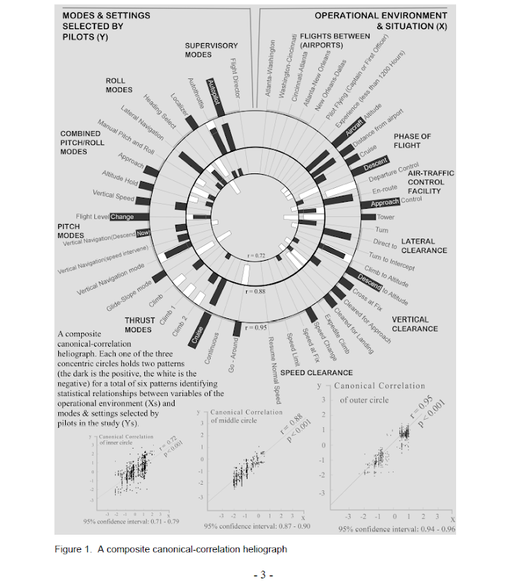
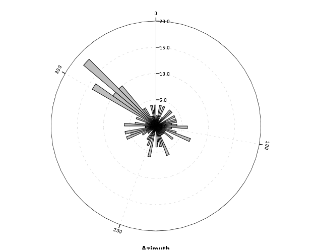
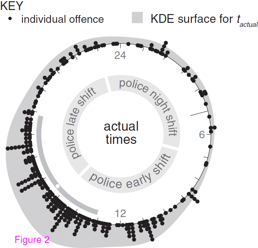
The other day I saw a popular post on the mathematica site was to reconstruct helio plots. They are essentially bar charts of canonical correlation coefficients plotted in polar coordinates, and below is the most grandiose example of them I could find (Degani et al., 2006).

That is a bit of a crazy example, but it is essentially several layers of bar charts in polar coordinates, with seperate rings displaying seperate correlation coefficients. Seeing there use in action struck me as odd, given typical perceptual problems known with using polar coordinates. Polar coordinates are popular for their space saving capabilities for network diagrams (see for example Circos) but there appears to be no redeeming quality of using polar coordinates for displaying the data in these circumstances that I can tell. The Degani paper gives the motivation for the polar coordinates because polar coordinates lack natural ordering that plots in cartesian coordinates imply. This strikes me as either unfounded or hypocritical, so I don’t really see why that is a reasonable motivation.

Polar coordinates have the negatives here that points going towards the center of the circle are compressed in smaller areas, and points going towards the edge of the circle are spread further apart. This creates a visual bias that does not portray actual data. I also presume length judgements in polar coordinates are more difficult. This having some bars protruding closer to one another and some diverging farther away I suspect cause more error judgements in false associations than do any ordering in bar charts in rectilinear coordinates. Also polar coordinates are very difficult to portray radial axis labels, so specific quantitative assements (e.g. this correlation is .5 and this correlation is .3) are difficult to make.

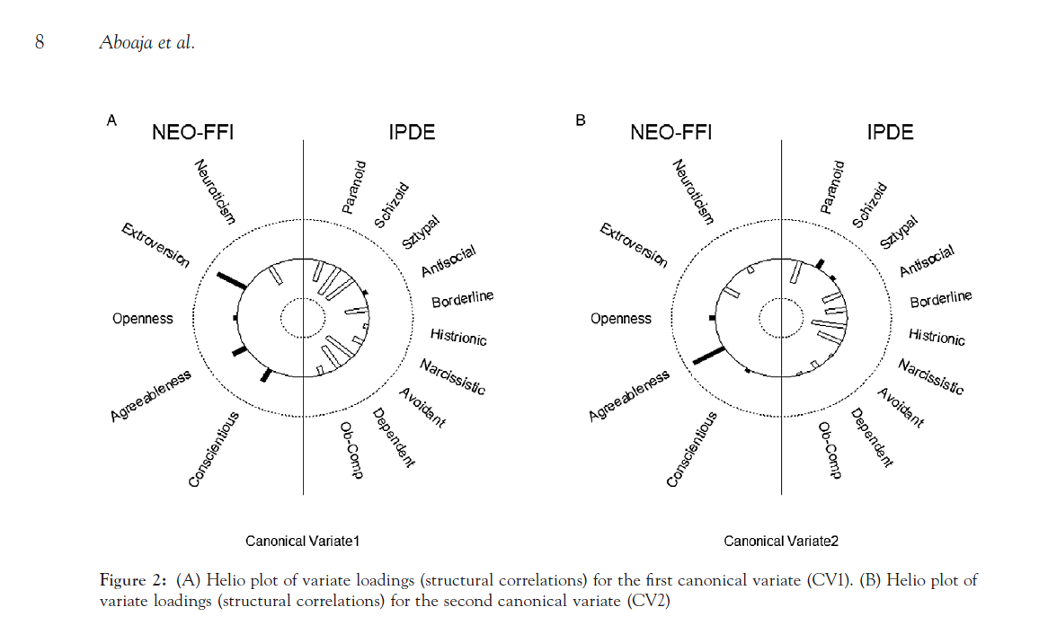
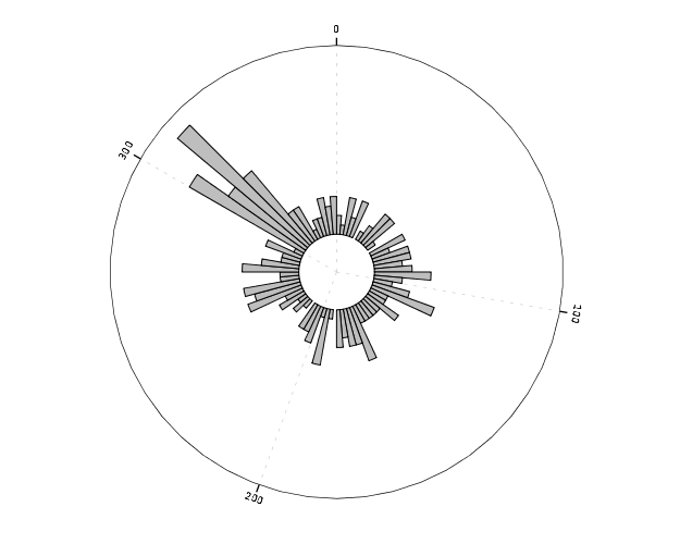
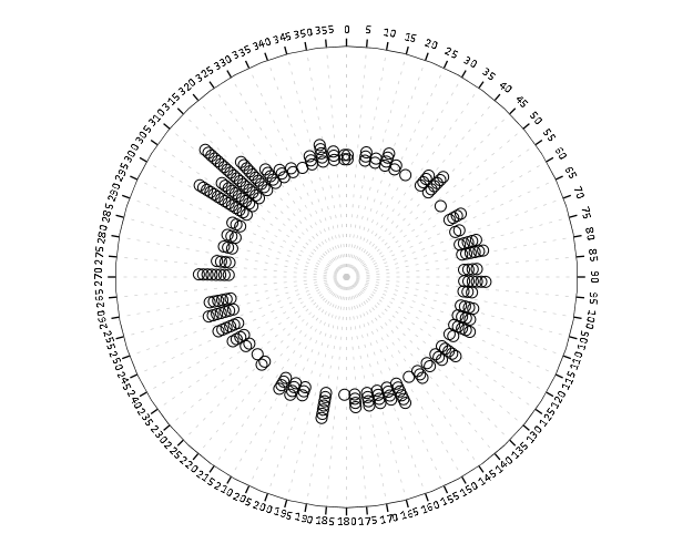
Below I will show an example taken from page 8 of Aboaja et al. (2011). Below is a screen shot of their helio plot, produced with the R package yacca.

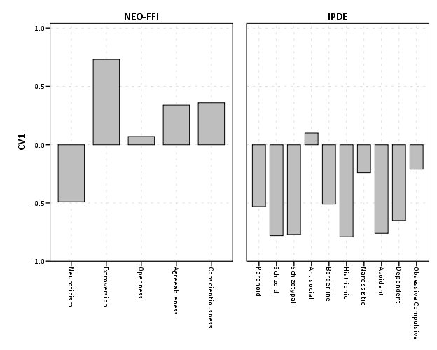
So first, lets not go crazy and just see how a simple bar chart suffices to show the data. I use nesting here to differentiate between NEO-FFI and IPDE factors, but one could use other aesthetics like color or pattern to clearly distinguish between the two.


data list free / type (F1.0) factors (F2.0) CV1 CV2.
begin data
1 1 -0.49 -0.17
1 2 0.73 -0.37
1 3 0.07 0.14
1 4 0.34 0.80
1 5 0.36 0.08
2 6 -0.53 -0.57
2 7 -0.78 0.25
2 8 -0.77 0.08
2 9 0.10 -0.45
2 10 -0.51 -0.48
2 11 -0.79 -0.48
2 12 -0.24 -0.56
2 13 -0.76 -0.04
2 14 -0.65 -0.16
2 15 -0.21 -0.05
end data.
value labels type
1 'NEO-FFI'
2 'IPDE'.
value labels factors
1 'Neuroticism'
2 'Extroversion'
3 'Openness'
4 'Agreeableness'
5 'Conscientiousness'
6 'Paranoid'
7 'Schizoid'
8 'Schizotypal'
9 'Antisocial'
10 'Borderline'
11 'Histrionic'
12 'Narcissistic'
13 'Avoidant'
14 'Dependent'
15 'Obsessive Compulsive'.
formats CV1 CV2 (F2.1).

*Bar Chart.
GGRAPH
  /GRAPHDATASET NAME="graphdataset" VARIABLES=factors CV1 type
  /GRAPHSPEC SOURCE=INLINE.
BEGIN GPL
 SOURCE: s=userSource(id("graphdataset"))
 DATA: factors=col(source(s), name("factors"), unit.category())
 DATA: type=col(source(s), name("type"), unit.category())
 DATA: CV1=col(source(s), name("CV1"))
 GUIDE: axis(dim(1), opposite())
 GUIDE: axis(dim(2), label("CV1"))
 SCALE: cat(dim(1.1), include("1", "2", "3", "4", "5", "6", "7", "8", "9", "10", "11", "12", "13", "14", "15"))
 SCALE: linear(dim(2), min(-1), max(1))
 ELEMENT: interval(position(factors/type*CV1), shape.interior(shape.square))
END GPL.

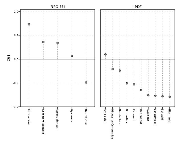
This shows an example of using nesting for the faceting structure in SPSS. The default behavior for SPSS is that the NEO-FFI has fewer categories, so the bars are plotted wider (because the panels are set to be equally sized). Wilkinson’s Grammer has examples of setting the panels to be different sizes just in this situation, but I do not believe this is possible in SPSS. Because of this, I like to use point and edge elements to just symbolize lines, which makes the panels visually similar. Also I post-hoc added a guideline at the zero value and sorted the values of CV1 descendingly within panels.


*Because of different sizes - I like the line with dotted interval.
GGRAPH
  /GRAPHDATASET NAME="graphdataset" VARIABLES=factors CV1 type
  /GRAPHSPEC SOURCE=INLINE.
BEGIN GPL
 SOURCE: s=userSource(id("graphdataset"))
 DATA: factors=col(source(s), name("factors"), unit.category())
 DATA: type=col(source(s), name("type"), unit.category())
 DATA: CV1=col(source(s), name("CV1"))
 TRANS: base=eval(0)
 GUIDE: axis(dim(1), opposite())
 GUIDE: axis(dim(2), label("CV1"))
 SCALE: cat(dim(1.1), include("1", "2", "3", "4", "5", "6", "7", "8", "9", "10", "11", "12", "13", "14", "15"), sort.statistic(summary.max(CV1)), reverse())
 SCALE: linear(dim(2), min(-1), max(1))
 ELEMENT: edge(position(factors/type*(base+CV1)), shape.interior(shape.dash), color(color.grey))
 ELEMENT: point(position(factors/type*CV1), shape.interior(shape.circle), color.interior(color.grey))
END GPL.

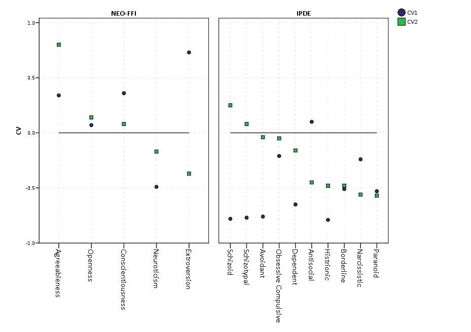
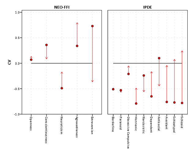
If one wanted to show both variates within the same plot, one could either use panels (as did the original Aboaja article, just in polar coordinates) or one could superimpose those estimates on the same plot. An example of superimposing is given below. This superimposing also extends to more than two canonical variates, although the more points the more the graph gets so busy it is difficult to interpret and one might want to consider small multiples. Here I show superimposing CV1 and CV2 and sort by descending values of CV2.


GGRAPH
  /GRAPHDATASET NAME="graphdataset" VARIABLES=factors CV1 CV2 type
  /GRAPHSPEC SOURCE=INLINE.
BEGIN GPL
 SOURCE: s=userSource(id("graphdataset"))
 DATA: factors=col(source(s), name("factors"), unit.category())
 DATA: type=col(source(s), name("type"), unit.category())
 DATA: CV1=col(source(s), name("CV1"))
 DATA: CV2=col(source(s), name("CV2"))
 TRANS: base=eval(0)
 GUIDE: axis(dim(1), opposite())
 GUIDE: axis(dim(2), label("CV"))
 SCALE: cat(dim(1.1), include("1", "2", "3", "4", "5", "6", "7", "8", "9", "10", "11", "12", "13", "14", "15"), sort.statistic(summary.max(CV2)), reverse())
 SCALE: linear(dim(2), min(-1), max(1))
 ELEMENT: line(position(factors/type*base), color(color.black))
 ELEMENT: point(position(factors/type*CV1), shape.interior("CV1"), color.interior("CV1"))
 ELEMENT: point(position(factors/type*CV2), shape.interior("CV2"), color.interior("CV2"))
END GPL.

Now, I know nothing of canonical correlation, but if one wanted to show the change from the first to second canonical covariate one could use the edge element with an arrow. One could also order the axis here, based on values of either the first or second canonical variate, or on the change between variates. Here I sort ascendingly by the absolute value in the change between variates.


GGRAPH
  /GRAPHDATASET NAME="graphdataset" VARIABLES=factors CV1 CV2 type
  /GRAPHSPEC SOURCE=INLINE.
BEGIN GPL
 SOURCE: s=userSource(id("graphdataset"))
 DATA: factors=col(source(s), name("factors"), unit.category())
 DATA: type=col(source(s), name("type"), unit.category())
 DATA: CV1=col(source(s), name("CV1"))
 DATA: CV2=col(source(s), name("CV2"))
 TRANS: base=eval(0)
 GUIDE: axis(dim(1), opposite())
 GUIDE: axis(dim(2), label("CV"))
 SCALE: cat(dim(1.1), include("1", "2", "3", "4", "5", "6", "7", "8", "9", "10", "11", "12", "13", "14", "15"), sort.statistic(summary.max(diff)))
 SCALE: linear(dim(2), min(-1), max(1))
 ELEMENT: line(position(factors/type*base), color(color.black))
 ELEMENT: edge(position(factors/type*(CV1+CV2)), shape.interior(shape.arrow), color.interior(color.red)) 
 ELEMENT: point(position(factors/type*CV1), shape.interior(shape.circle), color.interior(color.red))
END GPL.

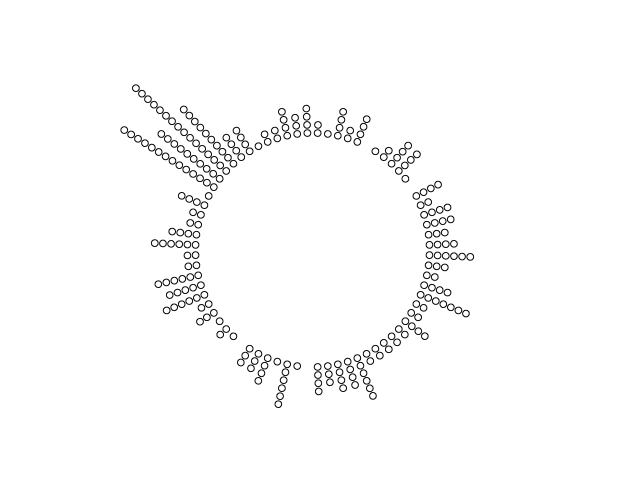
I’ve posted some additional code at the end of the blog post to show the nuts and bolts of making a similar chart in polar coordinates, plus a few other potential variants like a clustered bar chart. I see little reason though to prefer them to more traditional bar charts in a rectilinear coordinate system.


Citations


***********************************************************************************.
*Full code snippet.
data list free / type (F1.0) factors (F2.0) CV1 CV2.
begin data
1 1 -0.49 -0.17
1 2 0.73 -0.37
1 3 0.07 0.14
1 4 0.34 0.80
1 5 0.36 0.08
2 6 -0.53 -0.57
2 7 -0.78 0.25
2 8 -0.77 0.08
2 9 0.10 -0.45
2 10 -0.51 -0.48
2 11 -0.79 -0.48
2 12 -0.24 -0.56
2 13 -0.76 -0.04
2 14 -0.65 -0.16
2 15 -0.21 -0.05
end data.
value labels type
1 'NEO-FFI'
2 'IPDE'.
value labels factors
1 'Neuroticism'
2 'Extroversion'
3 'Openness'
4 'Agreeableness'
5 'Conscientiousness'
6 'Paranoid'
7 'Schizoid'
8 'Schizotypal'
9 'Antisocial'
10 'Borderline'
11 'Histrionic'
12 'Narcissistic'
13 'Avoidant'
14 'Dependent'
15 'Obsessive Compulsive'.
formats CV1 CV2 (F2.1).

*Bar Chart.
GGRAPH
  /GRAPHDATASET NAME="graphdataset" VARIABLES=factors CV1 type
  /GRAPHSPEC SOURCE=INLINE.
BEGIN GPL
 SOURCE: s=userSource(id("graphdataset"))
 DATA: factors=col(source(s), name("factors"), unit.category())
 DATA: type=col(source(s), name("type"), unit.category())
 DATA: CV1=col(source(s), name("CV1"))
 GUIDE: axis(dim(1), opposite())
 GUIDE: axis(dim(2), label("CV1"))
 SCALE: cat(dim(1.1), include("1", "2", "3", "4", "5", "6", "7", "8", "9", "10", "11", "12", "13", "14", "15"))
 SCALE: linear(dim(2), min(-1), max(1))
 ELEMENT: interval(position(factors/type*CV1), shape.interior(shape.square))
END GPL.

*Because of different sizes - I like the line with dotted interval.
GGRAPH
  /GRAPHDATASET NAME="graphdataset" VARIABLES=factors CV1 type
  /GRAPHSPEC SOURCE=INLINE.
BEGIN GPL
 SOURCE: s=userSource(id("graphdataset"))
 DATA: factors=col(source(s), name("factors"), unit.category())
 DATA: type=col(source(s), name("type"), unit.category())
 DATA: CV1=col(source(s), name("CV1"))
 TRANS: base=eval(0)
 GUIDE: axis(dim(1), opposite())
 GUIDE: axis(dim(2), label("CV1"))
 SCALE: cat(dim(1.1), include("1", "2", "3", "4", "5", "6", "7", "8", "9", "10", "11", "12", "13", "14", "15"), sort.statistic(summary.max(CV1)), reverse())
 SCALE: linear(dim(2), min(-1), max(1))
 ELEMENT: edge(position(factors/type*(base+CV1)), shape.interior(shape.dash), color(color.grey))
 ELEMENT: point(position(factors/type*CV1), shape.interior(shape.circle), color.interior(color.grey))
END GPL.

*Dot Plot Showing Both.
GGRAPH
  /GRAPHDATASET NAME="graphdataset" VARIABLES=factors CV1 CV2 type
  /GRAPHSPEC SOURCE=INLINE.
BEGIN GPL
 SOURCE: s=userSource(id("graphdataset"))
 DATA: factors=col(source(s), name("factors"), unit.category())
 DATA: type=col(source(s), name("type"), unit.category())
 DATA: CV1=col(source(s), name("CV1"))
 DATA: CV2=col(source(s), name("CV2"))
 TRANS: base=eval(0)
 GUIDE: axis(dim(1), opposite())
 GUIDE: axis(dim(2), label("CV"))
 SCALE: cat(dim(1.1), include("1", "2", "3", "4", "5", "6", "7", "8", "9", "10", "11", "12", "13", "14", "15"), sort.statistic(summary.max(CV2)), reverse())
 SCALE: linear(dim(2), min(-1), max(1))
 ELEMENT: line(position(factors/type*base), color(color.black))
 ELEMENT: point(position(factors/type*CV1), shape.interior("CV1"), color.interior("CV1"))
 ELEMENT: point(position(factors/type*CV2), shape.interior("CV2"), color.interior("CV2"))
END GPL.

*Arrow going from CV1 to CV2.
GGRAPH
  /GRAPHDATASET NAME="graphdataset" VARIABLES=factors CV1 CV2 type
  /GRAPHSPEC SOURCE=INLINE.
BEGIN GPL
 SOURCE: s=userSource(id("graphdataset"))
 DATA: factors=col(source(s), name("factors"), unit.category())
 DATA: type=col(source(s), name("type"), unit.category())
 DATA: CV1=col(source(s), name("CV1"))
 DATA: CV2=col(source(s), name("CV2"))
 TRANS: diff=eval(abs(CV1 - CV2))
 TRANS: base=eval(0)
 GUIDE: axis(dim(1), opposite())
 GUIDE: axis(dim(2), label("CV"))
 SCALE: cat(dim(1.1), include("1", "2", "3", "4", "5", "6", "7", "8", "9", "10", "11", "12", "13", "14", "15"), sort.statistic(summary.max(diff)))
 SCALE: linear(dim(2), min(-1), max(1))
 ELEMENT: line(position(factors/type*base), color(color.black))
 ELEMENT: edge(position(factors/type*(CV1+CV2)), shape.interior(shape.arrow), color.interior(color.red)) 
 ELEMENT: point(position(factors/type*CV1), shape.interior(shape.circle), color.interior(color.red))
END GPL.

*If you must, polar coordinate helio like plot.
GGRAPH
  /GRAPHDATASET NAME="graphdataset" VARIABLES=factors CV1 CV2 type
  /GRAPHSPEC SOURCE=INLINE.
BEGIN GPL
 SOURCE: s=userSource(id("graphdataset"))
 DATA: factors=col(source(s), name("factors"), unit.category())
 DATA: type=col(source(s), name("type"), unit.category())
 DATA: CV1=col(source(s), name("CV1"))
 DATA: CV2=col(source(s), name("CV2"))
 TRANS: base=eval(0)
 COORD: polar()
 GUIDE: axis(dim(2), null())
 SCALE: cat(dim(1), include("1", "2", "3", "4", "5", "6", "7", "8", "9", "10", "11", "12", "13", "14", "15"))
 SCALE: linear(dim(2), min(-1), max(1))
 ELEMENT: line(position(factors*base), color(color.black), closed())
 ELEMENT: edge(position(factors*(base+CV1)), shape.interior(shape.dash), color.interior(type))
 ELEMENT: point(position(factors*CV1), shape.interior(type), color.interior(type))
END GPL.

*Extras - not necesarrily recommended.

*Bars instead of lines in polar coordinates.
GGRAPH
  /GRAPHDATASET NAME="graphdataset" VARIABLES=factors CV1 CV2 type
  /GRAPHSPEC SOURCE=INLINE.
BEGIN GPL
 SOURCE: s=userSource(id("graphdataset"))
 DATA: factors=col(source(s), name("factors"), unit.category())
 DATA: type=col(source(s), name("type"), unit.category())
 DATA: CV1=col(source(s), name("CV1"))
 DATA: CV2=col(source(s), name("CV2"))
 TRANS: base=eval(0)
 COORD: polar()
 GUIDE: axis(dim(2), null())
 SCALE: cat(dim(1), include("1", "2", "3", "4", "5", "6", "7", "8", "9", "10", "11", "12", "13", "14", "15"))
 SCALE: linear(dim(2), min(-1), max(1))
 ELEMENT: line(position(factors*base), color(color.black), closed())
 ELEMENT: interval(position(factors*(base+CV1)), shape.interior(shape.square), color.interior(type))
END GPL.

*Clustering between CV1 and CV2? - need to reshape.
varstocases
/make CV from CV1 CV2
/index order.

value labels order
1 'CV1'
2 'CV2'.

*Clustered Bar.
GGRAPH
  /GRAPHDATASET NAME="graphdataset" VARIABLES=factors type CV order 
  /GRAPHSPEC SOURCE=INLINE.
BEGIN GPL
 SOURCE: s=userSource(id("graphdataset"))
 DATA: factors=col(source(s), name("factors"), unit.category())
 DATA: type=col(source(s), name("type"), unit.category())
 DATA: CV=col(source(s), name("CV"))
 DATA: order=col(source(s), name("order"), unit.category())
 COORD: rect(dim(1,2))
 GUIDE: axis(dim(3), label("factors"))
 GUIDE: axis(dim(2), label("CV"))
 GUIDE: legend(aesthetic(aesthetic.color.interior))
 SCALE: cat(aesthetic(aesthetic.color.interior))
 ELEMENT: interval.dodge(position(factors/type*CV)), color.interior(order),shape.interior(shape.square))
END GPL.
***********************************************************************************.

Making an Edge List in SPSS

$
0
0

I have planned a series of posts on some data manipulation for network data. Here I am going to show how to go from either a list of network relations in long or wide format to a list of (non-redundant) edges in SPSS.

So to start off lets define what I mean by long, wide and edge format. Long format would consist of a table where there is an ID column defining a shared instance, and a sperate column defining the nodes that have relations within that event. Imagine an event is a criminal incident, and a sharing relation can be offender(s) or victim(s).

So a long table might look like this;


Incident# Name Status
--------------
1 Mary O
1 Joe O
1 Steve V
2 Bob O
2 Ted V
2 Jeff V

Here, incident 1 has three nodes, Mary, Joe and Steve. The Status field represents if the node is either an offender, O, or a victim, V. They are all related through the incident number field. Wide format of this data would have only one record for each unique incident number, and the people "nodes" would span across multiple columns. It might then look something like below, where a . represents missing data.


Incident# Offender1 Offender2 Victim1 Victim2
---------------------------------------------
1 Mary Joe Steve . 
2 Bob . Ted Jeff .

I’ve encountered both of these types of data formats in police RMS databases, and the following solution I propose to make an edge list with go back and forth between the two to produce the final list. So what do I mean by an edge list? Below is an example;


Incident# FromID ToID FromStatus ToStatus
-----------------------------------------
1 Mary Joe O O
1 Mary Steve O V
1 Joe Steve O V
2 Bob Ted O V
2 Bob Jeff O V
2 Jeff Ted V V

Here we define all possible relationship among the two incidents ignoring the FromID and the ToID fields order (e.g. Mary Joe is equivalent to Joe Mary). Why do we want an edge list like this? In further posts I will show to do some data manipulation to find neighbors of different degrees using data formatted like this, but suffice to say many graph drawing algorithms need data in this format (or return data in this format).

So below I will show an example in SPSS going from the long format to the edge list format. In doing show I will transform the long list to the wide format, so it is trivial to adapt the code to go from the wide format to the edge list (instead of generating the wide table from the long table, you would generate the long table from the wide table).

So to start lets use some data in long format.


data list free / MyID (F1.0) Name (A1) Status (A1).
begin data
1 A O
1 B O
1 C V
1 D V
2 E O
2 F O
2 G V
end data.
dataset name long.

Now I will make a copy of this dataset, and reshape to the wide format. Then I merge the wide dataset into the long dataset.


*make copy and reshape to one row.
dataset copy wide.
dataset activate wide.
casestovars
/id MyID
/seperator = "".

*merge back into main dataset.
dataset activate long.
match files file = *
/table = 'wide'
/by MyID.
dataset close wide.

From here we will reshape the dataset to wide again, and this will create a full expansion of possible pairs. This produces much redundancy though. So first, before I reshape wide to long, I get rid of values in the new set of Name? variables that match the original Name variable (can’t have an edge with oneself). You could technically do this after VARSTOCASES, but I prefer to make as little extra data as possible. With big datasets this can expand to be very big – a case with n people would expand to be n^2, by eliminating self-referencing edges it will only expand n(n-1). Also I eliminate cases simply based on the sort order between Name and the wide XName? variables. By eliminating cases based on the ordering it reduces it to n(n-1)/2 total cases after the VARSTOCASES command (which by default drops missing data).


*Reshape to long again!
do repeat XName = Name1 to Name4 /XStatus = Status1 to Status4.
DO IF Name = XName OR  Name > XName. 
    compute Xname = " ".
    compute XStatus = " ".
END IF.
end repeat.
VARSTOCASES
/make XName from Name1 to Name4
/make XStatus from Status1 to Status4.

So you end up with a list of non-redundant edges with supplemental information on the nodes (note you can change the DO IF command to just Name > XName, here I leave it as is to further distinguish between them). To follow are some more posts about manipulating this data further to produce neighbor lists. I’d be interested to see in anyone has better ideas about how to make the edge list. It is easier to make pairwise comparisons in MATRIX programs, but I don’t go that route here because my intended uses are datasets too big to fit into memory. My code will certainly be slow though (CASESTOVARS and VARSTOCASES are slow operations on large datasets). Maybe an efficient XSAVE? (Not sure – let me know in the comments!) The Wikipedia page on SQL joins has an example of using a self join to produce the same type of edge table as well.


Below is the full code from the post without the text in between (for easier copying and pasting).

data list free / MyID (F1.0) Name (A1) Status (A1).
begin data
1 A O
1 B O
1 C V
1 D V
2 E O
2 F O
2 G V
end data.
dataset name long.

*make copy and reshape to one row.
dataset copy wide.
dataset activate wide.
casestovars
/id MyID
/seperator = "".

*merge back into main dataset.
dataset activate long.
match files file = *
/table = 'wide'
/by MyID.
dataset close wide.

*Reshape to long again! - and then get rid of duplicates.
do repeat XName = Name1 to Name4 /XStatus = Status1 to Status4.
DO IF Name = XName OR  Name > XName. 
    compute Xname = " ".
    compute XStatus = " ".
END IF.
end repeat.
VARSTOCASES
/make XName from Name1 to Name4
/make XStatus from Status1 to Status4.


Quick SPSS Tip: Cleaning up irregular characters in strings

$
0
0

This is just intended to be a quick tip on cleaning up string fields in SPSS. Frequently if I am parsing a field or matching string records (such as names or addresses) I don’t want extra ascii characters besides names and/or numbers in the field. For example, if I have a name I might want to eliminate hyphens or quotes, or if I have a field that is meant to be a house number I typically do not want any alpha character in the end (geocoding databases will rarely be able to tell the difference between Apt’s 1A and 1B).

We can use a simple loop and the PIB variable format in SPSS to clean out unwanted ascii codes in string characters. So for instance if I wanted to replace all the numbers with nothing in a string field I could use this code below (where OrigField is the original field with the numbers contained, and CleanField is the subsequent cleaned variable).

string CleanField (A5).
compute CleanField = OrigField.
loop #i = 48 to 57.
compute CleanField = REPLACE(CleanField,STRING(#i,PIB),"").
end loop.

The DEC column in the linked ascii table corresponds to the ascii character code in SPSS’s PIB format. The numbers 0 through 9 end up being 48 to 57 in decimal values, so I create a string corresponding to those characters via the string(#i,PIB) commmand and replace them with nothing in the REPLACE command. I loop through values of 48 to 57 to get rid of all numeric values.

This extends to potentially all characters, for instance if I want to return only capital alpha characters, I could use a loop with an if statement like below;

string CleanField (A5).
compute CleanField = OrigField.
loop #i = 1 to 255.
if #i < 65 or #i > 90 CleanField = REPLACE(CleanField,STRING(#i,PIB),"").
end loop.

There are (a lot) more than 255 ascii characters, but that should suffice to clean up most string fields in English.


Querying Graph Neighbors in SPSS

$
0
0

The other day I showed how one could make an edge list in SPSS, which is needed to generate network graphs. Today, I will show how one can use an edge list in long format to identify neighbors for higher degree relationships.

So to start, what do I mean by a neighbor of higher degree relationship? Lets say I have a relationship between two nodes A <-> B. Now lets also say I have another relationship between nodes B <-> C. I might say that A and C don’t have a direct relationship, but they are related in that they both have a relationship to B. So A is a first degree neighbor of B, and A is a second degree neighbor of C. If I drew a graph of the listed network, the degree relationship between A and C would be the minimum number of edges one would have to traverse to get from the A node to the C node.

A <-----> B <------> C

Why would a criminologist or crime analyst care about relationships of higher degrees? Well, here are two examples I am familiar with in criminology;

For more simple and practical motivation for crime analysts, you may just have some particular individuals who you want to have targeted enforcement towards (known chronic offenders, violent gang members) and you would like to compile a more extended network of individuals related to those particular offenders to keep an eye on, or further investigate for possible ties to co-offending or gang activity.

So to start in SPSS, lets say that we have a edge list in long format, where there is a column that ID’s each person, and another column that shows if those two people are related at the same event. Exampe ties for a crime analyst may be victimizations, or co-offending, or being stopped for field interviews at the same time.

*Long dataset marking people sharing same incident (ID).
data list free / IncID (F2.0) Person (A15).
begin data
1 John 
1 Mary
2 John 
2 Frank
3 John 
3 William
4 John 
4 Andrew
5 Mary 
5 Frank
6 Mary 
6 William
7 Frank 
7 Kelly
8 Andrew 
8 Penny
9 Matt 
9 Andrew
10 Kelly 
10 Andrew
end data.
dataset name long.
dataset activate long.

Now, lets say we want to grab higher degree neighbors for Mary, first I will ID the first degree neighbors by creating a flag, and then aggregating within the incident ID. That is, cases that share an incident with Mary.


*ID Mary and then aggregate to get first degree.
compute degree1 = (Person = "Mary").
*Now aggregate to get all degree1s.
AGGREGATE
  /OUTFILE=* MODE=ADDVARIABLES OVERWRITE = YES
  /BREAK=IncID
  /degree1 = MAX(degree1).

To identify if a person is a second degree neighbor of Mary, I can first aggregate within person, to ID that both John and Frank are first degree neighbors, and then pick their first degree neighbors, who I will then be able to tell are second degree neighbors of Mary.


*Aggregate within edge ID to get second degrees.
AGGREGATE
  /OUTFILE=* MODE=ADDVARIABLES OVERWRITE = YES
  /BREAK=Person
  /degree2 = MAX(degree1).
AGGREGATE
  /OUTFILE=* MODE=ADDVARIABLES OVERWRITE = YES
  /BREAK=IncID
  /degree2 = MAX(degree2).

I can continue to do the same procedure for third degree neighbors.


*Aggregate within edge ID to get third degrees.
AGGREGATE
  /OUTFILE=* MODE=ADDVARIABLES OVERWRITE = YES
  /BREAK=Person
  /degree3 = MAX(degree2).
AGGREGATE
  /OUTFILE=* MODE=ADDVARIABLES OVERWRITE = YES
  /BREAK=IncID
  /degree3 = MAX(degree3).

So now this should be clear how I can make a recursive structure to identify neighbors of however many degrees I want. I end the post with a general MACRO to estimate all neighbors of a certain degree given an edge list in long format. Since this will expand to very many cases, you will likely only want to use a smaller list, or I provided an option in the macro to only check certain flagged individuals for neighbors.

I'd love to see or hear about other applications crime analysts are using such social networks for. On the academic bucket list to learn more about graph layout algorithms, so hopefully you see more posts about that from me in the future.


*Current requirement - personid needs to be a string variable.
*Flag argument will return people who have a value of one for that variable and all of there
neighbors in the long list.
DEFINE !neighbor (incid = !TOKENS(1)
                           /personid = !TOKENS(1)
                           /number = !TOKENS(1) 
                           /flag = !DEFAULT ("") !TOKENS(1)   )

dataset copy neighbor.
dataset activate neighbor.
match files file = *
/keep = !incid !personid !flag.

rename variables (!incid = IncID)
(!personid = Person).

*I need to make a stacked dataset for all cases.
compute XXconstXX = 1.

*Making wide dataset of Persons in the long list.
dataset copy XXwideXX.
dataset activate XXwideXX.

*eliminating duplicate people.
sort cases by !personid.
match files file = *
/first = XXkeepXX
/by Person
/drop IncID.
select if XXkeepXX = 1.

*reshaping long to wide - could use flip here but that requires numeric PersonIDs.
*flip variables = Person.
!IF (!flag  !NULL) !THEN
select if !flag = 1.
!IFEND
casestovars
/ID = XXconstXX
/seperator = ""
/drop XXkeepXX !flag.
*Similar here you could just replace with a list of all unique offender nodes - just needs to be in wide format.

*Match back to the original long dataset.
dataset activate neighbor.
match files file = *
/table = 'XXwideXX'
/by XXconstXX.
dataset close XXwideXX.

*Reshape wide to long - @ is for filler so I dont need to know how many people - it gets dropped by default in varstocases.
string @ (A1).
varstocases
/make DegreePers from Person1 to @
/drop XXconstXX !flag.

sort cases by DegreePers IncID Person.

*Make first degree.
compute degree1 = (Person = DegreePers).
AGGREGATE
  /OUTFILE=* MODE=ADDVARIABLES OVERWRITE = YES
  /BREAK=IncID DegreePers
  /degree1 = MAX(degree1).
AGGREGATE
  /OUTFILE=* MODE=ADDVARIABLES OVERWRITE = YES
  /BREAK=Person DegreePers
  /degree1 = MAX(degree1).
*dropping self checks.
select if Person  DegreePers.

!LET !past = "degree1"
!DO !i = 2 !TO !number
!LET !current = !CONCAT("degree",!i)
AGGREGATE
  /OUTFILE=* MODE=ADDVARIABLES OVERWRITE = YES
  /BREAK=IncID DegreePers
  /!current = MAX(!past).
AGGREGATE
  /OUTFILE=* MODE=ADDVARIABLES OVERWRITE = YES
  /BREAK=Person DegreePers
  /!current = MAX(!current).
!LET !past = !current
!DOEND
*Clean up and delete duplicates.
compute degree = (!number + 1) - SUM(degree1 to !current).
string P1 P2 (A100).
DO IF Person <= DegreePers.
    compute P1 = Person.
    compute P2 = DegreePers.
ELSE.
    compute P1 = DegreePers.
    compute P2 = Person.
END IF.
sort cases by P1 P2.
match files file = *
/first = XXkeepXX
/by P1 P2
/drop DegreePers Person.
*will be [1 + degrees searched] if not a neighbor.
select if XXkeepXX = 1 and degree <= !number.
match files file = *
/drop degree1 to !current XXkeepXX IncID.
formats degree (!CONCAT("F",!LENGTH(!number),".0")).
!ENDDEFINE.

*Example use case - uncomment to check it out.
*dataset close ALL.
*Long dataset marking people sharing same incident (ID).
*data list free / IncID (F2.0) Person (A15).
*begin data
1 John 
1 Mary
2 John 
2 Frank
3 John 
3 William
4 John 
4 Andrew
5 Mary 
5 Frank
6 Mary 
6 William
7 Frank 
7 Kelly
8 Andrew 
8 Penny
9 Matt 
9 Andrew
10 Kelly 
10 Andrew
*end data.
*dataset name long.
*dataset activate long.
*compute myFlag = 1.
*set mprint on.
*output close ALL.
*neighbor incid = IncID personid = Person number = 3.
*set mprint off.
*dataset activate long.
*dataset close neighbor.
*compute myFlag = (Person = "Mary" or Person = "Andrew").
*set mprint on.
*output close ALL.
*neighbor incid = IncID personid = Person number = 3 flag = myFlag.
*set mprint off.

Using circular dot plots instead of circular histograms

$
0
0

Although as I mentioned in this post on circular helio bar charts, polar coordinates are unlikely to be as effective as rectilinear coordinates for most types of comparisons, I really wanted to use a circular histogram in a recent paper of mine. The motivation is I have circular data in form of azimuths (Journey to Crime), aggregated to quadrants. So I really wanted to use a small multiple plot of circular histograms with the visual connection to the actual direction the azimuths were distributed within each quadrant.

Part of the problem with circular histograms though is that the area near the center of the plot shrinks to nothing.

So a simple solution is to offset the center of the plot, so the bars don’t start at the origin, but a prespecified distance away from the center of the circle. Below is the same chart previously with a slight offset. (I saw this idea originally in Wilkinson’s Grammer of Graphics.)

And here is that technique extended to an example small multiple histogram from an earlier draft of the paper I previously mentioned.

Even with the offset, the problem of the shrinking area is even worse because of the many plots, and the outlying bars in one plot shrinks the rest of the distribution even more dramatically. So, even with the offsetting it is still quite difficult assess trends. Also note I don’t even bother to draw the radius guide lines. I noticed in some recent papers about analyzing circular data that they don’t draw bars for circular histograms, but use dots (and/or kernel density estimates). See examples in Brunsdon and Corcoran (2006), Ashby and Bowers (2013), and Russell and Levitin (1995). The below image is taken from Ashby and Bowers (2013) to demonstrate this.

The idea behind this is that, in polar coordinates, you need to measure the length of the bar, instead of distance from a common reference line. When you use dots, it is pretty trivial to just count the dots to see how far they stack up (so no axis guide is needed). This just replaces one problem for other ones, especially for larger sample sizes (in which you will need to discretize how many observations a point represents) but I don’t think it is any worse than bars at least in this situation (and can potentially be better for a smaller number of dots). One thing that does happen with points is that large stacks deviate from each other the further they grow towards the circumference of the polar coordinate system (the bars in histograms typically get wider). This just looks aesthetically bad, although the bars growing wider could be considered a disingenuous representation (e.g. Florence Nightingale’s coxcomb chart) (Brasseur, 2005; Friendly, 2008).

Unfortunately, SPSS’s routine to stack the dots in polar coordinates is off just slightly (I have full code linked at the end of the post to recreate some of the graphs in the post and display this behavior).

With alittle data manipulation though you can basically roll your own (although this is fixed bins, unlike irregular ones chosen based on the data like in Wilkinson’s dot plots, e.g. bin.dot in GPL) (Wilkinson, 1999).

And here is the same example small multiple histogram using the dots.

Here I have posted the code to demonstrate some of the graphs here (and I have the full code for the Viz. JTC paper here). To make the circular dot plot I use the sequential case processing trick, and then show how to use TRANS statements in inline GPL to adjust the positioning of the dots and if you want the dots to represent multiple values.


References


Hanging rootograms and viz. differences in time series

$
0
0

These two quick charting tips are based on the notion that comparing differences from a straight line are easier than comparing deviations from a curved line. The problems with comparing differences between curved lines are similar to the difference between comparings length and distance from a common baseline (so Cleveland’s work is applicable), but the task of comparing two curves comes up enough that it deserves some specific attention.

The first example is comparing differences between a histogram and an estimated distribution. For example, people often like to superimpose a distribution curve on a histogram, and here is an example SPSS chart.

I believe it was Tukey who suggested that instead of plotting the histogram bars at the zero upwards, you hang them from the expected value. What this does is that instead of comparing differences from a curved line, you are comparing differences to the straight reference line at zero.

Although it is usual to plot the bars to cover the entire bin, I sometimes find this distracting. So here is an alternative (in SPSS – with example code linked to at the end of the post) in which I only plot lines and dots and just note in text the bin widths are in-between the hash marks on the X axis.

The second example is taken from William Playfair’s atlas, and Cleveland uses it to show that comparing two curves can be misleading. (It took me forever to find this data already digitized, so thanks for the bissantz blog for posting it.)

Instead of comparing the two curves only in terms of vertical deviations from one another, we tend to compare the curves in terms of the nearest location. Here the visual error in the magnitude of differences is likely to occur in the area between 1760 and 1766, where they look very close to one another because of the upward slope for both time series in that period.

Here I like the default behavior of SPSS when plotting the differences as an interval element and it is easier to see this potential error (just compare the length of the bars). When using a continuous scale, SPSS plots the interval elements with zero area inside and only an exterior outline (which ends up being near equivalent to a edge element).

More frequently though, people suggest just to plot the differences, and here is a chart with all three (Imports, Exports and the difference) plotted on the same graph. Note the differences at 1763 (390) is actually larger than the difference and the start of the series, 280 at 1700.

You can do similar things to scatterplots, which Tukey calls detilting plots. Again, the lesson is it is easier to compare differences from a straight line than it is differences from a curve (or sloped line). Here I have posted the SPSS code to make the graphs (I slightly cheated though and post edited in the guidelines and labels in the graph editor).


Cyclical color ramps for time series line plots

$
0
0

Morphet & Symanzik (2010) propose different novel cyclical color ramps by taking ColorBrewer ramps and wrapping them on the circle. All other previous continuous circle ramps I had seen prior were always rainbow scales, and there is plenty discussion about why rainbow color scales are bad so we needn’t rehash that here (see Kosara, Drew Skau, and my favorite Why Should Engineers and Scientists Be Worried About Color? for a sampling of critiques).

Below is a picture of the wrapped cyclical ramps from Morphet & Symanzik (2010). Although how they "average" the end points is not real clear to me from reading the paper, they basically use a diverging ramp and have one end merge at a fully saturated end of the sprectrum (e.g. nearly black) and the other merge at the fully light end of the spectrum (e.g. nearly white).

The original motivation is for directional data, and here is a figure from my paper Viz. JTC lines comparing the original rainbow color ramp I chose (on the right) and an updated red-grey cyclical scale on the left. The map is still quite complicated, as part of the motivation of that map was to show how plotting the JTC the longer lines dominate the graphic.

But I was interested in applying this logic to showing cyclical line plots, e.g. aoristic crime estimates by hour of day and day of week. Using the same Arlington data I used before, here are the aoristic estimates for hour of day plotted seperately for each day of the week. The colors for the day of the week use SPSS’s default color scheme for nominal categories. SPSS does not have anything as far as color defaults to distinguish between ordinal data, so if you use a categorical coloring scheme this is what you get.

The default is very good to distinguish between nominal categories, but here I want to take advantage of the cyclical nature of the data, so I employ a cyclical color ramp.

From this it is immediately apparent that the percentage of crimes dips down during the daytime for the grey Saturday and Sunday aoristic estimates. Most burglaries happen during the day, and so you can see that when homeowners are more likely to be in the house (as oppossed to at work) burglaries are less likely to occur. Besides this, day of week seems largely irrelevant to the percentage of burglaries that are occurring in Arlington.

I chose to make during the week shades of red, the dark color split between Friday-Saturday, and the light color split between Sunday-Monday. This trades one problem for another, in that the more fully saturated colors draw more attention in the plot, but I believe it is a worthwhile sacrifice in this instance. Below are the Hexidecimal RGB codes I used for each day of the week.

Sun - BABABA
Mon - FDDBC7
Tue - F4A582
Wed - D6604D
Thu - 7F0103
Fri - 3F0001
Sat - 878787

Viewing all 78 articles
Browse latest View live