Quantcast
Channel: SPSS – Andrew Wheeler
Viewing all 78 articles
Browse latest View live

Stacking Intervals

$
0
0

Motivated by visualizing overlapping intervals from the This is not Rocket Science blog (by Valentine Svensson) I developed some code in SPSS to accomplish a similar feat. Here is an example plot from the blog:

It is related to a graph I attempted to make for visualizing overlap in crime events and interval censored crime data is applicable. The algorithm I mimic by Valentine here is not quite the same, but similar in effect. Here is the macro I made to accomplish this in SPSS. (I know I could also use the python code by the linked author directly in SPSS.)

DEFINE !StackInt (!POSITIONAL = !TOKENS(1)
                 /!POSITIONAL = !TOKENS(1) 
                 /Fuzz = !DEFAULT("0") !TOKENS(1) 
                 /Out = !DEFAULT(Y) !TOKENS(1) 
                 /Sort = !DEFAULT(Y) !TOKENS(1) 
                 /TempVals = !DEFAULT(100) !TOKENS(1) )
!IF (!Sort = "Y") !THEN
SORT CASES BY !1 !2.
!IFEND
VECTOR #TailEnd(!TempVals).
DO IF ($casenum = 1).  
  COMPUTE #TailEnd(1) = End + !UNQUOTE(!Fuzz).
  COMPUTE !Out = 1.
  LOOP #i = 2 TO !TempVals.
    COMPUTE #TailEnd(#i) = Begin-1.
  END LOOP.
ELSE.
  DO REPEAT i = 1 TO !TempVals /T = #TailEnd1 TO !CONCAT("#TailEnd",!TempVals).
    COMPUTE T = LAG(T).
    DO IF (Begin > T AND MISSING(Y)).
      COMPUTE T = End + !UNQUOTE(!Fuzz).
      COMPUTE !Out = i.
    END IF.
  END REPEAT.
END IF.
FORMATS !Out !CONCAT("(F",!LENGTH(!TempVals),".0)").
FREQ !Out /FORMAT = NOTABLE /STATISTICS = MAX.
!ENDDEFINE.

An annoyance for this is that I need to place the ending bins in a preallocated vector. Since you won’t know how large the offset values are to begin with, I default to 100 values. The function prints a set of frequencies after the command though (which forces a data pass) and if you have missing data in the output you need to increase the size of the vector.

One simple addition I made to the code over the original is what I call Fuzz in the code above. What happens for crime data is that there are likely to be many near overlaps in addition to many crimes that have an exact known time. What the fuzz factor does is displaces the lines if they touch within the fuzz factor. E.g. if you had two intervals, (1,3) and (3.5,5), if you specified a fuzz factor of 1 the second interval would be placed on top of the first, even though they don’t exactly overlap. This appears to work reasonably well for both small and large n in some experimentation, but if you use too large a fuzz factor it will produce river like runs through the overlap histogram.

Here is an example of using the macro with some fake data.

SET SEED 10.
INPUT PROGRAM.
LOOP #i = 1 TO 1000.
  COMPUTE Begin = RV.NORMAL(50,15).
  COMPUTE End = Begin + EXP(RV.GAMMA(1,2)).
  END CASE.
END LOOP.
END FILE.
END INPUT PROGRAM.

!StackInt Begin End Fuzz = "1" TempVals = 101.

GGRAPH
  /GRAPHDATASET NAME="graphdataset" VARIABLES=Begin End Mid
  /GRAPHSPEC SOURCE=INLINE.
BEGIN GPL
  SOURCE: s=userSource(id("graphdataset"))
  DATA: End=col(source(s), name("End"))
  DATA: Begin=col(source(s), name("Begin"))
  DATA: Y=col(source(s), name("Y"), unit.category())
  GUIDE: axis(dim(1))
  GUIDE: axis(dim(2), null())
  ELEMENT: edge(position((End+Begin)*Y))
END GPL.

And here is the graph:

Using the same burglary data from Arlington I used for my aoristic macro, here is an example plot for a few over 6,300 burglaries in Arlington in 2012 using a fuzz factor of 2 days.

This is somewhat misleading, as events with a known exact time are not given any area in the plot. Here is the same plot but with plotting the midpoint of the line as a circle over top of the edge.

You can also add in other information to the plot. Here I color edges and points according to the beat that they are in.

It produces a pretty plot, but it is difficult to discern any patterns. I imagine this plot would be good to evaluate when there is the most uncertainty in crime reports. I might guess if I did this type of plot with burglaries after college students come back from break you may see a larger number of long intervals, showing that they have large times of uncertainty. It is difficult to see any patterns in the Arlington data though besides more events in the summertime (which an aoristic chart would have shown to begin with.) At the level of abstraction of over a year I don’t think you will be able to spot any patterns (like with certain days of the week or times of the month).

I wonder if this would be useful for survival analysis, in particular to spot any temporal or cohort effects.


Using funnel charts for monitoring rates

$
0
0

For a recent project of mine I was exploring arrest rates at small units of analysis (street midpoints and intersections) for one of the collaborations we have at the Finn Institute.

One of the graphs I was interested in making was a funnel plot of the arrest rates on the Y axis and the total number of stops on the X axis. You can then draw confidence bands around a particular percentage (typically the overall rate) to see if any observations have oddly high or low rates. This procedure is described in Funnel plots for comparing institutional performance (Spiegelhalter, 2005), PDF Here. Funnel charts are more common in meta-analysis, but I hope to illustrate their utility here in monitoring rates with different denominators.

For an illustration I will make a funnel plot of the homicide rates per 100,000 given by the police agencies in New York and Pennsylvania in 2012 (available via the UCR data tool). Here is the data and code available to replicate the results in this blog post in a zip file. If you have the SPSSINC GETURI DATA add-on you can start just by calling (otherwise you have to download the data to follow along).

SPSSINC GETURI DATA
URI="https://dl.dropboxusercontent.com/u/3385251/NY_PA_crimerates_2012.sav"
FILETYPE=SAV DATASET=NY_PA.

I start at the point in the code where the data is already loaded, and I generate a scatterplot for Population and Murder_and_nonnegligent_manslaughter_rate. I eliminate agencies that did not report a full 12 months or had missing data for homicides and/or the population, and this results in around 360 homicide rates for populations above 10,000 and up nearly 10 million (in New York City). The labels for SPSS graphs inherit the format for the original data, so I make the homicide rates F2.0 to avoid decimal places in the axis tick mark labels.

FORMATS Murder_and_nonnegligent_manslaughter_rate (F2.0).
GGRAPH
  /GRAPHDATASET NAME="graphdataset" VARIABLES=Population Murder_and_nonnegligent_manslaughter_rate 
  /GRAPHSPEC SOURCE=INLINE.
BEGIN GPL
  SOURCE: s=userSource(id("graphdataset"))
  DATA: Population=col(source(s), name("Population"))
  DATA: Murder_and_nonnegligent_manslaughter_rate=col(source(s),
        name("Murder_and_nonnegligent_manslaughter_rate"))
  GUIDE: axis(dim(1), label("Population"))
  GUIDE: axis(dim(2), label("Murder Rate per 100,000"))
  SCALE: log(dim(1))
  ELEMENT: point(position(Population*Murder_and_nonnegligent_manslaughter_rate))
END GPL.

So we can see that the bulk of the institutions have very low murder rates, the overall rate is just shy of 6 murders per 100,000 in this sample. But there are quite a few locations that appear to be high outliers. We are talking about proportions as small as 0.00006 to 0.00065 though, so are some of the high murder rate locations really that surprising? Lets see by adding an estimate of the error if the individual rates were drawn from the same distribution as the overall rate.

Now to make the funnel chart we need to estimate the confidence interval for a rate of 6/100,000 for population sizes between 10,000 and 10 million to add to our chart. We can add these interpolated bounds directly into our SPSS dataset. So to estimate the lines what I do is use the AGGREGATE command to interpolate population step sizes for the min and max population in the sample (and calculate the total homicide rate). Here I interpolate the population steps on the log scale, as the X axis in the chart uses a log scale.

*Aggregate proportions and max/min counts.
COMPUTE Id = $casenum - 1.
AGGREGATE OUTFILE=* MODE=ADDVARIABLES
  /BREAK
  /MaxPop = MAX(Population)
  /MinPop = MIN(Population)
  /AllHom = SUM(Murder_and_nonnegligent_Manslaughter)
  /TotalPop = SUM(Population)
  /TotalObs = MAX(Id).
*Overall homicide rate per 100,000.
COMPUTE HomRate = (AllHom/TotalPop)*100000.
*Now interpolating bounds for the population.
COMPUTE #Step = (LG10(MaxPop) - LG10(MinPop))/TotalObs.
COMPUTE N = 10**(LG10(MinPop) + Id*#Step).

So if you see the variable N in the dataset now you will see that the highest value is equal to the population in New York City at over 8 million. SPSS does not have an inverse function for the binomial distribution, but it does have one for the beta distribution. Wikipedia lists how the Clopper-Pearson binomial confidence intervals can be rewritten in terms of the beta distribution. I use this equality here to generate 99% confidence intervals for the population sizes in the N variable for the overall homicide rate, HomeRate (remembering to convert rates per 100,000 back to proportions).

*Now calculating bands based on statewide homicide rates.
*Exact bounds based on inverse beta.
*http://en.wikipedia.org/wiki/Binomial_proportion_confidence_interval#Clopper-Pearson_interval.
COMPUTE #Alph = 0.01.
COMPUTE #Suc = (HomRate*N)/100000.
COMPUTE LowB = IDF.BETA(#Alph/2,#Suc,N-#Suc+1)*100000.
COMPUTE HighB = IDF.BETA(1-#Alph/2,#Suc+1,N-#Suc)*100000.
EXECUTE.

Now we can superimpose LowB, HighB, and HomRate on the same graph as the previous scatterplot to give a sense of the uncertainty in the estimates. Here I also change the size of the graph using PAGE statements. I color the error bounds as light grey lines, and the overall homicide rate as a red line, and then superimpose the homicide rates for each agency on top of them.

*Now can make the plot with the error bounds.
FORMATS LowB HighB HomRate (F2.0) N (F8.0).
GGRAPH
  /GRAPHDATASET NAME="graphdataset" VARIABLES=Population Murder_and_nonnegligent_manslaughter_rate 
                                              LowB HighB HomRate N
  /GRAPHSPEC SOURCE=INLINE.
BEGIN GPL
  PAGE: begin(scale(600px,800px))
  SOURCE: s=userSource(id("graphdataset"))
  DATA: Population=col(source(s), name("Population"))
  DATA: Murder_and_nonnegligent_manslaughter_rate=col(source(s),
        name("Murder_and_nonnegligent_manslaughter_rate"))
  DATA: LowB=col(source(s), name("LowB"))
  DATA: HighB=col(source(s), name("HighB"))
  DATA: HomRate=col(source(s), name("HomRate"))
  DATA: N=col(source(s), name("N"))
  GUIDE: axis(dim(1), label("Population"))
  GUIDE: axis(dim(2), label("Murder Rate per 100,000"), delta(2))
  SCALE: log(dim(1))
  SCALE: linear(dim(2), min(2), max(64))
  ELEMENT: line(position(N*HomRate), color(color.red), size(size."2"))
  ELEMENT: line(position(N*LowB), color(color.grey))
  ELEMENT: line(position(N*HighB), color(color.grey))
  ELEMENT: point(position(Population*Murder_and_nonnegligent_manslaughter_rate), size(size."5"), 
           transparency.exterior(transparency."0.5"))
  PAGE: end()
END GPL.

So I hope you see where the name funnel chart comes from now! This chart gives us an idea of the variability we would expect if random data were drawn with a rate of 6/100000 for population sizes between 10,000 and 100,000 is quite large, and most of the agencies with high homicide rates are still below the upper bound. Even with a population of 100,000, the 99% confidence interval covers rates between 2 and almost 16 per 100,000 – which translates directly to 2 and 16 homicides in a jurisdiction of that size.

Here I add labels to the chart for locations above the interval and below the interval (but at least have one homicide). I add the total number of homicides in that jurisdiction in parenthesis to the label as well.

*Now adding in labels.
COMPUTE #Alph = 0.01.
COMPUTE #Suc = (HomRate*Population)/100000.
COMPUTE LowA = IDF.BETA(#Alph/2,#Suc,Population-#Suc+1)*100000.
COMPUTE HighA = IDF.BETA(1-#Alph/2,#Suc+1,Population-#Suc)*100000.
EXECUTE.

STRING HighLab (A50).
IF Murder_and_nonnegligent_manslaughter_rate > HighA 
   HighLab = CONCAT(RTRIM(REPLACE(Agency,"Police Dept",""))," (",LTRIM(STRING(Murder_and_nonnegligent_Manslaughter,F3.0)),")").
IF Murder_and_nonnegligent_manslaughter_rate < LowA AND Murder_and_nonnegligent_manslaughter_rate > 0 
   HighLab = CONCAT(RTRIM(REPLACE(Agency,"Police Dept",""))," (",LTRIM(STRING(Murder_and_nonnegligent_Manslaughter,F3.0)),")").
EXECUTE.

The labels get a little busy, but we can see that save for Buffalo and Rochester, all of the jurisdictions with higher than expected homicide rates are in Pennsylvania, with Philadelphia being the most egregious outlier. New York City and Yonkers are actually lower than the confidence interval, although quite close (along with a set of cities with zero homicides in populations between mainly the lower bound of 10,000 to 100,000). Chester city and Mckeesport are high locations as well, but we can see from the labels they only have 22 and 10 homicides respectively. The point to the left of Mckeesport is Coatesville, which ends up having only 6 homicides.

Where I consider such charts useful are to identify outliers (such as Philadelphia and Chester City). Depending on the nature of the study will depend on what this information could be useful for. For a reporting agency like the FBI they may be interested in seeing if Chester City is a reporting anomaly, or the NIJ/DOJ may be interested in funnelling resources to these high homicide rate locations. The same is true for a police department monitoring rates of say contraband recovery at particular locations, or uses of force per officer incident.

For a researcher they may be interested in other causal factors that could cause a high or low rate, as this might give insight into the mechanisms that increase or decrease homicides (for this particular chart). Evaluating against the overall homicide rate for the sample is an ad-hoc decision (it appears in this chart that PA and NY may plausibly have distinct homicide rate values, with PA being higher) but it at least gives the analyst an idea of the variability when evaluating rates.


Using the Google Distance API in SPSS – plus some EDA of travel time versus geographic distance

$
0
0

The other day I had a conversation with a colleague about calculating travel time distances and comparing them to actual geographic distances (aka as the crow flies). Being unfamiliar with the Network add-on in ArcGIS I figured I would take a stab at this task with the Google Distance API. Being lazy, I’m not going to explain the code, but in a nutshell works basically the same way as my prior code samples for the Google places API. The main difference is that this code will only return one result per record in the original file.

BEGIN PROGRAM Python.
import urllib, json

#This parses the returned json to pull out the distance in meters and
#duration in seconds, [None,None] is returned is status is not OK
def ExtJsonDist(place):
  if place['rows'][0]['elements'][0]['status'] == 'OK':
    meters = place['rows'][0]['elements'][0]['distance']['value']
    seconds = place['rows'][0]['elements'][0]['duration']['value']
  else:
    meters,seconds = None,None
  return [meters,seconds]

#Takes a set of lon-lat coordinates for origin and destination,
#plus your API key and returns the json from the distance API
def GoogDist(OriginX,OriginY,DestinationX,DestinationY,key):
  MyUrl = ('https://maps.googleapis.com/maps/api/distancematrix/json'
           '?origins=%s,%s'
           '&destinations=%s,%s'
           '&key=%s') % (OriginY,OriginX,DestinationY,DestinationX,key)
  response = urllib.urlopen(MyUrl)
  jsonRaw = response.read()
  jsonData = json.loads(jsonRaw)
  data = ExtJsonDist(jsonData)
  return data
END PROGRAM.

So because for each pair of origin and destinations this only returns one result, we can use this function in SPSSINC TRANS to return the distance in meters and the travel time in seconds without having to worry about any other data manipulations in python. The only additional item we need besides the origin and destination latitude and longitude are your Google API key in a seperate string variable. So if you had the OD coordinates in the fields Ox,Oy,Dx,Dy for origin longitude, origin latitude etc. the code would simply be:

STRING MyKey (A100).
COMPUTE MyKey = '!!!!!!!YOUR KEY HERE!!!!!!!!!!!!!'.
EXECUTE.

SPSSINC TRANS RESULT=Meters Seconds TYPE=0 0
/FORMULA GoogDist(OriginX=Ox,OriginY=Oy,DestinationX=Dx,DestinationY=Dy,key=MyKey).

Note the Google distance API has a limit of 2,500 queries per day, and unlike the places API can not be upped by providing verification (unfortunately).

The context the colleague was asking was for a project about prison visitation, for some background see a report by Jacquelyn Greene at the New York State DCJS, and I saw recently Joshua Cochran plus a few other of the Florida State folks published a paper about prisoner visitation in Florida. So I figured a good test would be calculating the correlation between travel distance and geographic distances between all of the zip codes in New York State to one particular prison.

I chose to calculate the distances between the centroid of zip code areas and Attica State prison, which is in between Rochester and Buffalo in the westernmost part of New York state. FYI zip code areas are not well defined, so don’t ask me how exactly the ones I used here are calculated, but I got them from the New York State GIS clearinghouse, and they were from 2009.

So as long as you have the prior python function GoogDist defined, here is a set of brief syntax to grab the zip code data and calculate the travel time and travel distance. This does take a few minutes, but I never had a problem with the 100 queries per 1 minute suggestion by Google in my tests. Their are 2,332 zip code areas in New York State, so beware this about uses up your limit for the day (and you have no second chances)! This took me about 8 minutes to calculate.

*Grab the online data.
SPSSINC GETURI DATA
URI="https://dl.dropboxusercontent.com/u/3385251/NewYork_ZipCentroids.sav"
FILETYPE=SAV DATASET=NY_Zips.

*Travel distance to Attica.
COMPUTE Dx = -78.276205.
COMPUTE Dy = 42.850721.

STRING MyKey (A100).
COMPUTE MyKey = '!!!!!!!YOUR KEY HERE!!!!!!!!!!!!!'.
EXECUTE.

SPSSINC TRANS RESULT=Meters Seconds TYPE=0 0
/FORMULA GoogDist(OriginX=LongCent,OriginY=LatCent,DestinationX=Dx,DestinationY=Dy,key=MyKey).

We can also calculate the euclidean "crows flies" distance via the extendedTransforms python code. This returns the distance miles, and so the following code converts the two distances to kilometers and the time to minutes.

*As the crow flies distance.
SPSSINC TRANS RESULT=MilesCrow TYPE=0
/FORMULA extendedTransforms.ellipseDist(lat1=LatCent,lon1=LongCent,lat2=Dy,lon2=Dx,inradians=False).

*Convert to meters.
COMPUTE KMCrow = (MilesCrow*1609.34)/1000.
COMPUTE KMTrav = Meters/1000.
COMPUTE Minutes = Seconds/60.
FORMATS KMCrow KMTrav Minutes (F6.0).

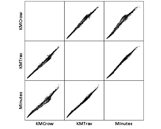
Now, part of my suggestion was actually that calculating travel times is not necessary, because they will be highly correlated with each other. Here is the scatterplot matrix of the three measures, travel distance, geographic distance, and travel time. The inter-item correlations are all around .99.

GGRAPH
  /GRAPHDATASET NAME="graphdataset" VARIABLES=KMCrow KMTrav Minutes
  /GRAPHSPEC SOURCE=INLINE.
BEGIN GPL
  SOURCE: s=userSource(id("graphdataset"))
  DATA: KMCrow=col(source(s), name("KMCrow"))
  DATA: KMTrav=col(source(s), name("KMTrav"))
  DATA: Minutes=col(source(s), name("Minutes"))
  GUIDE: axis(dim(1.1), ticks(null()))
  GUIDE: axis(dim(2.1), ticks(null()))
  GUIDE: axis(dim(1), gap(0px))
  GUIDE: axis(dim(2), gap(0px))
  TRANS: KMCrow_label = eval("KMCrow")
  TRANS: KMTrav_label = eval("KMTrav")
  TRANS: Minutes_label = eval("Minutes")
  ELEMENT: point(position((KMCrow/KMCrow_label+KMTrav/KMTrav_label+Minutes/Minutes_label)*
                (KMCrow/KMCrow_label+KMTrav/KMTrav_label+Minutes/Minutes_label)),
                 size(size."2"), transparency.exterior(transparency."0.8"))
END GPL.
CORRELATIONS VARIABLES= KMCrow KMTrav Minutes.

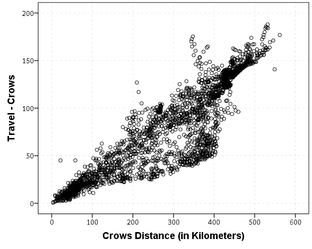
I expected that the error would get larger for larger travel and geographic distances, so to investigate this a simple graphical check is to estimate the difference between the two measures on the Y axis and the mean of the two measures on the X axis. Depending on who you ask, this is a Tukey mean difference plot or a Bland-Altman plot. Generally when comparing the scatterplot matrices it is easier to see the spread when you detilt the plot (using Tukey’s terminology), and calculating the differences is one way to do the detilting.

Here I calculate Dif = TravelDistance - GeoDistance, as I know the travel distance will always be larger than the geographic distance. For simplicity I just plot the geographic distance on the x axis instead of the mean of the two measures.

*Tukey mean difference chart.
GGRAPH
  /GRAPHDATASET NAME="graphdataset" VARIABLES=KMTrav KMCrow MISSING=LISTWISE REPORTMISSING=NO
  /GRAPHSPEC SOURCE=INLINE.
BEGIN GPL
  SOURCE: s=userSource(id("graphdataset"))
  DATA: KMTrav=col(source(s), name("KMTrav"))
  DATA: KMCrow=col(source(s), name("KMCrow"))
  TRANS: Dif = eval(KMTrav - KMCrow)
  GUIDE: axis(dim(2), label("Travel - Crows"))
  GUIDE: axis(dim(1), label("Crows Distance (in Kilometers)"))
  ELEMENT: point(position(KMCrow*Dif))
END GPL.

This shows three particular things:

  1. It appears to be a mostly mixture of two separate linear regressions
  2. Within each mixture the measurement error is close to a constant multiple of the geographic distance
  3. There are some outliers as fingers of large travel distances extending from the point cloud.

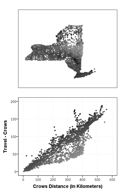
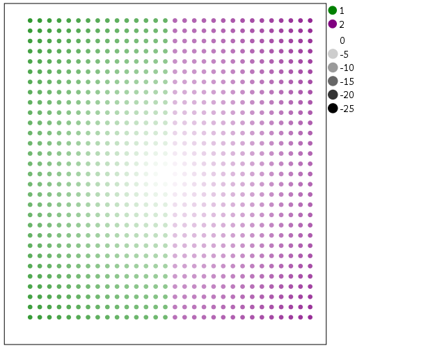
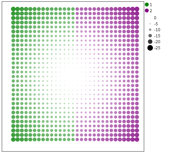
Some more EDA shows that the mixture is reflective of being close to Interstate 90 – those cities (like Albany and Syracuse) nearby the highway have a shorter travel time. Here what I did was estimate the linear regression for the prior plot and then color the residuals. Then I made a side-by-side set of the latitude-longitude coordinates next to the same scatterplot (colored). I can’t tell from this plot, but some of the high outliers appears in a cluster in downstate, maybe in the Catskills. But there are a few other of the high outliers shown around the state.

*Note this is the same as estimating regression on differences.
*see http://stats.stackexchange.com/a/15759/1036.
REGRESSION
  /MISSING LISTWISE
  /STATISTICS COEFF OUTS R ANOVA
  /CRITERIA=PIN(.05) POUT(.10)
  /NOORIGIN
  /DEPENDENT KMTrav
  /METHOD=ENTER KMCrow
  /SAVE RESID(Resid1).

*Hmm, we have a mixture, lets see what explains that.
GGRAPH
  /GRAPHDATASET NAME="graphdataset" VARIABLES=LongCent LatCent Resid1 KMTrav KMCrow
    MISSING=LISTWISE REPORTMISSING=NO
  /GRAPHSPEC SOURCE=INLINE.
BEGIN GPL
  PAGE: begin(scale(500px,800px))
  SOURCE: s=userSource(id("graphdataset"))
  DATA: LongCent=col(source(s), name("LongCent"))
  DATA: LatCent=col(source(s), name("LatCent"))
  DATA: Resid1=col(source(s), name("Resid1"))
  DATA: KMTrav=col(source(s), name("KMTrav"))
  DATA: KMCrow=col(source(s), name("KMCrow"))
  TRANS: Dif = eval(KMTrav - KMCrow)
  GRAPH: begin(origin(15%, 5%), scale(81%, 40%))
  GUIDE: axis(dim(1), null())
  GUIDE: axis(dim(2), null())
  GUIDE: legend(aesthetic(aesthetic.color.interior), null())
  SCALE: linear(aesthetic(aesthetic.color), aestheticMinimum(color.lightgrey), aestheticMaximum(color.black))
  ELEMENT: point(position(LongCent*LatCent), color.interior(Resid1), size(size."5"), transparency.exterior(transparency."0.7"))
  GRAPH: end()
  GRAPH: begin(origin(15%, 50%), scale(81%, 40%))
  GUIDE: axis(dim(2), label("Travel - Crows"))
  GUIDE: axis(dim(1), label("Crows Distance (in Kilometers)"))
  GUIDE: legend(aesthetic(aesthetic.color.interior), null())
  SCALE: linear(aesthetic(aesthetic.color), aestheticMinimum(color.lightgrey), aestheticMaximum(color.black))
  ELEMENT: point(position(KMCrow*Dif), color.interior(Resid1), size(size."5"), transparency.exterior(transparency."0.7"))
  GRAPH: end()
  PAGE: end()
END GPL.

The linear regression gives a rough estimate for the relationship between travel distance and geographic distance in this sample that is about:

Travel Distance in = -4.7 + 1.3*Geographic Distance

A better model would include an interaction between distance to I-90 (and then maybe a term for being in the mountains), but again I am lazy! Obviously the negative intercept doesn’t make physical sense, so you really only want to use this for geographic distances of say 50 kilometers or larger, else it will likely be an underestimate. The opposite is true if you are close to I-90, this formula is likely to be an overestimate.

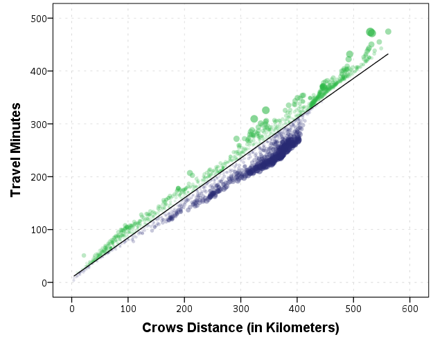
The same exercise for the travel time in minutes gives the equation Travel Time in Minutes = 9 + 0.75*(Geographic Distance in Kilometers):

*Minutes as a function of distance.
REGRESSION
  /MISSING LISTWISE
  /STATISTICS COEFF OUTS R ANOVA
  /CRITERIA=PIN(.05) POUT(.10)
  /NOORIGIN
  /DEPENDENT Minutes
  /METHOD=ENTER KMCrow
  /SAVE RESID(MinResid).

COMPUTE AbsResid = ABS(MinResid).
COMPUTE DirResid = MinResid/AbsResid.
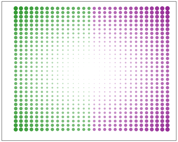
GGRAPH
  /GRAPHDATASET NAME="graphdataset" VARIABLES=Minutes KMCrow AbsResid DirResid
  /GRAPHSPEC SOURCE=INLINE.
BEGIN GPL
  SOURCE: s=userSource(id("graphdataset"))
  DATA: Minutes=col(source(s), name("Minutes"))
  DATA: KMCrow=col(source(s), name("KMCrow"))
  DATA: AbsResid=col(source(s), name("AbsResid"))
  DATA: DirResid=col(source(s), name("DirResid"), unit.category())
  TRANS: Dif = eval(KMTrav - KMCrow)
  GUIDE: axis(dim(2), label("Travel Minutes"))
  GUIDE: axis(dim(1), label("Crows Distance (in Kilometers)"))
  GUIDE: legend(aesthetic(aesthetic.color.interior), null())
  GUIDE: legend(aesthetic(aesthetic.transparency.interior), null())
  GUIDE: legend(aesthetic(aesthetic.size), null())
  SCALE: linear(aesthetic(aesthetic.size), aestheticMinimum(size."3"), aestheticMaximum(size."13"))
  SCALE: linear(aesthetic(aesthetic.transparency), aestheticMinimum(transparency."0.3"), aestheticMaximum(transparency."0.9"), reverse())
  ELEMENT: point(position(KMCrow*Minutes), color.interior(DirResid), transparency.interior(AbsResid),
                 size(AbsResid), transparency.exterior(transparency."1"))
  ELEMENT: line(position(smooth.linear(KMCrow*Minutes)))
END GPL.

Again the mixture appears, but the linear regression appears as a much closer fit between geographic distance and travel time.

So in both cases, at least in this sample, it appears it is not really necessary to calculate travel distance. One can make a pretty good guess as to the travel distance simply given the geographic distance. Or going the other way using Pennsylvania speak, if I say the distance between two locations is about 1 hour this would translate into about 68 kilometers (i.e. 42 miles).


Automating tasks in SPSS using production jobs

$
0
0

For tasks that take along time or ones I want done on a regular basis I typically have the computer do the work while I am away. Such example tasks I have set up before are:

  • querying large databases and dumping the results into flat files (querying large tables may take an hour or longer)
  • conduction statistical analysis that takes along time to converge
  • generating automated graphs and statistics

The SPSS facility to accomplish these are production jobs, and I will briefly detail how to set up a production job and then run the job from the command line for a simple example. So first I will walk through creating a production job to a set of syntax.

So first to set up a production job go to Utilities -> Production Facility in the menu bar. (Note you can open the screen shots larger in a separate window.)

Next you will be presented with the screen below. To specify the syntax file(s) that the production job will run, click the New button.

After you click the New button, the green plus sign in the Syntax files section will be active, and then you can browse to your sps file. Here you can see I selected a file named GenerateChart.sps in a particular directory on my C drive. You can specify the job to run multiple syntax files, but here I only choose one.

Next navigate to the Output section of the window. Here you need to choose where to save the SPSS output. Here I choose to save it in the same directory under the name Output. I choose the output format to be plain text. This ends up being the same output as if you ran the syntax interactively and then used EXPORT OUTPUT.

I could have exported the charts in the syntax directly by using EXPORT OUTPUT, but you can have the production facility do that as well. If you click on the Options button in the Output section a new dialogue will appear that lets you choose to save the charts if you want. Here I save them as png files.

Production jobs also have the capability to create user input variables directly in the syntax, using the form @VariableName in the syntax. This is what the section Run time variables deals with. These are nice if you have a set of syntax and want to input some arbitrary information, as when you run the production job a GUI pops up asking for the input, but I don’t illustrate that functionality here.

Below is the specific set of syntax that grabs a csv file, swdata.csv, calculates a moving median for each chat room, and makes some time series charts. The csv file is a set of scrapped chat data from the Cross Validated and R chat rooms via Scraperwiki (more details here). It aggregates the number of monologue tags (a pretty good indicator of the number of posts in the room) per day, so is an estimate of the chat activity.

*Where the data is located.
FILE HANDLE data
  /NAME = "C:\Users\andrew.wheeler\Dropbox\Documents\BLOG\ProductionJob".
DATA LIST LIST (",") FILE = "data\swdata.csv" SKIP = 1
  /Date (SDATE10) Mono (F4.0) Baseroom (A100).
DATASET NAME Chats.

*Calculate moving median.
AUTORECODE VARIABLES = Baseroom /INTO BaseN.
SORT CASES BY BaseN Date.
SPLIT FILE BY BaseN.
CREATE MovMed = RMED(Mono 5).
FORMATS MovMed (F4.0) Date (MOYR6).

*Make charts.
GGRAPH
  /GRAPHDATASET NAME="graphdataset" VARIABLES=Date Mono MovMed
   MISSING=VARIABLEWISE
  /GRAPHSPEC SOURCE=INLINE.
BEGIN GPL
  SOURCE: s=userSource(id("graphdataset"))
  DATA: Date=col(source(s), name("Date"))
  DATA: Mono=col(source(s), name("Mono"))
  DATA: MovMed=col(source(s), name("MovMed"))
  GUIDE: axis(dim(1))
  GUIDE: axis(dim(2), label("Mono Tags"))
  ELEMENT: line(position(Date*Mono), color(color.grey),
           transparency(transparency."0.5"), size(size."1"))
  ELEMENT: line(position(Date*MovMed), color(color.red),
           transparency(transparency."0.4"), size(size."1"))
END GPL.

Now I am interested in running this set of syntax automatically. The details will change depending on your operating system, but on my windows machine the easiest way to do this is to create a bat file that specifies the commands. Now I named the production job ChatRoom_Dialogue.spj, and to run this job I filled in the bat file with the text:

REM delete old csv file and download new one
del swdata.csv
wget "http://goo.gl/mxyRI7" --no-check-certificate
REM this runs the SPSS syntax
"C:\Program Files\IBM\SPSS\Statistics\22\stats.exe"  "C:\Users\andrew.wheeler\Dropbox\Documents\BLOG\ProductionJob\ChatRoom_Dialogue.spj" -production silent

Here I downloaded the wget utility to grab the csv file. (Note REM is to comment lines.) The bat file treats where ever it is located at as the directory for the commands, so I first use del to delete the older csv file, and then grab the new csv file from the listed url and it automatically saves the file in the folder where the bat file is located. Then I call the SPSS syntax by starting stats.exe and then calling the spj production job file. I use the switches -production silent so I am not prompted for any user input values to insert into the syntax. If you had stats.exe as a windows system path you wouldn’t need to worry about using the fully quoted strings, put I typically don’t worry about it (unless the program automatically adds it). Note that running the fully quoted string for stats.exe makes the windows command directory go to there, so you need to then fully quote the spj files path. Note you could call the first two commands directly within SPSS using the HOST command, but being able to chain multiple commands together makes running them in the bat file directly a bit more flexible.

So now you can simply double click the bat file and it will download the new data and create two graphs. To automate the job you can use the Windows task scheduler to make the bat file at a particular time. Here is the bundled up files to run on your own (you just need to change the files paths in the sps and the bat file to wherever you want to run the script).

Here are the two graphs the production job creates. The first is the Cross Validated chat room, and the second is the R stackoverflow chat room.

I planned on writing a blog post for the CV blog awhile ago about these trends, so if I ever get to it these are teasers.


Repeating Charts in SPSS for unique IDs

$
0
0

The title is probably not that clear, but I’ve seen this request a few times and have used this trick in one my projects, so figured it would be a worthwhile topic to illustrate. So the problem is you have a background distribution, and you want to tailor a set of individual charts showing the unique individuals score against the background distribution. See two examples (1,2) of this question. In the first link I showed how one can do this by artificially duplicating the data in a specific way using VARSTOCASES and then using SPLIT FILE to generate the separate charts. Here I will show a python based solution that does not require duplicating the data.

So first we will start off with a set of fake student scores, 20 students with 5 scores each.

*Create some fake data, student test scores.
SET SEED 10.
INPUT PROGRAM.
STRING Student (A1).
LOOP #i = 1 TO 5.
  LOOP #j = 1 TO 20.
    COMPUTE Student = STRING(#j+64,PIB).
    COMPUTE Score = RND(RV.NORMAL(100,10)).
    END CASE.
  END LOOP.
END LOOP.
END FILE.
END INPUT PROGRAM.
DATASET NAME Student_Scores.
FORMATS Score (F3.0).
EXECUTE.

Now the students are listed as strings, but here I am going to use AUTORECODE to automatically turn the strings into number variables, and more importantly for what follows create a set of value labels corresponding to those unique strings.

*Use Auto-recode to make the variables 1 to N.
AUTORECODE VARAIBLES = Student /INTO Student_N.
FORMATS Student_N (F6.0).

Now the workflow I want to do is to make a set of charts with the background a boxplot for the whole class, and then the individual students scores as foreground dots. To do this I will make a second set of scores that are missing for everyone except that one particular student, the specify MISSING=VARIABLEWISE on the GGRAPH command, and then superimpose Score2 over the boxplot of Score.

*Example of Individual chart.
NUMERIC flag (F1.0) Score2 (F3.0).

DO IF Student_N = 1.
  COMPUTE Score2 = Score.
  COMPUTE flag = 1.
ELSE.
  COMPUTE Score2 = $SYSMIS.
  COMPUTE flag = 0.
END IF.

GGRAPH
  /GRAPHDATASET NAME="graphdataset" VARIABLES=Score Score2 flag MISSING = VARIABLEWISE
  /GRAPHSPEC SOURCE=INLINE.
BEGIN GPL
  SOURCE: s=userSource(id("graphdataset"))
  DATA: Score=col(source(s), name("Score"))
  DATA: Score2=col(source(s), name("Score2"))
  COORD: rect(dim(1), transpose())
  GUIDE: axis(dim(1), label("Score"))
  GUIDE: legend(aesthetic(aesthetic.visible), null())
  GUIDE: text.title(label("Student: A"))
  ELEMENT: schema(position(bin.quantile.letter(Score)), color.interior(color.grey))
  ELEMENT: point.dodge.symmetric(position(bin.dot(Score2)), color.interior(color.red))
END GPL.
*cleaing up temp variables.
MATCH FILES FILE = * /DROP flag Score2.

There are other ways to do this, like using the visible option in GPL aesthetics, but I don’t do that here because they still exist in the chart but simply aren’t shown. This causes problems with the dodging, and if you sent the chart in vector format the information would still be contained in the chart (e.g. if you need to aggregate the background data to be obfuscated for confidentiality reasons you don’t want it in the chart even if it is invisible). Here even the outlier dots in the boxplot are potentially disseminating confidential information, but for simplicity I don’t worry about that here (my syntax at the developerworks forum showed how you can build your own boxplot without having the points, it would be nice to have a no points option for the schema element).

So now the problem is looping through all of the individual students and generating a chart for each one. That is where the AUTORECODE comes in handy. I can grab all of the value labels from the SPSS dictionary and place them in a Python dictionary.

*Python to grab the different students.
BEGIN PROGRAM Python.
import spss
spss.StartDataStep()
datasetObj = spss.Dataset()
StudentLab = datasetObj.varlist['Student_N'].valueLabels
print StudentLab #this is a dictionary of all the unique students
spss.EndDataStep()
END PROGRAM.

Now with the StudentLab Python dictionary I can loop over the dictionary and submit the SPSS syntax for each unique student (using spss.Submit) using string substitutions. I first create the variables and set there formats outside of the loop (the chart inherits the formats). Then I just set several aesthetics of the charts so they are the same for every chart, e.g. the scale goes between 60 and 150, and the size of the superimposed points is 12.

*Now loop through the students.
OUTPUT CLOSE ALL.
BEGIN PROGRAM Python.
spss.Submit("NUMERIC flag (F1.0) Score2 (F3.0).")
for val, lab in StudentLab.data.iteritems():
  spss.Submit("""*Individual score chart.
DO IF Student_N = %d.
  COMPUTE Score2 = Score.
  COMPUTE flag = 1.
ELSE.
  COMPUTE Score2 = $SYSMIS.
  COMPUTE flag = 0.
END IF.
GGRAPH
  /GRAPHDATASET NAME="graphdataset" VARIABLES=Score Score2 flag MISSING = VARIABLEWISE
  /GRAPHSPEC SOURCE=INLINE.
BEGIN GPL
  SOURCE: s=userSource(id("graphdataset"))
  DATA: Score=col(source(s), name("Score"))
  DATA: Score2=col(source(s), name("Score2"))
  DATA: id=col(source(s), name("$CASENUM"), unit.category())
  DATA: flag=col(source(s), name("flag"), unit.category())
  COORD: rect(dim(1), transpose())
  GUIDE: axis(dim(1), label("Score"), delta(10), start(60))
  GUIDE: text.title(label("Student: %s"))
  GUIDE: legend(aesthetic(aesthetic.visible), null())
  SCALE: linear(dim(1), min(60), max(150))
  ELEMENT: schema(position(bin.quantile.letter(Score)), color.interior(color.grey))
  ELEMENT: point.dodge.symmetric(position(bin.dot(Score2)), color.interior(color.red),
           size(size."12"))
END GPL.
""" %(val,lab))
END PROGRAM.

I wanted to export these charts in the loop with the students names, using something like:

SpssOutputDoc.SelectLastOutput() #grab last output
SpssOutputDoc.ExportCharts(SpssClient.SpssExportSubset.SpssSelected, path + lab, SpssClient.ChartExportFormat.png)

but what happens with this is that it is always one behind (e.g. the first chart is selected in the second loop iteration). So what I did was to stuff all of the charts within a list and then loop over that list, select the chart, and then export it using SpssOutputDoc.ExportCharts (another option would be to use EXPORT OUTPUT and then either delete the output in-between charts or clear it, I wish OMS could export only charts). This would be more annoying with multiple individual charts, and could likely be made more concise, but here it is.

*Now exporting the individual charts.
BEGIN PROGRAM Python.
import SpssClient
SpssClient.StartClient()
SpssOutputDoc = SpssClient.GetDesignatedOutputDoc()

#creating a list of all the charts
OutputItems = SpssOutputDoc.GetOutputItems()
Charts = []
for index in range(OutputItems.Size()):
  OutputItem = OutputItems.GetItemAt(index)
  if OutputItem.GetType() == SpssClient.OutputItemType.CHART:
    Charts.append(OutputItem)

labList = []
for val, lab in StudentLab.data.iteritems():
  labList.append(lab)

path = "C:/Users/andrew.wheeler/Dropbox/Documents/BLOG/RepeatingCharts/"

for chart,lab in zip(Charts,labList):
  SpssOutputDoc.ClearSelection() #clear prior selections
  chart.SetSelected(True) #select chart
  #export chart
  SpssOutputDoc.ExportCharts(SpssClient.SpssExportSubset.SpssSelected, path + lab, SpssClient.ChartExportFormat.png)
END PROGRAM.

Here is a screen shot of the resulting images in my folder.

So this will export the charts to PNG format with the image name the same as the students in the file (so the name needs to be in a format appropriate to save a file name). Annoyingly SPSS appends 1 to the end of all charts, even if it is only exporting one chart. Here is an example of the student G’s chart.

Eventually I will figure out how to send emails via Python, and this would be a good tool for individualized report cards for a class. Here is a copy of the full syntax to more easily run on your local machine (just replace path with a location on your local machine).


Treemaps in SPSS

$
0
0

Instead of an Xmas tree this year I will discuss a bit about treemaps. Treemaps are a visualization developed by Ben Shneiderman to identify how the current space on ones hard drive is being partitioned. Now they are a popular tool to visualize any hierarchical data that have quantitative size data associated with it. Some of my favorites are from Catherine Mulbrandon of the Visualizing Economics blog. Here is one visualizing the job market sector:

There are quite a few problems with visualizing treemaps, mainly that evaluating areas are a much more difficult task than evaluating the position along an aligned axis. I find some of them visually appealing though, and well suited for their original goal: identifying large categories in unordered hierarchical data with very many categories. So I took some time to write up code to make them in SPSS. The layout algorithm I use (I believe) is the slice and dice, which does not look nice if there are many small categories, but basically a nice workaround is to create different levels in the hierarchy. (This took me about 4+ hours to do, and at this point I would just use a Python or R library to make them if I wanted a different layout algorithm.)

So here is the macro in an sps file (plus the other files used in this post), and it takes as parameters:

  • Data: the name of the original dataset
  • Val (optional): If your categorical data have a numeric variable indicating the size of the category. If not, it simply counts up the number of times a category is in the data file.
  • Vars: the categorical variables that define the treemap. (This should work with as many categories as you want, tested currently with up to 4.)

So lets make some fake data, load in the macro, and then see what it spits out.

FILE HANDLE data /NAME = "C:\Users\andrew.wheeler\Dropbox\Documents\BLOG\TreeMaps_SPSS".
INSERT FILE = "data\TreeMap_MACRO.sps".
*Making some random data.
SET SEED 10.
INPUT PROGRAM.
LOOP #i = 1 TO 1000.
  COMPUTE Cat1 = RV.UNIFORM(0,1).
  COMPUTE Cat2 = RV.UNIFORM(0,1).
  END CASE.
END LOOP.
END FILE.
END INPUT PROGRAM.
DATASET NAME Tree.
NUMERIC C1 C2.
DO REPEAT Prop1 = 0.6 0.9 0.97 1
         /Prop2 = 0.4 0.7 0.9 1
         /i = 1 TO 4.
  IF (MISSING(C1) AND Cat1 <= Prop1) C1 = i.
  IF (MISSING(C2) AND Cat2 <= Prop2) C2 = i.
END REPEAT.
COMPUTE C3 = RV.BERNOULLI(0.8).
MATCH FILES FILE = * /DROP Cat1 Cat2.
FORMATS C1 C2 C3 (F1.0).
EXECUTE.
*Making the rectangles.
!TreeMap Data = Tree Vars = C1 C2 C3.

You have returned a second dataset named Tree_C3 that contains the corners of the boxes for each level of the hierarchy in a set of variables BL_x, BL_y, TR_x, TR_y (meant to be bottom left x, top right y etc.) Using the link.hull parameter for a polygon element in inline GPL (as I showed for spineplots) we can now create the boxes.

*Now plotting the rectangles.
MATCH FILES FILE = *
  /FIRST = Flag
  /BY C1 C2.
DO IF Flag = 0.
  DO REPEAT x = BL_x2 BL_y2 TR_x2 TR_y2.
    COMPUTE x = $SYSMIS.
  END REPEAT.
END IF.
*Prevents repeated drawing of the same polygon at a higher level.
EXECUTE.
GGRAPH
  /GRAPHDATASET NAME="graphdataset" VARIABLES=BL_x3 BL_y3 TR_x3 TR_y3 BL_x2 BL_y2 TR_x2 TR_y2 C1 C2 C3
                MISSING=VARIABLEWISE
  /GRAPHSPEC SOURCE=INLINE TEMPLATE = "data\Labels_Poly.sgt".
BEGIN GPL
  PAGE: begin(scale(800px,600px))
  SOURCE: s=userSource(id("graphdataset"))
  DATA: BL_x3=col(source(s), name("BL_x3"))
  DATA: BL_y3=col(source(s), name("BL_y3"))
  DATA: TR_x3=col(source(s), name("TR_x3"))
  DATA: TR_y3=col(source(s), name("TR_y3"))
  DATA: BL_x2=col(source(s), name("BL_x2"))
  DATA: BL_y2=col(source(s), name("BL_y2"))
  DATA: TR_x2=col(source(s), name("TR_x2"))
  DATA: TR_y2=col(source(s), name("TR_y2"))
  DATA: C1=col(source(s), name("C1"), unit.category())
  DATA: C2=col(source(s), name("C2"), unit.category())
  DATA: C3=col(source(s), name("C3"), unit.category())
  TRANS: casenum = index()
  SCALE: cat(aesthetic(aesthetic.texture.pattern), map(("0",texture.pattern.mesh),("1",texture.pattern.solid)))
  GUIDE: legend(aesthetic(aesthetic.color.interior), label("Cat 1"))
  GUIDE: legend(aesthetic(aesthetic.texture.pattern), label("Cat 3"))
  GUIDE: axis(dim(1), null())
  GUIDE: axis(dim(2), null())
  ELEMENT: polygon(position(link.hull((BL_x3 + TR_x3)*(BL_y3 + TR_y3))), split(C2), color.interior(C1),
           texture.pattern(C3))
  ELEMENT: polygon(position(link.hull((BL_x2 + TR_x2)*(BL_y2 + TR_y2))), transparency.exterior(transparency."1"),
           transparency.interior(transparency."1"), label(C2), split(casenum))
  ELEMENT: edge(position(link.hull((BL_x2 + TR_x2)*(BL_y2 + TR_y2))), size(size."3"), split(casenum))
  PAGE: end()
END GPL.

So here is a quick rundown of the complicated GPL code. Here I mapped colors to the first C1 category, and then made C3 a different texture pattern. To get all of the squares to draw I use the split modifier on the C2 category, which has no direct aesthetics mapped, and then placed the C2 label in the center. I made the labels white with an additional chart template to my default, and made the outline for the C2 bars more distinct by plotting them on top as an edge element and making them thicker. If I wanted to publish this, I would probably just export the vector chart and add in the labels in nice spots (SPSS I don’t believe you can style the labels separately, maybe you can with some chart template magic that I am unaware of). So here if I could in SPSS I would make the labels for category 1 in the top left of its respective color, but that is not possible.

If we change the categories to not be so uneven, you can see how my slice-and-dice layout algorithm is not so nice. Here it is with the proportions being about equal for all categories.

Fortunately most categorical data are not like this, and have uneven distributions (also with even data and more hierarchies it tends to look nicer). For an actual example, I grabbed the NIBRS 2012 incident data from ICPSR, which is incident level crime reports from participating police jurisdictions over the country (NIBRS stands for National Incident Based Reporting System). It is pretty big, over 5 million records, and with the over 350 variables the fixed text file is over 6 gigabytes, but the compressed zsav format is only slightly larger than the original gzipped file from ICPSR, (0.35 gigabytes vs 0.29 gigabytes in the fixed width ascii gzipped). So here I grab the NIBRS data I prepared, and create the hierarchy as follows:

  • Level 1: I aggregate the UCR crimes into Part 1 Violent, Part 1 Non-Violent, and Other
  • Level 2: Individual UCR categories
  • Level 3: Location Type broken down into outdoor, indoor, home, and other/missing

And here is the code and the plot:

*Now NIBRS data.
DATASET CLOSE ALL.
GET FILE = "data\NIBRS_2012.zsav".
DATASET NAME NIBRS_2012.

RECODE V20061 (91 THRU 132 = 1)(200 THRU 240 = 2)(ELSE = 3) INTO UCR_Cat.
VALUE LABELS UCR_Cat 1 'Violent' 2 'Property' 3 'Other'.
RECODE V20111 (10,13,16,18,50,51 = 1)(20 = 3)(25, LO THRU 0 = 4)(ELSE = 2) INTO Loc_Cat.
VALUE LABELS Loc_Cat 1 'Outdoor' 2 'Indoor' 3 'Home' 4 'Other'.

!TreeMap Data = NIBRS_2012 Vars = UCR_Cat V20061 Loc_Cat.
DATASET ACTIVATE Tree_Loc_Cat.

MATCH FILES FILE = *
  /FIRST = Flag_UCRType
  /BY UCR_Cat V20061.
DO IF Flag_UCRType = 0.
  DO REPEAT x = BL_x2 BL_y2 TR_x2 TR_y2.
    COMPUTE x = $SYSMIS.
  END REPEAT.
END IF.

*Calculating width, if under certain value not placing label.
MATCH FILES FILE = * /DROP UCR_Lab.
STRING UCR_Lab (A20).
IF (TR_x2 - BL_x2) >= 0.12 UCR_Lab = VALUELABEL(V20061).
EXECUTE.

GGRAPH
  /GRAPHDATASET NAME="graphdataset" VARIABLES=BL_x3 BL_y3 TR_x3 TR_y3 UCR_Cat UCR_Lab Loc_Cat
                BL_x2 BL_y2 TR_x2 TR_y2 MISSING=VARIABLEWISE
  /GRAPHSPEC SOURCE=INLINE TEMPLATE = "data\Labels_Poly.sgt".
BEGIN GPL
  PAGE: begin(scale(800px,600px))
  SOURCE: s=userSource(id("graphdataset"))
  DATA: BL_x3=col(source(s), name("BL_x3"))
  DATA: BL_y3=col(source(s), name("BL_y3"))
  DATA: TR_x3=col(source(s), name("TR_x3"))
  DATA: TR_y3=col(source(s), name("TR_y3"))
  DATA: BL_x2=col(source(s), name("BL_x2"))
  DATA: BL_y2=col(source(s), name("BL_y2"))
  DATA: TR_x2=col(source(s), name("TR_x2"))
  DATA: TR_y2=col(source(s), name("TR_y2"))
  DATA: UCR_Cat=col(source(s), name("UCR_Cat"), unit.category())
  DATA: UCR_Lab=col(source(s), name("UCR_Lab"), unit.category())
  DATA: Loc_Cat=col(source(s), name("Loc_Cat"))
  TRANS: casenum = index()
  SCALE: linear(aesthetic(aesthetic.color.saturation.interior), aestheticMaximum(color.saturation."1"),
         aestheticMinimum(color.saturation."0.4"))
  GUIDE: legend(aesthetic(aesthetic.color.interior), null())
  GUIDE: legend(aesthetic(aesthetic.color.saturation.interior), null())
  GUIDE: axis(dim(1), null())
  GUIDE: axis(dim(2), null())
  ELEMENT: polygon(position(link.hull((BL_x3 + TR_x3)*(BL_y3 + TR_y3))),
                   color.interior(UCR_Cat), split(casenum), transparency.exterior(transparency."1"),
                   color.saturation.interior(Loc_Cat))
  ELEMENT: polygon(position(link.hull((BL_x2 + TR_x2)*(BL_y2 + TR_y2))),
                   transparency.exterior(transparency."1")), transparency.interior(transparency."1"),
                   label(UCR_Lab), split(casenum))
  ELEMENT: edge(position(link.hull((BL_x2 + TR_x2)*(BL_y2 + TR_y2))), size(size."3"), split(casenum))
  PAGE: end()
END GPL.

The saturation for locations types goes from lightest to darkest: Outdoor, Indoor, Home, Other. Instead of randomly allocating the saturation to distinguish between the location types furthest down the hierarchy, I can map the saturation to another category. Here I map it to whether someone was arrested for the proportion of offenses.

*Adding in proportion of arrests.
DATASET ACTIVATE NIBRS_2012.
COMPUTE Arrest = (RECSARR > 0).
DATASET DECLARE ArrestProp.
AGGREGATE OUTFILE='ArrestProp'
  /BREAK UCR_Cat V20061 Loc_Cat
  /ArrestProp = MEAN(Arrest).
DATASET ACTIVATE Tree_Loc_Cat.
MATCH FILES FILE = *
  /TABLE = 'ArrestProp'
  /BY UCR_Cat V20061 Loc_Cat.
DATASET CLOSE ArrestProp.


*Now mapping arrest proportion to saturation.
GGRAPH
  /GRAPHDATASET NAME="graphdataset" VARIABLES=BL_x3 BL_y3 TR_x3 TR_y3 UCR_Cat UCR_Lab Loc_Cat ArrestProp
                BL_x2 BL_y2 TR_x2 TR_y2 MISSING=VARIABLEWISE
  /GRAPHSPEC SOURCE=INLINE TEMPLATE = "data\Labels_Poly.sgt".
BEGIN GPL
  PAGE: begin(scale(800px,600px))
  SOURCE: s=userSource(id("graphdataset"))
  DATA: BL_x3=col(source(s), name("BL_x3"))
  DATA: BL_y3=col(source(s), name("BL_y3"))
  DATA: TR_x3=col(source(s), name("TR_x3"))
  DATA: TR_y3=col(source(s), name("TR_y3"))
  DATA: BL_x2=col(source(s), name("BL_x2"))
  DATA: BL_y2=col(source(s), name("BL_y2"))
  DATA: TR_x2=col(source(s), name("TR_x2"))
  DATA: TR_y2=col(source(s), name("TR_y2"))
  DATA: UCR_Cat=col(source(s), name("UCR_Cat"), unit.category())
  DATA: UCR_Lab=col(source(s), name("UCR_Lab"), unit.category())
  DATA: Loc_Cat=col(source(s), name("Loc_Cat"))
  DATA: ArrestProp=col(source(s), name("ArrestProp"))
  TRANS: casenum = index()
  SCALE: linear(aesthetic(aesthetic.color.saturation.interior), aestheticMaximum(color.saturation."1"),
         aestheticMinimum(color.saturation."0.4"))
  GUIDE: legend(aesthetic(aesthetic.color.interior), null())
  GUIDE: legend(aesthetic(aesthetic.color.saturation.interior), null())
  GUIDE: axis(dim(1), null())
  GUIDE: axis(dim(2), null())
  ELEMENT: polygon(position(link.hull((BL_x3 + TR_x3)*(BL_y3 + TR_y3))),
                   color.interior(UCR_Cat), split(casenum), transparency.exterior(transparency."1"),
                   color.saturation.interior(ArrestProp))
  ELEMENT: polygon(position(link.hull((BL_x2 + TR_x2)*(BL_y2 + TR_y2))),
                   transparency.exterior(transparency."1")), transparency.interior(transparency."1"),
                   label(UCR_Lab), split(casenum))
  ELEMENT: edge(position(link.hull((BL_x2 + TR_x2)*(BL_y2 + TR_y2))), size(size."3"), split(casenum))
  PAGE: end()
END GPL.

This ends up being pretty boring though, there does not appear to be much variation within the location types for arrest rates. For here with widely varying category sizes I would likely want to do a model based approach and shrink the extreme proportions in the smaller categories, but that is a challenge for another blog post! (Also the sizes of the categories naturally de-emphasizes the small areas.)

One of the other things I was experimenting with was the use of svg gradients via the chart template, (see Squarified Treemaps (Bruls et al., 2000) for a motivating example) but I was unable to figure out the chart template xml needed to have the polygons drawn with gradients. (I had saved a few templates from V20 that had example gradients in them, and I’ve gotten them to work for bar graphs.) Also I attempted to export this with tooltips, but the tool tips were derived variables from the polygons, so I’m not quite sure how to cajole SPSS to give the tool tips I want.

This is not the best use of treemaps though, and I will have to write a post showing how small multiples of bar graphs can be just as effective as these examples. Shneiderman intended these to be an interactive application in which you could see the forest and then drill down into smaller subsets for exploration. Comparing areas across categories in this example, e.g. comparing the proportion of crimes occurring at home in assaults versus robberies, is very difficult to accomplish in the treemap. I would say that they are slightly more aesthetically pleasing than the wooden Charlie Brown xmas tree I built for my tiny apartment though.

Happy Holidays!


Translating between the dispersion term in a negative binomial regression and random variables in SPSS

$
0
0

When estimating a negative binomial regression equation in SPSS, it returns the dispersion parameter in the form of:

Var(x) = mean + mean*dispersion

So a dispersion parameter of 0 in this notation is the same as a variable that is Poisson distributed without any extra dispersion. When generating random variables from the negative binomial distribution, SPSS does not take the parameters like this, but the more usual N trials with P successes. Stealing a bit from the R documentation for dnbinom, I was able to translate between the two with just a tedious set of algebra. So with our original distribution being:

Mean = mu
Variance = mu + mu*a

R has an alternative representation closer to SPSS’s based on:

Mean = mu
Variance = mu + mu^2/x

Some algebra will reveal that in this notation x = mu/a. Also, R’s help for dbinom states that in the original N and P notation that p = x/(x + mu). So here with mu and a (again a is the dispersion term as reported by GENLIN in SPSS) we can solve for p.

x = mu/a
p = (mu/a)/(mu/a + mu)

And since p is solved, R lists the mean of the distribution in the N and P notation as:

n*(1-p)/p = mu

So with p solved we can figure out N as equal to:

mu*p/(1-p) = n

So to reiterate, if you have a mean of 1 and dispersion parameter of 4, the resultant N and P notation would be:

p = (mu/a)/(mu/a + mu) = (1/4)/(1/4 + 1) = 1/5
n = mu*p/(1-p) = 1*0.2/(1 - 0.2) = 1/4

Here we can see that in the N and P notation the similar negative binomial model results in a fractional number of successes, which might be a surprising result for some that it is even a possibility. (There is likely an easier way to do this translation, but forgive me I am not a mathematician!)

Now we would be finished, but unfortunately SPSS’s negative binomial random functions do not take values of N less than 1 (R’s dnbinom does). In the case N is greater than 1 the NEGBIN functions (CDF, PDF and RV) will work (and will take fractional values over 1). But if N is smaller than 1, we have to do another translation of the N and P notation to the gamma distribution to be able to draw random numbers in SPSS. Another representation of the negative binomial model is a mixture of Poisson distributions, with the distribution of the mixtures being from a gamma distribution. Wikipedia lists a translation from the N and P notation to a gamma with shape = N and scale = P/(1-P).

So I wrapped these computations up in an SPSS macros that takes the mean and the dispersion parameter, calculates N and P under the hood, and then draws a random variable from the associated negative binomial distribution.

*Type can either be CDF, PDF or RV.
DEFINE !NegBinRV (mu = !TOKENS(1)
       /disp = !TOKENS(1)
       /out = !TOKENS(1) )
COMPUTE #x = !mu/!disp.
COMPUTE #p = #x / (#x + !mu).
COMPUTE #n = #p / (1 - #p).
COMPUTE #G = RV.GAMMA(#n,#p/(1 - #p)).
COMPUTE !Out = RV.POISSON(#G).
!ENDDEFINE.

I am not sure if it is possible to use this gamma representation and native SPSS functions to calculate the corresponding CDF and PDF of the negative binomial distribution. But we can use R to do that. Here is an example of keeping the mean at 1 and varying the dispersion parameter between 0 and 5.

BEGIN PROGRAM R.
library(ggplot2)
x <- expand.grid(0:10,1:5)
names(x) <- c("Int","Disp")
mu <- 1
x$PDF <- mapply(dnbinom, x=x$Int, size=mu/x$Disp, mu=mu)
#add in poisson
t <- data.frame(cbind(0:10,rep(0,11),dpois(0:10,lambda=1)))
names(t) <- c("Int","Disp","PDF")
x <- rbind(t,x)
p <- ggplot(data = x, aes(x = Int, y = PDF, group = as.factor(Disp))) + geom_line()
p
#for the CDF
x$CDF <- ave(x$PDF, x$Disp, FUN = cumsum)
END PROGRAM.

Here you can see how the larger dispersion term can easily approximate the zero inflation typical in criminal justice data (see an applied example from my work). R will not take a dispersion parameter of zero in this notation (as the size would be divided by zero and not defined), so I just tacked on the Poisson distribution with a mean of zero.

Here is an example of generating random data from a negative binomial distribution with a mean of 1 and a dispersion parameter of 4. I then grab the PDF from R, and superimpose them both on a chart in SPSS (or perhaps I should call it a PMF, since it only has support on integer values). You can see the simulation with 10,000 observations is a near perfect fit (so a good sign I did not make any mistakes!)

*Simulation In SPSS.
INPUT PROGRAM.
LOOP Id = 1 TO 10000.
END CASE.
END LOOP.
END FILE.
END INPUT PROGRAM.
DATASET NAME RandNB.

!NegBinRV mu = 1 disp = 4 out = NB.

*Making seperate R dataset of PDF.
BEGIN PROGRAM R.
mu <- 1
disp <- 4
x <- 0:11
pdf <- dnbinom(x=x,size=mu/disp,mu=mu)
#add in larger than 10
pdf[max(x)+1] <- 1 - sum(pdf[-(max(x)+1)])
MyDf <- data.frame(cbind(x,pdf))
END PROGRAM.
EXECUTE.
STATS GET R FILE=* /GET DATAFRAME=MyDf DATASET=PDF_NB.
DATASET ACTIVATE PDF_NB.
FORMATS x (F2.0).
VALUE LABELS x 11 '11 or More'.

*Now superimposing bar plot and PDF from separate datasets.
DATASET ACTIVATE RandNB.
RECODE NB (11 THRU HIGHEST = 11)(ELSE = COPY) INTO NB_Cat.
FORMATS NB_Cat (F2.0).
VALUE LABELS NB_Cat 11 '11 or More'.

GGRAPH
  /GRAPHDATASET NAME="Data" DATASET='RandNB' VARIABLES=NB_Cat[LEVEL=ORDINAL] COUNT()[name="COUNT"]
  /GRAPHDATASET NAME="PDF" DATASET='PDF_NB' VARIABLES=x pdf
  /GRAPHSPEC SOURCE=INLINE.
BEGIN GPL
  SOURCE: Data=userSource(id("Data"))
  DATA: NB_Cat=col(source(Data), name("NB_Cat"), unit.category())
  DATA: COUNT=col(source(Data), name("COUNT"))
  SOURCE: PDF=userSource(id("PDF"))
  DATA: x=col(source(PDF), name("x"), unit.category())
  DATA: den=col(source(PDF), name("pdf"))
  TRANS: den_per = eval(den*100)
  GUIDE: axis(dim(1))
  GUIDE: axis(dim(2))
  SCALE: linear(dim(2), include(0))
  ELEMENT: interval(position(summary.percent(NB_Cat*COUNT)), shape.interior(shape.square))
  ELEMENT: point(position(x*den_per), color.interior(color.black), size(size."8"))
END GPL.

Labeling tricks in SPSS plots

$
0
0

The other day I noticed when making the labels for treemaps that when using a polygon element in inline GPL SPSS places the label directly on the centroid. This is opposed to offsetting the label when using a point element. We can use this to our advantage to force labels in plots to be exactly where we want them. (Syntax to replicate all of this here.)

One popular example I have seen is in state level data to use the state abbreviation in a scatterplot instead of a point. Here is an example using the college degree and obesity example originally via Albert Cairo.

FILE HANDLE save /NAME = "!!!!Your Handle Here!!!".
*Data obtained from http://vizwiz.blogspot.com/2013/01/alberto-cairo-three-steps-to-become.html
*Or more specifically https://dl.dropbox.com/u/14050515/VizWiz/obesity_education.xls.
GET DATA /TYPE=XLS
   /FILE='save\obesity_education.xls'
   /SHEET=name 'Sheet1'
   /CELLRANGE=full
   /READNAMES=on
   /ASSUMEDSTRWIDTH=32767.
DATASET NAME Obs.
MATCH FILES FILE = *
/DROP V5.
FORMATS BAORHIGHER OBESITY (F2.0).

*Scatterplot with States and labels.
GGRAPH
  /GRAPHDATASET NAME="graphdataset" VARIABLES=BAORHIGHER OBESITY StateAbbr
  /GRAPHSPEC SOURCE=INLINE.
BEGIN GPL
  SOURCE: s=userSource(id("graphdataset"))
  DATA: BAORHIGHER=col(source(s), name("BAORHIGHER"))
  DATA: OBESITY=col(source(s), name("OBESITY"))
  DATA: StateAbbr=col(source(s), name("StateAbbr"), unit.category())
  GUIDE: axis(dim(1), label("% BA or Higher"))
  GUIDE: axis(dim(2), label("% Obese"))
  ELEMENT: point(position(BAORHIGHER*OBESITY), label(StateAbbr))
END GPL.

Here you can see the state abbreviations are off-set from the points. A trick to just plot the labels, but not the points, is to draw the points fully transparent. See the transparency.exterior(transparency."1") in the ELEMENT statement.

 GGRAPH
   /GRAPHDATASET NAME="graphdataset" VARIABLES=BAORHIGHER OBESITY StateAbbr
   /GRAPHSPEC SOURCE=INLINE.
 BEGIN GPL
   SOURCE: s=userSource(id("graphdataset"))
   DATA: BAORHIGHER=col(source(s), name("BAORHIGHER"))
   DATA: OBESITY=col(source(s), name("OBESITY"))
   DATA: StateAbbr=col(source(s), name("StateAbbr"), unit.category())
   GUIDE: axis(dim(1), label("% BA or Higher"))
   GUIDE: axis(dim(2), label("% Obese"))
   ELEMENT: point(position(BAORHIGHER*OBESITY), label(StateAbbr),
            transparency.exterior(transparency."1"))
 END GPL.

But, this does not draw the label exactly at the data observation. You can post-hoc edit the chart to specify that the label is drawn at the middle of the point element, but another option directly in code is to specify the element as a polygon instead of a point. By default this is basically equivalent to using a point element, since we do not pass the function an actual polygon using the link.??? functions.

GGRAPH
  /GRAPHDATASET NAME="graphdataset" VARIABLES=BAORHIGHER OBESITY StateAbbr
  /GRAPHSPEC SOURCE=INLINE.
BEGIN GPL
  SOURCE: s=userSource(id("graphdataset"))
  DATA: BAORHIGHER=col(source(s), name("BAORHIGHER"))
  DATA: OBESITY=col(source(s), name("OBESITY"))
  DATA: StateAbbr=col(source(s), name("StateAbbr"), unit.category())
  GUIDE: axis(dim(1), label("% BA or Higher"))
  GUIDE: axis(dim(2), label("% Obese"))
  ELEMENT: polygon(position(BAORHIGHER*OBESITY), label(StateAbbr), transparency.exterior(transparency."1"))
END GPL.

To show that this now places the labels directly on the data values, here I superimposed the data points as red dots over the labels.

GGRAPH
  /GRAPHDATASET NAME="graphdataset" VARIABLES=BAORHIGHER OBESITY StateAbbr
  /GRAPHSPEC SOURCE=INLINE.
BEGIN GPL
  SOURCE: s=userSource(id("graphdataset"))
  DATA: BAORHIGHER=col(source(s), name("BAORHIGHER"))
  DATA: OBESITY=col(source(s), name("OBESITY"))
  DATA: StateAbbr=col(source(s), name("StateAbbr"), unit.category())
  GUIDE: axis(dim(1), label("% BA or Higher"))
  GUIDE: axis(dim(2), label("% Obese"))
  ELEMENT: polygon(position(BAORHIGHER*OBESITY), label(StateAbbr), transparency.exterior(transparency."1"))
  ELEMENT: point(position(BAORHIGHER*OBESITY), color.interior(color.red))
END GPL.

Note to get the labels like this my chart template specifies the style of data labels as:

<addDataLabels styleOnly="true">
  <style number="0" font-size="12pt" font-weight="regular" color2="transparent" color="black"
   label-location-inside="false" margin="1px" padding="1px" stroke-width="0.5pt"/>
  <style number="1" visible="true" color="transparent" color2="transparent"/>
</addDataLabels>

The first style tag specifies the font, and the second specifies the background color and outline (my default was originally a white background with a black outline). The option styleOnly="true" makes it so the labels are not always generated in the chart. Another side-effect of using a polygon element I should note is that SPSS draws all of the labels. When labelling point elements SPSS does intelligent labelling, and does not label all of the points if many overlap (and tries to place the labels at non-overlapping locations). It is great for typical scatterplots, but here I do not want that behavior.

Other examples I think this would be useful are for simple dot plots in which the categories have meaningful labels. Here is an example using a legend, and one has to learn the legend to understand the graph. I like making the points semi-transparent, so when they overlap you can still see the different points (see here for an example with data that actually overlap).

Such a simple graph though we can plot the category labels directly.

The direct labelling will not work out so well if if many of the points overlap, but jittering or dodging can be used then as well. (You will have to jitter or dodge the data yourself if using a polygon element in inline GPL. If you want to use a point element again you can post hoc edit the chart so that the labels are at the middle of the point.)

Another example is that I like to place labels in line graphs at the end of the line. Here I show an example of doing that by making a separate label for only the final value of the time series, offsetting to the right slightly, and then placing the invisible polygon element in the chart.

SET SEED 10.
INPUT PROGRAM.
LOOP #M = 1 TO 5.
  LOOP T = 1 TO 10.
    COMPUTE ID = #M.
    COMPUTE Y = RV.NORMAL(#M*5,1).
    END CASE.
  END LOOP.
END LOOP.
END FILE.
END INPUT PROGRAM.
DATASET NAME TimeSeries.
FORMATS T ID Y (F3.0).
ALTER TYPE ID (A1).

STRING Lab (A1).
IF T = 10 Lab = ID.
EXECUTE.

*Labelled at end of line.
GGRAPH
  /GRAPHDATASET NAME="graphdataset" VARIABLES=T Y ID Lab MISSING=VARIABLEWISE
  /GRAPHSPEC SOURCE=INLINE.
BEGIN GPL
  SOURCE: s=userSource(id("graphdataset"))
  DATA: T=col(source(s), name("T"))
  DATA: Y=col(source(s), name("Y"))
  DATA: ID=col(source(s), name("ID"), unit.category())
  DATA: Lab=col(source(s), name("Lab"), unit.category())
  TRANS: P=eval(T + 0.2)
  GUIDE: axis(dim(1), label("T"))
  GUIDE: axis(dim(2), label("Y"))
  SCALE: linear(dim(1), min(1), max(10.2))
  ELEMENT: line(position(T*Y), split(ID))
  ELEMENT: polygon(position(P*Y), label(Lab), transparency.exterior(transparency."1"))
END GPL.

This works the same for point elements too, but this forces the label to be drawn and they are drawn at the exact location. See the second image in my peremptory challenge post for example behavior when labelling with the point element.

You can also use this to make random annotations in the graph. Code omitted here (it is available in the syntax at the beginning), but here is an example:

If you want you can then style this label separately when post-hoc editing the chart. Here is a silly example. (The workaround to use annotations like this suggests a change to the grammar to allow GUIDES to have a special type specifically for just a label where you supply the x and y position.)

This direct labelling just blurs the lines between tables and graphs some more, what Tukey calls semi-graphic. I recently came across the portmanteau, grables (graphs and tables) to describe such labelling in graphs as well.


Some examples of using DO REPEAT in SPSS

$
0
0

For the majority of data management I do in SPSS, the brunt of the work is likely done in under 10 different commands. DO REPEAT is one of those commands, and I figured I would show some examples of its use.

In its simplest form, DO REPEAT simply iterates over a list of variables and can apply computations to those variables. So say in a survey you had a skip pattern, and the variables A, B, C should not be answered if someone has a value of 1 for Skip, but your current dataset just has missing data as system missing. We can use DO REPEAT to iterate over the variables and assign the missing value code.

DO REPEAT v = A B C.
  IF Skip = 1 v = 9.
END REPEAT.

Note this is not a great example, as you could simply use a DO IF Skip = 1. and nest a RECODE in that do if, but hopefully that is a clear example to start. One of the other tricks to DO REPEAT is that you can specify a counter variable to iterate over at the same time. So say you had a variable X that took integer values of 1 to 4. If you want to make dummy codes for say a regression equation, using such a counter makes short work of the process. (The VECTOR command creates the 4 original dummy variables.)

VECTOR X(4,F1.0).
DO REPEAT Xn = X1 TO X4 /#i = 1 TO 4.
  COMPUTE Xn = (X = #i).
END REPEAT.

A final trick I often find use for is to make a list of strings instead of a list of variables. For instance, say I had a list of addresses and I wanted to specifically pull out people on Main, 1st, or Central. You could do:

COMPUTE Flag = 0.
IF CHAR.INDEX(Street,"Main") > 0 Flag = 1.
IF CHAR.INDEX(Street,"1st") > 0 Flag = 2.
IF CHAR.INDEX(Street,"Central") > 0 Flag = 3.

But it is much easier to just submit your own list of strings to DO REPEAT:

COMPUTE Flag = 0.
DO REPEAT str = "Main" "1st" "Central" /#i = 1 TO 3.
  IF CHAR.INDEX(Street,str) > 0 Flag = #i.
END REPEAT.

You can similarly submit arbitrary lists of numeric values as well. With much longer lists you can see how much more expedited this code is. Anytime I find myself writing a series of very similar COMPUTE or IF statements, or chaining many variables together in one statement, I often rewrite the code to use DO REPEAT.


Continuous color ramps in SPSS

$
0
0

For graphs in syntax SPSS can specify continuous color ramps. Here I will illustrate a few tricks I have found useful, as well as provide alternatives to the default rainbow color ramps SPSS uses when you don’t specify the colors yourself. First we will start with a simple set of fake data.

INPUT PROGRAM.
LOOP #i = 1 TO 30.
  LOOP #j = 1 TO 30.
    COMPUTE x = #i.
    COMPUTE y = #j.
    END CASE.
  END LOOP.
END LOOP.
END FILE.
END INPUT PROGRAM.
DATASET NAME Col.
FORMATS x y (F2.0).
EXECUTE.

The necessary GGRAPH code to make a continuous color ramp is pretty simple, just include a scale variable and map it to a color.

*Colors vary by X, bar graph default rainbow.
TEMPORARY.
SELECT IF y = 1.
GGRAPH
  /GRAPHDATASET NAME="graphdataset" VARIABLES=x y
  /GRAPHSPEC SOURCE=INLINE.
BEGIN GPL
  SOURCE: s=userSource(id("graphdataset"))
  DATA: x=col(source(s), name("x"), unit.category())
  DATA: xC=col(source(s), name("x"))
  DATA: y=col(source(s), name("y"))
  GUIDE: axis(dim(1), null())
  GUIDE: axis(dim(2), null())
  SCALE: linear(dim(2), min(0), max(1))
  ELEMENT: interval(position(x*y), shape.interior(shape.square), color.interior(xC),
           transparency.exterior(transparency."1"))
END GPL.
EXECUTE.

The TEMPORARY statement is just so the bars have only one value passed, and in the inline GPL I also specify that the outsides of the bars are fully transparent. The necessary code is simply creating a variable, here xC, that is continuous and mapping it to a color in the ELEMENT statement using color.interior(xC). Wilkinson in the Grammar of Graphics discusses that even for continuous color ramps he prefers a discrete color legend, which is the behavior in SPSS.

The default color ramp is well known to be problematic, so I will provide some alternatives. A simple choice suitable for many situations is simply a grey-scale chart. To make this you have to make a separate SCALE statement in the inline GPL, and set the aestheticMinimum and the aestheticMaximum. Besides that one additional SCALE statement, the code is the same as before.

*Better color scheme based on grey-scale.
TEMPORARY.
SELECT IF y = 1.
GGRAPH
  /GRAPHDATASET NAME="graphdataset" VARIABLES=x y
  /GRAPHSPEC SOURCE=INLINE.
BEGIN GPL
  SOURCE: s=userSource(id("graphdataset"))
  DATA: x=col(source(s), name("x"), unit.category())
  DATA: xC=col(source(s), name("x"))
  DATA: y=col(source(s), name("y"))
  GUIDE: axis(dim(1), null())
  GUIDE: axis(dim(2), null())
  SCALE: linear(dim(2), min(0), max(1))
  SCALE: linear(aesthetic(aesthetic.color.interior),
         aestheticMinimum(color.lightgrey), aestheticMaximum(color.black))
  ELEMENT: interval(position(x*y), shape.interior(shape.square), color.interior(xC),
           transparency.exterior(transparency."1"))
END GPL.
EXECUTE.

Another option I like is to make a grey-to-red scale ramp (which is arguably diverging or continuous).

*Grey to red.
TEMPORARY.
SELECT IF y = 1.
GGRAPH
  /GRAPHDATASET NAME="graphdataset" VARIABLES=x y
  /GRAPHSPEC SOURCE=INLINE.
BEGIN GPL
  SOURCE: s=userSource(id("graphdataset"))
  DATA: x=col(source(s), name("x"), unit.category())
  DATA: xC=col(source(s), name("x"))
  DATA: y=col(source(s), name("y"))
  GUIDE: axis(dim(1), null())
  GUIDE: axis(dim(2), null())
  SCALE: linear(dim(2), min(0), max(1))
  SCALE: linear(aesthetic(aesthetic.color.interior),
         aestheticMinimum(color.black), aestheticMaximum(color.red))
  ELEMENT: interval(position(x*y), shape.interior(shape.square), color.interior(xC),
           transparency.exterior(transparency."1"))
END GPL.
EXECUTE.

To make an nice looking interpolation with these anchors is pretty difficult, but another one I like is the green to purple. It ends up looking quite close to the associated discrete color ramp from the ColorBrewer palettes.

*Diverging color scale, purple to green.
TEMPORARY.
SELECT IF y = 1.
GGRAPH
  /GRAPHDATASET NAME="graphdataset" VARIABLES=x y
  /GRAPHSPEC SOURCE=INLINE.
BEGIN GPL
  SOURCE: s=userSource(id("graphdataset"))
  DATA: x=col(source(s), name("x"), unit.category())
  DATA: xC=col(source(s), name("x"))
  DATA: y=col(source(s), name("y"))
  GUIDE: axis(dim(1), null())
  GUIDE: axis(dim(2), null())
  SCALE: linear(dim(2), min(0), max(1))
  SCALE: linear(aesthetic(aesthetic.color.interior),
         aestheticMinimum(color.green), aestheticMaximum(color.purple))
  ELEMENT: interval(position(x*y), shape.interior(shape.square), color.interior(xC),
           transparency.exterior(transparency."1"))
END GPL.
EXECUTE.

In cartography, whether one uses diverging or continuous ramps is typically related to the data, e.g. if the data has a natural middle point use diverging (e.g. differences with zero at the middle point). I don’t really like this advice though, as pretty much any continuous number can be reasonably turned into a diverging number (e.g. continuous rates to location quotients, splitting at the mean, residuals from a regression, whatever). So I would make the distinction like this, the ramp decides what elements you end up emphasizing. If you want to emphasize the extremes of both ends of the distribution use a diverging ramp, if you only want to emphasize one end use a continuous ramp. There are many situations with natural continuous numbers that we want to emphasize both ends of the ramp based on the questions the map or graph is intended to answer.

Going along with this, you may want the middle break to not be in the middle of the actual data. To set the anchors according to an external benchmark, you can use the min and max function within the same SCALE statement that you specify the colors. Here is an example with the black-to-red color ramp, but I set the minimum lower than the data are, so the ramp starts at a more grey location.

*Setting the break with the external min.
TEMPORARY.
SELECT IF y = 1.
GGRAPH
  /GRAPHDATASET NAME="graphdataset" VARIABLES=x y
  /GRAPHSPEC SOURCE=INLINE.
BEGIN GPL
  SOURCE: s=userSource(id("graphdataset"))
  DATA: x=col(source(s), name("x"), unit.category())
  DATA: xC=col(source(s), name("x"))
  DATA: y=col(source(s), name("y"))
  GUIDE: axis(dim(1), null())
  GUIDE: axis(dim(2), null())
  SCALE: linear(dim(2), min(0), max(1))
  SCALE: linear(aesthetic(aesthetic.color.interior),
         aestheticMinimum(color.black), aestheticMaximum(color.red),
         min(-10), max(30))
  ELEMENT: interval(position(x*y), shape.interior(shape.square), color.interior(xC),
           transparency.exterior(transparency."1"))
END GPL.
EXECUTE.

Another trick I like using often is to map discrete colors, and then use transparency to create a continuous ramp (most of the examples I use here could be replicated by specifying the color saturation as well). Here I use two colors and make points more towards the center of the graph more transparent. This can be extended to multiple color bins, see this post on Stackoverflow. Related are value-by-alpha maps, using more transparent to signify more uncertainty in the data (or to draw less attention to those areas). (That linked stackoverflow post wanted to emphasize the middle break for diverging data, but the point remains the same, make things you want to de-emphasize more transparent and things to want to emphasize more saturated.)

*Using transparency and fixed color bins.
RECODE x (1 THRU 15 = 1)(ELSE = 2) INTO XBin.
FORMATS XBin (F1.0).
COMPUTE Dis = -1*SQRT((x - 15)**2 + (y - 15)**2).
FORMATS Dis (F2.0).
GGRAPH
  /GRAPHDATASET NAME="graphdataset" VARIABLES=x y Dis XBin
  /GRAPHSPEC SOURCE=INLINE.
BEGIN GPL
  SOURCE: s=userSource(id("graphdataset"))
  DATA: x=col(source(s), name("x"))
  DATA: y=col(source(s), name("y"))
  DATA: Dis=col(source(s), name("Dis"))
  DATA: XBin=col(source(s), name("XBin"), unit.category())
  GUIDE: axis(dim(1), null())
  GUIDE: axis(dim(2), null())
  SCALE: cat(aesthetic(aesthetic.color.interior), map(("1",color.green),("2",color.purple)))
  ELEMENT: point(position(x*y), color.interior(XBin),
           transparency.exterior(transparency."1"), transparency.interior(Dis))
END GPL.

Another powerful visualization tool to emphasize (or de-emphasize) certain points is to map the size of an element in addition to transparency. This is a great tool to add more information to scatterplots.

*Using redundant with size.
GGRAPH
  /GRAPHDATASET NAME="graphdataset" VARIABLES=x y Dis XBin
  /GRAPHSPEC SOURCE=INLINE.
BEGIN GPL
  SOURCE: s=userSource(id("graphdataset"))
  DATA: x=col(source(s), name("x"))
  DATA: y=col(source(s), name("y"))
  DATA: Dis=col(source(s), name("Dis"))
  DATA: XBin=col(source(s), name("XBin"), unit.category())
  GUIDE: axis(dim(1), null())
  GUIDE: axis(dim(2), null())
  SCALE: linear(aesthetic(aesthetic.size), aestheticMinimum(size."1"),
         aestheticMaximum(size."18"), reverse())
  SCALE: cat(aesthetic(aesthetic.color.interior), map(("1",color.green),("2",color.purple)))
  ELEMENT: point(position(x*y), color.interior(XBin),
           transparency.exterior(transparency."1"), transparency.interior(Dis), size(Dis))
END GPL.

Finally, if you want SPSS to omit the legend (or certain aesthetics in the legend) you have to specify a GUIDE: legend statement for every mapped aesthetic. Here is the previous scatterplot omitting all legends.

*IF you want the legend omitted.
GGRAPH
  /GRAPHDATASET NAME="graphdataset" VARIABLES=x y Dis XBin
  /GRAPHSPEC SOURCE=INLINE.
BEGIN GPL
  SOURCE: s=userSource(id("graphdataset"))
  DATA: x=col(source(s), name("x"))
  DATA: y=col(source(s), name("y"))
  DATA: Dis=col(source(s), name("Dis"))
  DATA: XBin=col(source(s), name("XBin"), unit.category())
  GUIDE: axis(dim(1), null())
  GUIDE: axis(dim(2), null())
  GUIDE: legend(aesthetic(aesthetic.color), null())
  GUIDE: legend(aesthetic(aesthetic.transparency), null())
  GUIDE: legend(aesthetic(aesthetic.size), null())
  SCALE: linear(aesthetic(aesthetic.size), aestheticMinimum(size."1"),
         aestheticMaximum(size."18"), reverse())
  SCALE: cat(aesthetic(aesthetic.color.interior), map(("1",color.green),("2",color.purple)))
  ELEMENT: point(position(x*y), color.interior(XBin),
           transparency.exterior(transparency."1"), transparency.interior(Dis), size(Dis))
END GPL.

String substitution in Python

$
0
0

I recently had a set of SPSS syntax that iterated over multiple variables and generated many similar graphs. They were time series graphs of multiple variables, so the time stayed the same but the variable on the Y axis changed and the code also changed the titles of the graphs. Initially I was using the % string substitution with a (long) list of replacements. Here is a brief synonymous example.

*Creating some fake data.
MATRIX.
SAVE {UNIFORM(100,6)} /OUTFILE = * /VARIABLES = V1 TO V3 X1 TO X3.
END MATRIX.
DATASET NAME x.

*Crazy long string substitution.
BEGIN PROGRAM Python.
import spss

#my variable and label lists
var = ["V1","V2","V3"]
lab = ["Var 1","Var 2","Var 3"]

for v,l in zip(var,lab):
  spss.Submit("""
*Descriptive statistics.
FREQ %s.
CORRELATIONS /VARIABLES=X1 X2 X3 %s.
*Graph 1.
GRAPH /SCATTERPLOT(BIVAR)=X1 WITH %s /TITLE = "%s".
*Graph 2.
GRAPH /SCATTERPLOT(BIVAR)=X2 WITH %s /TITLE = "%s".
*Graph 3.
GRAPH /SCATTERPLOT(BIVAR)=X3 WITH %s /TITLE = "%s".
""" % (v,v,v,l,v,l,v,l))
END PROGRAM.

When you only have to substitute one or two things, "str %s and %s" % (one,two) is no big deal, but here is quite annoying having to keep track of the location of all the separate variables when the list grows. Also we are really just recycling the same object to be replaced multiple times. I thought this is python, so there must be an easier way, and sure enough there is! A simple alternative is to use the format modifier to a string object. Format can take a vector of arguments, so the prior example would be "str {0} and {1}".format(one,two). Instead of %s, you place brackets and the index position of the argument (and Python has zero based indices, so the first element is always 0).

Here is the SPSS syntax updated to use format for string substitution.

*This is much simpler using ".format" for substitution.
BEGIN PROGRAM Python.

var = ["V1","V2","V3"]
lab = ["Var 1","Var 2","Var 3"]

for v,l in zip(var,lab):
  spss.Submit("""
*Descriptive statistics.
FREQ {0}.
CORRELATIONS /VARIABLES=X1 X2 X3 {0}.
*Graph 1.
GRAPH /SCATTERPLOT(BIVAR)=X1 WITH {0} /TITLE = "{1}".
*Graph 2.
GRAPH /SCATTERPLOT(BIVAR)=X2 WITH {0} /TITLE = "{1}".
*Graph 3.
GRAPH /SCATTERPLOT(BIVAR)=X3 WITH {0} /TITLE = "{1}".
""".format(v,l))
END PROGRAM.

Much simpler. You can use a dictionary with the % substitution to the same effect, but here the format modifier is a quite simple solution. Another option I might explore more in the future are using string templates, which seem a good candidate for long strings of SPSS code.


String substitution in Python continued

$
0
0

On my prior post Jon and Jignesh both made the comment that using locals() in string substitution provides for easier to read code – and is a great recommendation. What locals() does is grab the object from the local environment, so in your string if you place %(MyObject)s, and in the prior part of your code you have MyObject = "foo", it will substitute foo into the string. Using the same prior code, here is an example:

BEGIN PROGRAM Python.

var = ["V1","V2","V3"]
lab = ["Var 1","Var 2","Var 3"]

for v,l in zip(var,lab):
  spss.Submit("""
*Descriptive statistics.
FREQ %(v)s.
CORRELATIONS /VARIABLES=X1 X2 X3 %(v)s.
*Graph 1.
GRAPH /SCATTERPLOT(BIVAR)=X1 WITH %(v)s /TITLE = "%(l)s".
*Graph 2.
GRAPH /SCATTERPLOT(BIVAR)=X2 WITH %(v)s /TITLE = "%(l)s".
*Graph 3.
GRAPH /SCATTERPLOT(BIVAR)=X3 WITH %(v)s /TITLE = "%(l)s".
""" % (locals()))

END PROGRAM.

This ends up working in a similar fashion to the dictionary substitution I mentioned, just that Python makes the dictionary for you. Here is the same prior example using the dictionary with % substitution:

BEGIN PROGRAM Python.

var = ["V1","V2","V3"]
lab = ["Var 1","Var 2","Var 3"]

MyDict = {"a":v, "b":l}

for v,l in zip(var,lab):
  spss.Submit("""
*Descriptive statistics.
FREQ %(a)s.
CORRELATIONS /VARIABLES=X1 X2 X3 %(a)s.
*Graph 1.
GRAPH /SCATTERPLOT(BIVAR)=X1 WITH %(a)s /TITLE = "%(b)s".
*Graph 2.
GRAPH /SCATTERPLOT(BIVAR)=X2 WITH %(a)s /TITLE = "%(b)s".
*Graph 3.
GRAPH /SCATTERPLOT(BIVAR)=X3 WITH %(a)s /TITLE = "%(b)s".
""" % (MyDict) )

END PROGRAM.

And finally here is this example using a string template. It is basically self-explanatory.

*Using a string template.
BEGIN PROGRAM Python.
from string import Template

#Making template
c = Template("""*Descriptive statistics.
FREQ $var.
CORRELATIONS /VARIABLES=X1 X2 X3 $var.
*Graph 1.
GRAPH /SCATTERPLOT(BIVAR)=X1 WITH $var /TITLE = "$lab".
*Graph 2.
GRAPH /SCATTERPLOT(BIVAR)=X2 WITH $var /TITLE = "$lab".
*Graph 3.
GRAPH /SCATTERPLOT(BIVAR)=X3 WITH $var /TITLE = "$lab".
""")

#now looping over variables and labels
var = ["V1","V2","V3"]
lab = ["Var 1","Var 2","Var 3"]
for v,l in zip(var,lab):
  spss.Submit(c.substitute(var=v,lab=l))
END PROGRAM.

The template solution is nice because it can make the code a bit more modular (i.e. you don’t have huge code blocks within a loop). The only annoyance I can see with this is that $ does come up in SPSS code on occasion with the few system defined variables, so it needs to be escaped with a second $.


Emailing with Python and SPSS

$
0
0

Emailing automated messages using Python was on my bucket list for a few projects, so here I will illustrate how to do that within SPSS. Basically the use case is if you have an automated report generated by SPSS and you want to send that automated report to certain parties (or to yourself while you are away from work). Emailing right within Python cuts out the middle annoying task of having to email yourself.

There are basically two parts of emailing within Python, 1) building the message and 2) opening your server and sending the mail. The latter is pretty simple, the former is quite tedious though. So adapting from several posts around the internet (1,2,3 plus others I don’t remember at this point), here is a function to build the email text.

*function to build message.
BEGIN PROGRAM Python.
from os.path import basename
from email.mime.multipart import MIMEMultipart
from email.mime.text import MIMEText
from email.MIMEBase import MIMEBase
from email import Encoders
from email.utils import COMMASPACE, formatdate

def make_mail(send_from, send_to, subject, text, files=None):
    assert isinstance(send_to, list)

    msg = MIMEMultipart(
        From=send_from,
        To=COMMASPACE.join(send_to),
        Date=formatdate(localtime=True),
        Subject=subject
    )
    msg.attach(MIMEText(text))

    if files != None:
      for f in files:
        part = MIMEBase('application', 'base64')
        part.set_payload(open(f,"rb").read())
        part.add_header('Content-Disposition', 'attachment', filename=basename(f))
        Encoders.encode_base64(part)
        msg.attach(part)
    return msg.as_string()
END PROGRAM.

The function subsequently takes as arguments:

  • send_from: Your email address as a string
  • send_to: A list of email addresses to send to.
  • subject: A text string for the subject (please use a subject when you send an email!)
  • text: The text composition of the email in a string
  • files: A list of files with the full directory

Basically an email message is just a particular text format (which actually looking at the markup I’m slightly amazed email still functions at all). Building the markup for the to, from, subject and text in the email is tedious but relatively straightforward. However, attaching files (the main motivation for this to begin with!) is rather a pain in the butt. Here I just encode all the files in base64, and CSV, PDF, and PNG files have all worked out so far for me in my tests. (You can attach images as binary, but this approach seems to work fine at least for PNG images.)

So here is an example constructing a message, and I attach three example files. Here I just use my gmail address as both the from and to address. You can uncomment the print MyMsg at the end to see the particular markup, but it is quite long with the base64 attached files.

*Now lets make a message.
BEGIN PROGRAM Python.

us = "apwheele"
fr = us + "@gmail.com"
to = [fr]
te = "Hello!"

MyCSV = [r"C:\Users\andrew.wheeler\Dropbox\Documents\BLOG\Email_Python\Test.csv",
         r"C:\Users\andrew.wheeler\Dropbox\Documents\BLOG\Email_Python\Test.pdf",
         r"C:\Users\andrew.wheeler\Dropbox\Documents\BLOG\Email_Python\OUTPUT0.PNG"]

MyMsg = make_mail(send_from=fr,send_to=to,subject="Test",text=te,files=MyCSV)
#print MyMsg
END PROGRAM.

The second part is opening your email server and sending the message — relatively straight forward. Many people have their python functions for emailing with the username and password as part of the function. This does not make much sense to me, as they will be basically constants for a particular user, so I find it simpler to make the message and then open the server and send it. If you want to send multiple messages it makes more sense to open up the server just once. Below to make it work for yourself you just have to insert your own username and password (and possibly update the port number for your server).

*Now set up the server and send a message.
BEGIN PROGRAM Python.

us = "!!Your Username!!"
pa = "!!Your Password!!"

import smtplib
server = smtplib.SMTP('smtp.gmail.com',587)
server.starttls()

server.login(us,pa)
server.sendmail(fr,to, MyMsg)
server.quit()
END PROGRAM.

I don’t have Outlook on any of my personal machines, but hopefully it is just as simple when sending an email through a client as it is through gmail.


ROC and Precision-Recall curves in SPSS

$
0
0

Recently I was tasked with evaluating a tool used to predict violence. I initially created some code to plot ROC curves in SPSS for multiple classifiers, but then discovered that the ROC command did everything I wanted. Some recommend precision-recall curves in place of ROC curves, especially when the positive class is rare. This fit my situation (a few more than 100 positive cases in a dataset of 1/2 million) and it was pretty simple to adapt the code to return the precision. I will not go into the details of the curves (I am really a neophyte at this prediction stuff), but here are a few resources I found useful:

The macro is named !Roc and it takes three parameters:

  • Class – the numeric classifier (where higher equals a greater probability of being predicted)
  • Target – the outcome you are trying to predict. Positive cases need to equal 1 and negative cases 0
  • Suf – this the the suffix on the variables returned. The procedure returns "Sens[Suf]", "Spec[Suf]" and "Prec[Suf]" (which are the sensitivity, specificity, and precision respectively).

So here is a brief made up example using the macro to draw ROC and precision and recall curves (entire syntax including the macro can be found here). So first lets make some fake data and classifiers. Here Out is the target being predicted, and I have two classifiers, X and R. R is intentionally made to be basically random. The last two lines show an example of calling the macro.

SET SEED 10.
INPUT PROGRAM.
LOOP #i = 20 TO 70.
  COMPUTE X = #i + RV.UNIFORM(-10,10).
  COMPUTE R = RV.NORMAL(45,10).
  COMPUTE Out = RV.BERNOULLI(#i/100).
  END CASE.
END LOOP.
END FILE.
END INPUT PROGRAM.
DATASET NAME RocTest.
DATASET ACTIVATE RocTest.
EXECUTE.

!Roc Class = X Target = Out Suf = "_X".
!Roc Class = R Target = Out Suf = "_R".

Now we can make an ROC curve plot with this information. Here I use inline TRANS statements to calculate 1 minus the specificity. I also use a blending trick in GPL to make the beginning of the lines connect at (0,0) and the end at (1,1).

*Now make a plot with both classifiers on it.
GGRAPH
  /GRAPHDATASET NAME="graphdataset" VARIABLES=Spec_X Sens_X Spec_R Sens_R
  /GRAPHSPEC SOURCE=INLINE.
BEGIN GPL
  PAGE: begin(scale(770px,600px))
  SOURCE: s=userSource(id("graphdataset"))
  DATA: Spec_X=col(source(s), name("Spec_X"))
  DATA: Sens_X=col(source(s), name("Sens_X"))
  DATA: Spec_R=col(source(s), name("Spec_R"))
  DATA: Sens_R=col(source(s), name("Sens_R"))
  TRANS: o = eval(0)
  TRANS: e = eval(1)
  TRANS: SpecM_X = eval(1 - Spec_X)
  TRANS: SpecM_R = eval(1 - Spec_R)
  COORD: rect(dim(1,2), sameRatio())
  GUIDE: axis(dim(1), label("1 - Specificity"), delta(0.1))
  GUIDE: axis(dim(2), label("Sensitivity"), delta(0.1))
  GUIDE: text.title(label("ROC Curve"))
  SCALE: linear(dim(1), min(0), max(1))
  SCALE: linear(dim(2), min(0), max(1))
  ELEMENT: edge(position((o*o)+(e*e)), color(color.lightgrey))
  ELEMENT: line(position(smooth.step.right((o*o)+(SpecM_R*Sens_R)+(e*e))), color("R"))
  ELEMENT: line(position(smooth.step.right((o*o)+(SpecM_X*Sens_X)+(e*e))), color("X"))
  PAGE: end()
END GPL.

This just replicates the native SPSS ROC command though, and that command returns other useful information as well (such as the actual area under the curve). We can see though that my calculations of the curve are correct.

*Compare to SPSS's ROC command.
ROC R X BY Out (1)
  /PLOT CURVE(REFERENCE)
  /PRINT SE COORDINATES.

To make a precision-recall graph we need to use the path element and sort the data in a particular way. (SPSS’s line element works basically the opposite of the way we need it to produce the correct sawtooth pattern.) The blending trick does not work with this graph, but it is immaterial in interpreting the graph.

*Now make precision recall curves.
*To make these plots, need to reshape and sort correctly, so the path follows correctly.
VARSTOCASES
  /MAKE Sens FROM Sens_R Sens_X
  /MAKE Prec FROM Prec_R Prec_X
  /MAKE Spec FROM Spec_R Spec_X
  /INDEX Type.
VALUE LABELS Type
 1 'R'
 2 'X'.
SORT CASES BY Sens (A) Prec (D).
GGRAPH
  /GRAPHDATASET NAME="graphdataset" VARIABLES=Sens Prec Type
  /GRAPHSPEC SOURCE=INLINE.
BEGIN GPL
  PAGE: begin(scale(770px,600px))
  SOURCE: s=userSource(id("graphdataset"))
  DATA: Sens=col(source(s), name("Sens"))
  DATA: Prec=col(source(s), name("Prec"))
  DATA: Type=col(source(s), name("Type"), unit.category())
  COORD: rect(dim(1,2), sameRatio())
  GUIDE: axis(dim(1), label("Recall"), delta(0.1))
  GUIDE: axis(dim(2), label("Precision"), delta(0.1))
  GUIDE: text.title(label("Precision-Recall Curve"))
  SCALE: linear(dim(1), min(0), max(1))
  SCALE: linear(dim(2), min(0), max(1))
  ELEMENT: path(position(Sens*Prec), color(Type))
  PAGE: end()
END GPL.
*The sawtooth is typical.

These curves both show that X is the clear winner. In my use application the ROC curves are basically superimposed, but there is more separation in the precision-recall graph. Being very generic, most of the action in the ROC curve is at the leftmost area of the graph (with only a few positive cases), but the PR curve is better at identifying how wide you have to cast the net to find the few positive cases. In a nut-shell, you have to be willing to live with many false positives to be able to predict just the few positive cases.

I would be interested to hear other analysts perspective. Predicting violence is a popular topic in criminology, with models of varying complexity. But what I’m finding so far in this particular evaluation is basically that there are set of low hanging fruit of chronic offenders that score high no matter how much you crunch the numbers (around 60% of the people who committed serious violence in a particular year in my sample), and then a set of individuals with basically no prior history (around 20% in my sample). So basically ad-hoc scores are doing about as well predicting violence as more complicated machine learning models (even machine learning models fit on the same data).


Using the New York State Online Geocoding API with Python

$
0
0

I’ve been very lucky doing geographic analysis in New York state, as the majority of base map layers I need, and in particular streets centerline files for geocoding, are available statewide at the NYS GIS Clearing house. I’ve written in the past how to use various Google API’s for geo data, and here I will show how one can use the NYS SAM Address database and their ESRI online geocoding service. I explored this because Google’s terms of service are restrictive, and the NYS composite locator should be more comprehensive/up to date in matches (in theory).

So first, this is basically the same as with most online API’s (at least in my limited experience), submit a particular url and get JSON in return. You just then need to parse the JSON for whatever info you need. This is meant to be used within SPSS, but the function works with just a single field address string and returns the single top hit in a list of length 3, with the unicode string address, and then the x and y coordinates. (The function is of course a valid python function, so you could use this in any environment you want.) The coordinates are specified using ESRI’s WKID (see the list for projected and geographic coordinate systems). In the code I have it fixed as WKID 4326, which is WGS 1984, and so returns the longitude and latitude for the address. When the search returns no hits, it just returns a list of [None,None,None].

*Function to use NYS geocoding API.
BEGIN PROGRAM Python.
import urllib, json

def ParsNYGeo(jBlob):
  if not jBlob['candidates']:
    data = [None,None,None]
  else:
    add = jBlob['candidates'][0]['address']
    y = jBlob['candidates'][0]['location']['y']
    x = jBlob['candidates'][0]['location']['x']
    data = [add,x,y]
  return data

def NYSGeo(Add, WKID=4326):
  base = "http://gisservices.dhses.ny.gov/arcgis/rest/services/Locators/SAM_composite/GeocodeServer/findAddressCandidates?SingleLine="
  wkid = "&maxLocations=1&outSR=4326"
  end = "&f=pjson"
  mid = Add.replace(' ','+')
  MyUrl = base + mid + wkid + end
  soup = urllib.urlopen(MyUrl)
  jsonRaw = soup.read()
  jsonData = json.loads(jsonRaw)
  MyDat = ParsNYGeo(jsonData)
  return MyDat

t1 = "100 Washington Ave, Albany, NY"
t2 = "100 Washington Ave, Poop"

Out = NYSGeo(t1)
print Out

Empt = NYSGeo(t2)
print Empt
END PROGRAM.

So you can see in the code sample that you need both the street address and the city in one field. And here is a quick example with some data in SPSS. Just the zip code doesn’t return any results. There is some funny results here though in this test run, and yes that Washington Ave. extension has caused me geocoding headaches in the past.

*Example using with SPSS data.
DATA LIST FREE / MyAdd (A100).
BEGIN DATA
"100 Washington Ave, Albany"
"100 Washinton Ave, Albany"
"100 Washington Ave, Albany, NY 12203"
"100 Washington Ave, Albany, NY, 12203"
"100 Washington Ave, Albany, NY 12206"
"100 Washington Ave, Poop"
"12222"
END DATA.
DATASET NAME NY_Add.

SPSSINC TRANS RESULT=GeoAdd lon lat TYPE=100 0 0
  /FORMULA NYSGeo(Add=MyAdd).

LIST ALL.


Extracting items from SPSS tables using Python

$
0
0

Sometimes there are calculations provided for in SPSS tables that are necessary to use for other calculations. A frequent one is to grab certain percentiles from a FREQUENCY table (Equal Probability Histograms in SPSS is one example). The typical way to do this is to grab the table using OMS, but where that is overkill is if you need to merge this info. back into the original data for further calculations. I will show a brief example of grabbing the 25th, 50th, and 75th percentiles from a frequency table and using Python to calculate a robust standardized variable using these summary statistics.

First we will make a set of random data to work with.

SET SEED 10.
MATRIX.
SAVE {UNIFORM(100,1)} /OUTFILE = *.
END MATRIX.
DATASET NAME U.
FREQ COL1 /FORMAT = NOTABLE /PERCENTILES = 25 50 75.

The frequency table we are working with then looks like:

Now to get to the items in this frequency table we just to do a bit of going down a rabbit hole of different python objects.

  • The first block grabs the items in the output, which include tables and text.
  • The second block then grabs the last table for this specific output. Note that minus 2 from the size of the list is necessary because Python uses zero based indices and there is a log item after the table. So if the size of the list is 10, that means list[9] is the last item in the list. (Using negative indices does not work for extracting from the OutputItemList object.)
  • The third part then grabs the quantiles from the indices of the table. It ends up being in the first data column (so zero) and in the 3rd, 4th and 5th rows (again, Python uses zero based indices). Using GetUnformattedValueAt grabs the floating point number.
  • The final part then uses these quantiles to calculate a robust normalized variable by using spss.Submit and string substitution. (And then closes the SPSS client at the end.)

BEGIN PROGRAM Python.
import SpssClient, spss

#start the client, grab the items in the output
SpssClient.StartClient()
OutputDoc = SpssClient.GetDesignatedOutputDoc()
OutputItemList = OutputDoc.GetOutputItems()

#Grab the last table, 0 based index
lastTab = OutputItemList.Size() - 2
OutputItem = OutputItemList.GetItemAt(lastTab)
PivotTable = OutputItem.GetSpecificType()
SpssDataCells = PivotTable.DataCellArray()

#Grab the specific quantiles
Q25 = float(SpssDataCells.GetUnformattedValueAt(2,0))
Q50 = float(SpssDataCells.GetUnformattedValueAt(3,0))
Q75 = float(SpssDataCells.GetUnformattedValueAt(4,0))
print [Q25,Q50,Q75]

#Use these stats in SPSS commands
spss.Submit("COMPUTE QuantNormX = ( COL1 - %(Q50)f )/( %(Q75)f - %(Q25)f )." % locals())
SpssClient.StopClient()
END PROGRAM.

While the python code in terms of complexity is just about the same as using OMS to grab the frequency table and merge the quantiles back into the original data, this will be much more efficient. I can imagine using this for other projects too, like grabbing coefficients from a regression model and estimating certain marginal effects.


Passing arguments to SPSSINC TRANS

$
0
0

So I actually bothered to read the help the other day for SPSSINC TRANS, which being generic allows you to use Python functions similar to how COMPUTE statements work, just a bit more general. Two examples of passing arguments I did not know you could do were 1) pass a list as an argument, and 2) pass constants that aren’t SPSS variables to functions. To follow are a few brief examples.

The first is passing a list to a function, and here is a simple example using the Python function sorted().

DATA LIST FREE / X1 X2 X3.
BEGIN DATA
3 2 1
1 0 3
1 1 2
2 2 1
3 0 3
END DATA.
DATASET NAME Test.

SPSSINC TRANS RESULT=S1 S2 S3 TYPE=0
  /FORMULA sorted([X1,X2,X3]).

This takes the variables X1 to X3, sorts them, and returns them in a new set of variables S1 to S3. We can also do reverse sorting by passing a constant value of 1 to the reverse function, which acts synonymously with reverse=True.

SPSSINC TRANS RESULT=RS1 RS2 RS3 TYPE=0
  /FORMULA sorted([X1,X2,X3],reverse=1).

This is a rather simplistic example, but the action is much simpler in Python than whatever equivalent SPSS code you can come up with. When using the SPSSINC TRANS extension it expects the returned function to simply be a flat list. For this sorting situation though it might be convenient to return the order in which the original value was stored. Here I make a function that returns the indice of the original list, and then flattens the two into sequential order, per this SO answer.

BEGIN PROGRAM Python.
import itertools

def SortList(L,reverse=0):
  I = range(1,len(L)+1)
  x = sorted(zip(L,I),reverse=reverse)
  r = list(itertools.chain.from_iterable(x))
  return r

#example use
print SortList(L=[2,1,3])
print SortList(L=[2,1,3],reverse=1)
END PROGRAM.

MATCH FILES FILE = * /DROP S1 TO RS3.

SPSSINC TRANS RESULT= S1 T1 S2 T2 S3 T3 TYPE=0
  /FORMULA SortList([X1,X2,X3],reverse=1).

When passing a string constant to a function in SPSSINC TRANS you need to triple quote the string. This makes some of my prior examples of using the Google maps related API’s much simpler. Instead of making variables to pass to the function, you can just triple quote the constants. Also when using the maps API I often have an argument for the API key, but you will get results even without a key (I presume Google just checks the IP address an limits you after so many requests). So for many of my functions you can not worry about making an API key and just pass an empty string. Here is an example from my prior Google distance API post using string constants and no API key.

BEGIN PROGRAM Python.
import urllib, json

#This parses the returned json to pull out the distance in meters and
#duration in seconds, [None,None] is returned is status is not OK
def ExtJsonDist(place):
  if place['rows'][0]['elements'][0]['status'] == 'OK':
    meters = place['rows'][0]['elements'][0]['distance']['value']
    seconds = place['rows'][0]['elements'][0]['duration']['value']
  else:
    meters,seconds = None,None
  return [meters,seconds]

#Takes a set of lon-lat coordinates for origin and destination,
#plus your API key and returns the json from the distance API
def GoogDist(OriginX,OriginY,DestinationX,DestinationY,key):
  MyUrl = ('https://maps.googleapis.com/maps/api/distancematrix/json'
           '?origins=%s,%s'
           '&destinations=%s,%s'
           '&key=%s') % (OriginY,OriginX,DestinationY,DestinationX,key)
  response = urllib.urlopen(MyUrl)
  jsonRaw = response.read()
  jsonData = json.loads(jsonRaw)
  data = ExtJsonDist(jsonData)
  return data
END PROGRAM.

*Grab the online data.
DATASET CLOSE ALL.
SPSSINC GETURI DATA
URI="https://dl.dropboxusercontent.com/u/3385251/NewYork_ZipCentroids.sav"
FILETYPE=SAV DATASET=NY_Zips.

*Selecting out only a few.
SELECT IF $casenum <= 5.
EXECUTE.

SPSSINC TRANS RESULT=Meters Seconds TYPE=0 0
/FORMULA GoogDist(OriginX=LongCent,OriginY=LatCent,DestinationX='''-78.276205''',DestinationY='''42.850721''',key=''' ''').

SPSS Predictive Analytics Blog

$
0
0

SPSS had a blog on the old developerworks site, but they’ve given it a bit of a reboot recently. I’ve volunteered to have my old SPSS posts uploaded to the site, and this is what I said I wanted back in 2012; a blogging community related to SPSS. So when blogging about SPSS related topics I will be cross-posting the posts both here and predictive analytics blog. Hopefully the folks at IBM can get more individuals to participate in writing posts.


Passing arguments to SPSSINC TRANS (2)

$
0
0

Jon Peck made some great comments on my prior post on passing arguments to the SPSSINC TRANS function. Besides advice on that I should be quoting the argument on the FORMULA statement, he gave examples of how you can use the "TO" argument in both passing variables lists within the python formula and assigning variables to the results. Here is a brief example of their use.

First I will be working with a tiny, toy dataset:

DATA LIST FREE / X1 TO X4.
BEGIN DATA
1 2 3 4
5 6 7 8
9 8 7 6
5 4 3 2
END DATA.
DATASET NAME Test.

Now here is a command that returns the second lowest value in a list. (While there are plenty of things you can do in base code, this python code is very simple compared to what you would have to do in vanilla SPSS to figure this out.) In a nutshell you can specify the variable list on the /VARIABLE subcommand (and mix in TO to specify adjacent variables as in most SPSS commands). And then insert these into the python formula by specifying <>.

SPSSINC TRANS RESULT = Second
  /VARIABLES X1 TO X4
  /FORMULA "sorted([<>])[1]".

In my prior post, I showed how you could do this for the original variables, which would look like /FORMULA "sorted([X1,X2,X3,X4])[1]". Here you can see I’ve specified a set of variables on the VARIABLES subcommand, and inserted them into a list using [<>]. Enclosing <> in brackets produces a list in python. I then sort the list and grab the second element (located at 1, since python uses 0 based indices). You can also mix variables in the dataset and the <> listed on the variables subcommand. See here for an example.

You can also use the TO modifier in making a new set of variables. Here I return the sorted variables X1 TO X4 as a new set of variables S1 TO S4.

SPSSINC TRANS RESULT = S1 TO S4
  /VARIABLES X1 TO X4
  /FORMULA "sorted([<>])".

In both the prior examples I omitted the TYPE argument, as it defaults to 0 (i.e. a numeric variable returned as a float). But when specifying variable lists of the same type for multiple variables you can simply specify the type one time and the rest of the results are intelligently returned as the same. Here is the same sorted example, except that I return the results each as a string of length 1 as opposed to a numeric value.

SPSSINC TRANS RESULT = A1 TO A4 TYPE = 1
  /VARIABLES X1 TO X4
  /FORMULA "map(str, sorted([<>]))".

Fuzzy matching in SPSS using a custom python function

$
0
0

The other day I needed to conduct propensity score matching, but I was working with geographic data and wanted to restrict the matches to within a certain geographic distance. To do this I used the FUZZY extension command, which allows you to input a custom function. To illustrate I will be using some example data from my dissertation, and the code and data can be downloaded here.

So first lets grab the data and reduce it down a bit to only the variables we will be using. This dataset are street segments and intersections in DC, and the variables are crime, halfway houses, sidewalk cafes, and bars. Note to follow along you need to update the file handle to your machine.

FILE HANDLE save /NAME = "!!!Your Handle Here!!!".
GET FILE = "save\BaseData.sav".
DATASET NAME DC_Data.
SORT CASES BY MarID.

*Reduce the variable list down a bit.
MATCH FILES FILE = * /KEEP  MarID XMeters YMeters OffN1 OffN2 OffN3 OffN4 OffN5 OffN6 OffN7 OffN8 OffN9
                            TotalCrime HalfwayHouse SidewalkCafe TypeC_D.

Now as a quick illustration, I am going to show a propensity score analysis predicting the location of halfway houses in DC – and see if street units with a halfway house are associated with more violence. Do not take this as a serious analysis, just as an illustration of the workflow. The frequency shows there are only 9 halfway houses in the city, and the compute statements collapse crimes into violent and non-violent. Then I use PLUM to fit the logistic model predicting the probability of treatment. I use non-violent crimes, sidewalk cafes, and bars as predictors.

FREQ HalfwayHouse.
COMPUTE Viol = OffN1 + OffN4 + OffN5 + OffN6.
COMPUTE NonViol = OffN2 + OffN3 + OffN7 + OffN8 + OffN9.

*Fitting logit model via PLUM.
PLUM HalfwayHouse WITH NonViol SidewalkCafe TypeC_D
  /CRITERIA=CIN(95) DELTA(0) LCONVERGE(0) MXITER(100) MXSTEP(5) PCONVERGE(1.0E-6) SINGULAR(1.0E-8)
  /LINK=LOGIT
  /PRINT=FIT PARAMETER SUMMARY
  /SAVE=ESTPROB.

The model is very bad, but we can see that sidewalk cafes are never associated with a halfway house! (Again this is just an illustration – don’t take this as a serious analysis of the effects of halfway houses on crime.) Now we need to make a custom function with which to restrict matches not only based on the probability of treatment, but also based on the geographic location. Here I made a file named DistFun.py, and placed in it the following functions:

#These functions are for SPSS's fuzzy case control matching
import math
#distance under 500, and caliper within 0.02
def DistFun(d,s):
  dx = math.pow(d[1] - s[1],2)
  dy = math.pow(d[2] - s[2],2)
  dis = math.sqrt(dx + dy)
  p = abs(d[0] - s[0])
  if dis < 500 and p < 0.02:
    t = 1
  else:
    t = 0
  return t
#distance over 500, but under 1500
def DistBuf(d,s):
  dx = math.pow(d[1] - s[1],2)
  dy = math.pow(d[2] - s[2],2)
  dis = math.sqrt(dx + dy)
  p = abs(d[0] - s[0])
  if dis < 1500 and dis > 500 and p < 0.02:
    t = 1
  else:
    t = 0
  return t

The FUZZY command expects a function to return either a 1 for a match and 0 otherwise, and the function just takes a fixed set of vectors. The first function DistFun, takes a list where the first two elements are the coordinates, and the last element is the probability of treatment. It then calculates the euclidean distance, and returns a 1 if the distance is under 500 and the absolute distance in propensity scores is under 0.02. The second function is another example if you want matches not too close but not too far away, at a distance of between 500 and 1500. (In this dataset my coordinates are projected in meters.)

Now to make the research reproducible, what I do is save this python file, DistFun.py, in the same folder as the analysis. To make this an importable function in SPSS for FUZZY you need to do two things. 1) Also have the file __init__.py in the same folder (Jon Peck made the comment this is not necessary), and 2) add this folder to the system path. So back in SPSS we can add the folder to sys.path and check that our function is importable. (Note that this is not permanent change to the PATH system variable in windows, and is only active in the same SPSS session.)

*Testing out my custom function.
BEGIN PROGRAM Python.
import sys
sys.path.append("!!!Your\\Path\\Here!!!\\")

import DistFun

#test case
x = [0,0,0.02]
y = [0,499,0.02]
z = [0,500,0.02]
print DistFun.DistFun(x,y)
print DistFun.DistFun(x,z)
END PROGRAM.

Now we can use the FUZZY command and supply our custom function. Without the custom function you could specify the distance in any one dimension on the FUZZ command (e.g. here something like FUZZ = 0.02 500 500), but this produces a box, not a circle. Also with the custom function you can do more complicated things, like my second buffer function. The function takes the probability of treatment along with the two spatial coordinates of the street unit.

*This uses a custom function I made to restrict matches to within 500 meters.
FUZZY BY=EST2_1 XMeters YMeters SUPPLIERID=MarID NEWDEMANDERIDVARS=Match1 Match2 Match3 GROUP=HalfwayHouse CUSTOMFUZZ = "DistFun.DistFun"
    EXACTPRIORITY=FALSE
MATCHGROUPVAR=MGroup
/OPTIONS SAMPLEWITHREPLACEMENT=FALSE MINIMIZEMEMORY=TRUE SHUFFLE=TRUE SEED=10.

This takes less than a minute, and in this example provides a full set of matches for all 9 cases (not surprising, since the logistic regression equation predicting halfway house locations is awful). Now to conduct the propensity score analysis just takes alittle more data munging. Here I make a second data of just the matched locations, and then reshape the cases and controls so they are in long format. Then I merge the original data back in.

*Reshape, merge back in, and then conduct outcome analysis.
DATASET COPY PropMatch.
DATASET ACTIVATE PropMatch.
SELECT IF HalfwayHouse = 1.
VARSTOCASES /MAKE MarID FROM MarID Match1 Match2 Match3
            /INDEX Type
            /KEEP MGroup.

*Now remerge original data back in.
SORT CASES BY MarID.
MATCH FILES FILE = *
  /TABLE = 'DC_Data'
  /BY MarID. 

Now you can conduct the analysis. For example most people use t-tests both for the outcome and to assess balance on the pre-treatment variables.

*Now can do your tests.
T-TEST GROUPS=HalfwayHouse(0 1)
  /MISSING=ANALYSIS
  /VARIABLES=Viol
  /CRITERIA=CI(.95).

One of my next projects will be to use this workflow to conduct fuzzy name matching within and between police databases using custom string distance functions.


Viewing all 78 articles
Browse latest View live